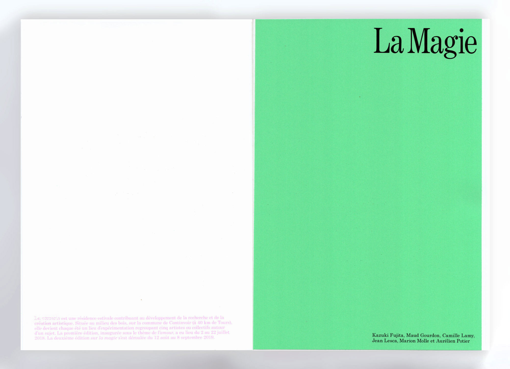
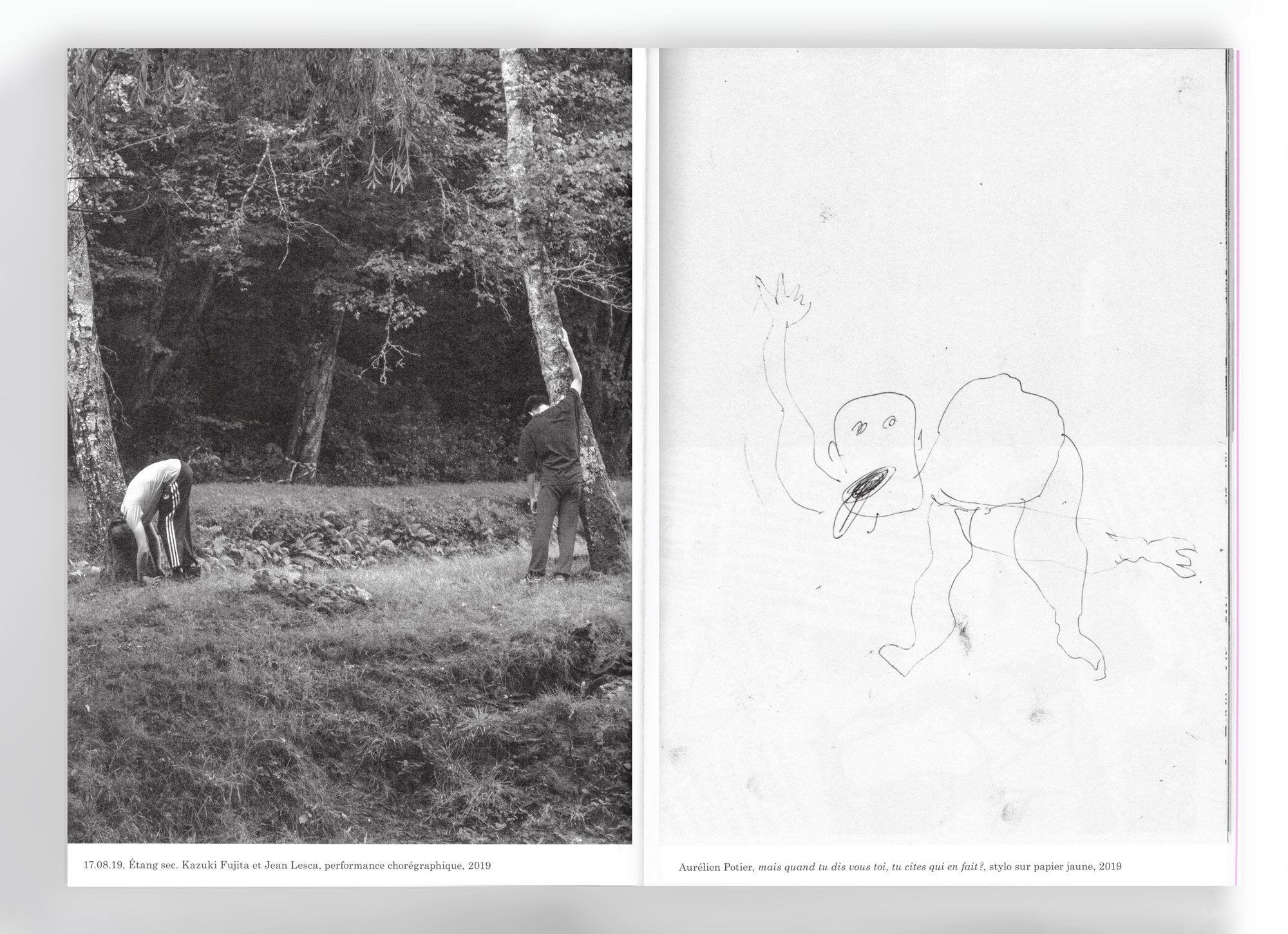
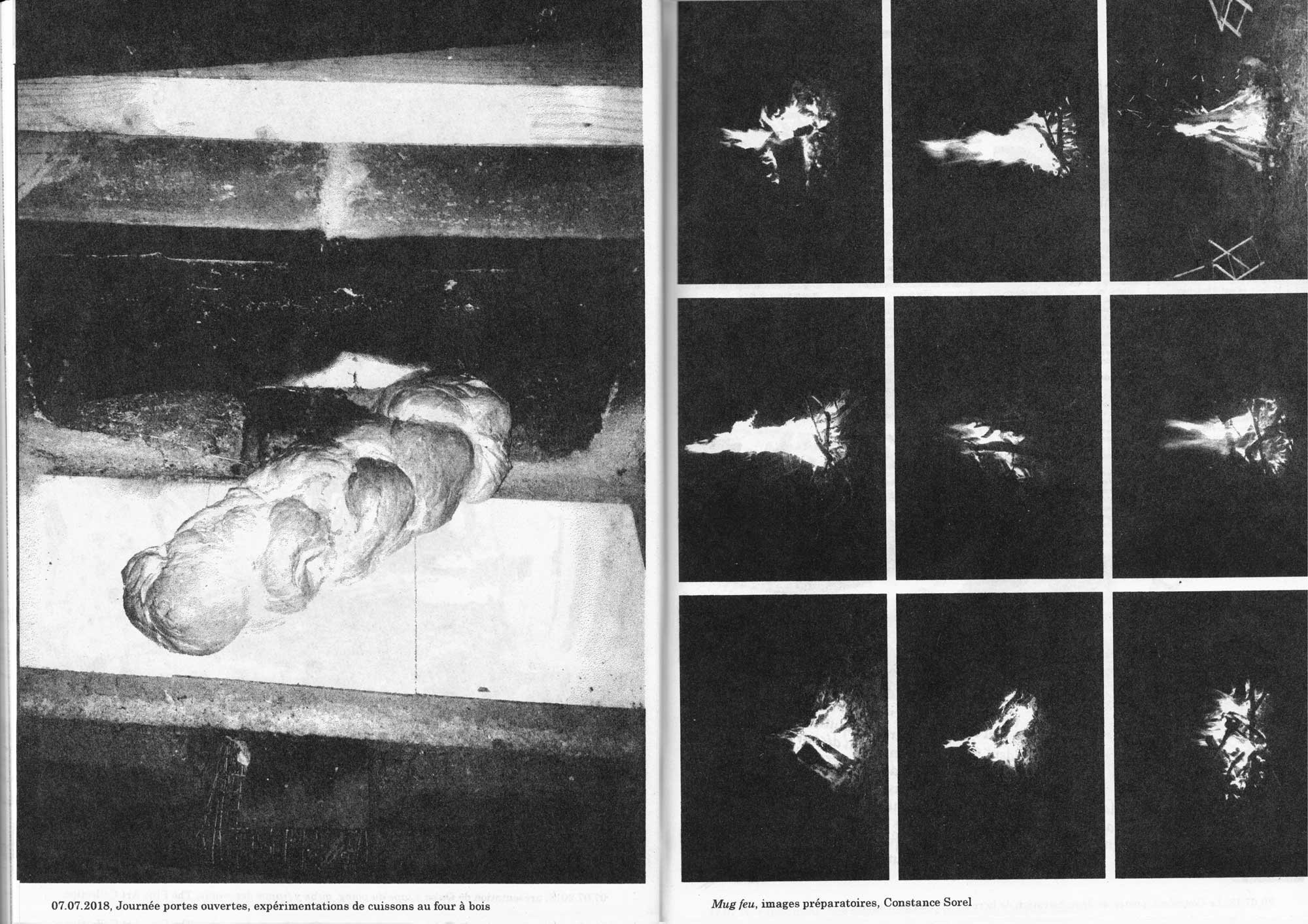
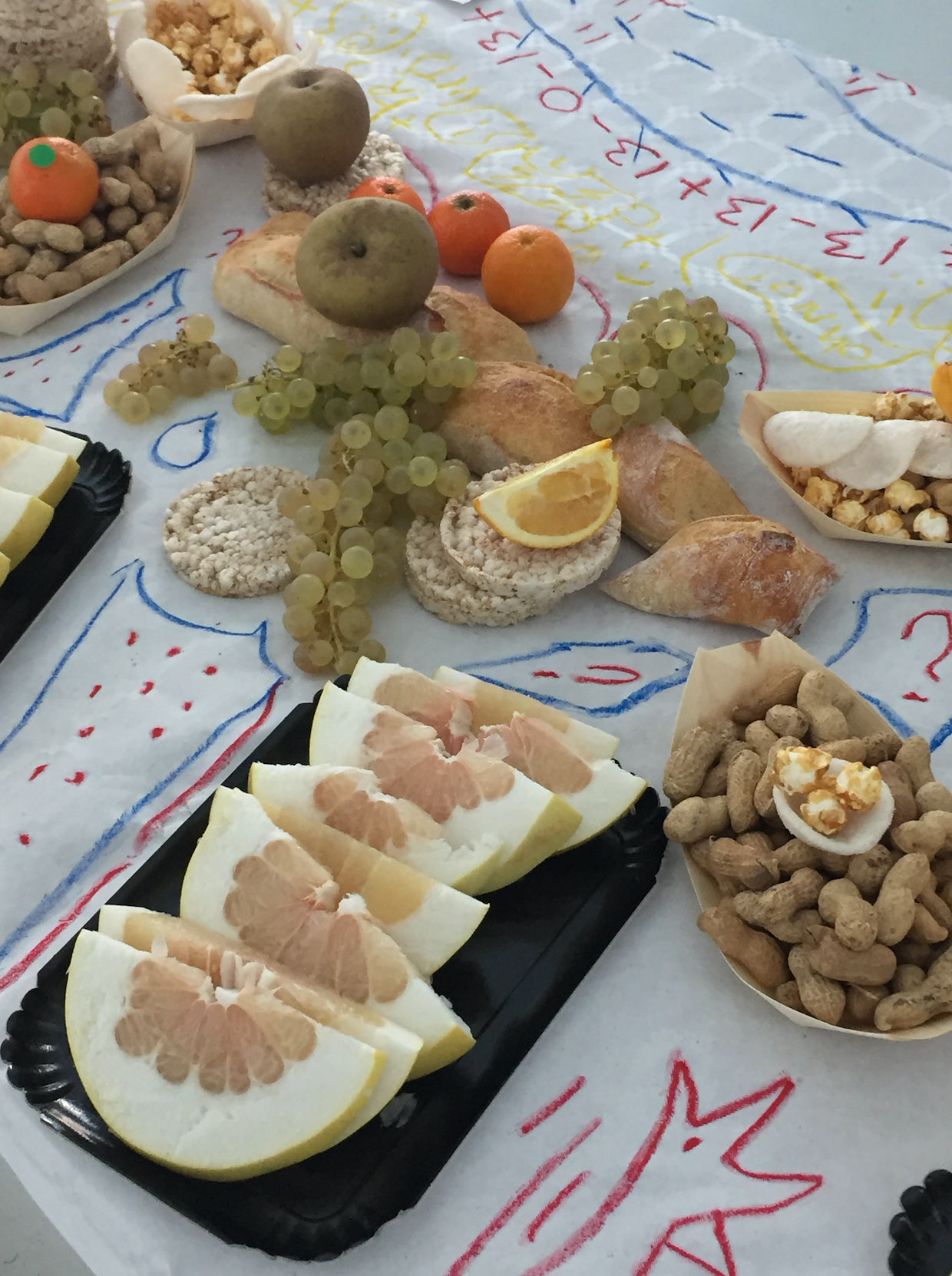
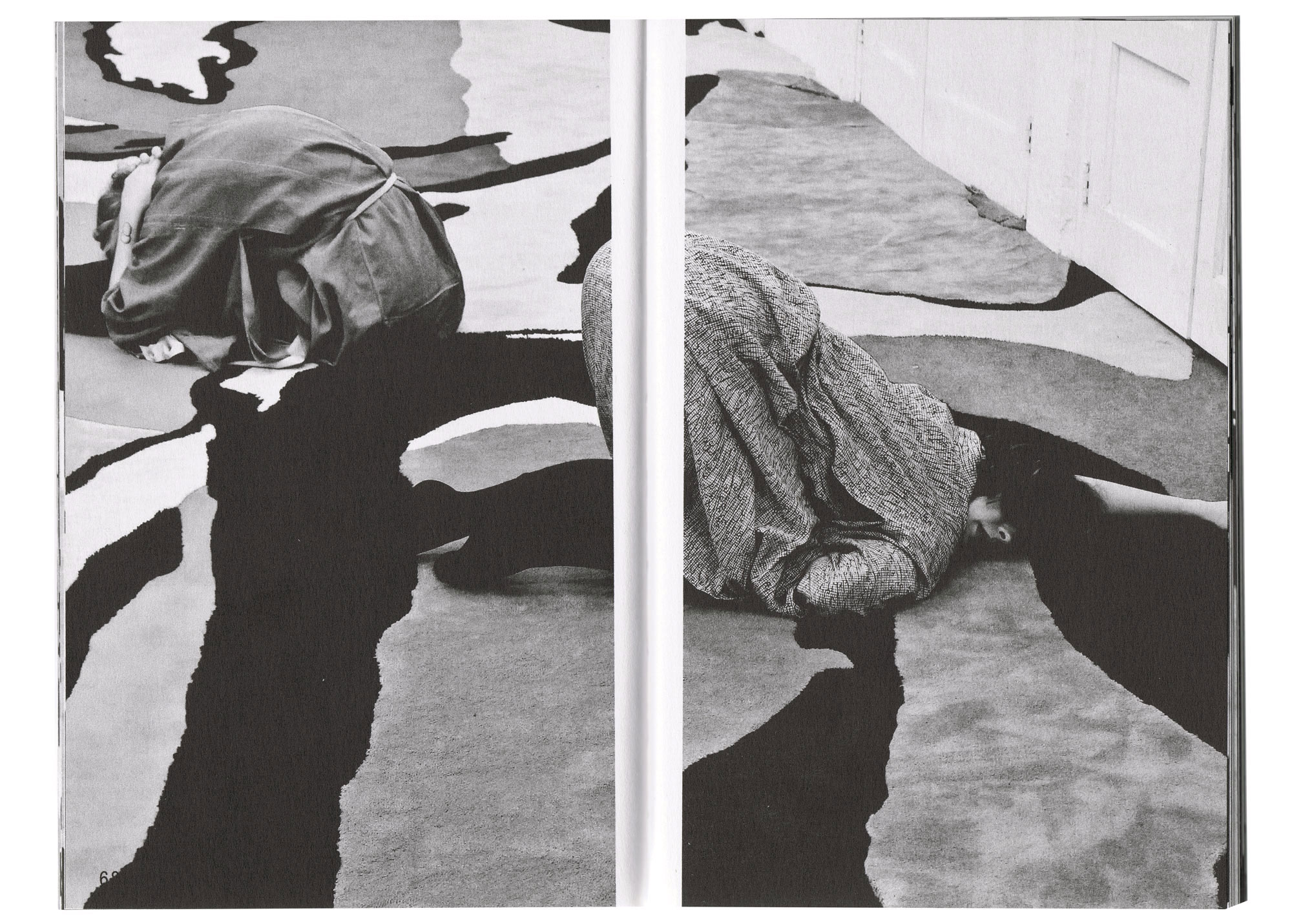
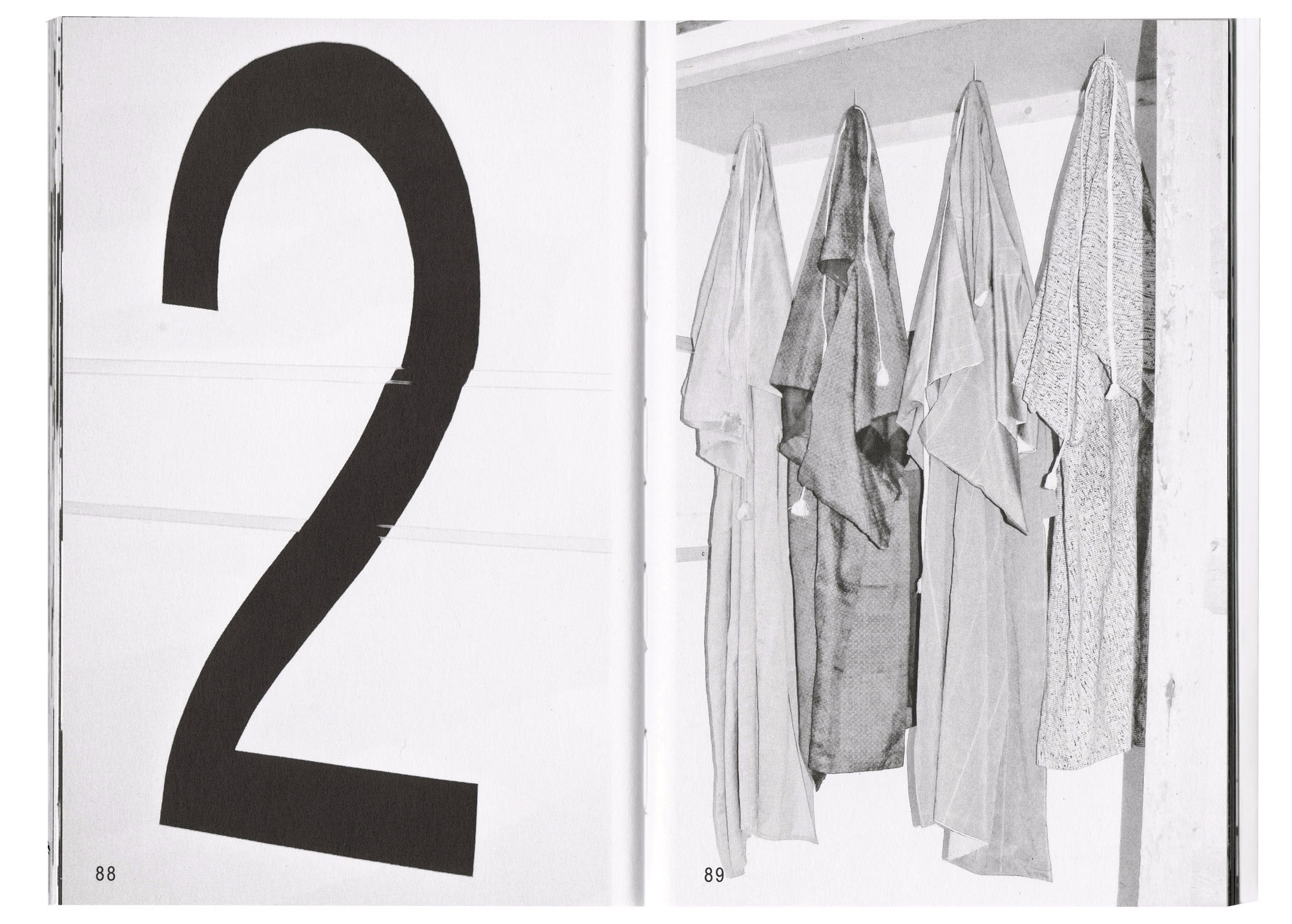
La Magie. Book concept and design. Artworks and texts by Margot Delalande, Kazuki Fujita, Maud Gourdon, Camille Lamy, Jean Lesca, Marion Molle, Aurélien Potier. Edited and published by La Résidence la Verrerie. Black offset, pantone cover, green insert. Limited edition of 150. 68 pages, 18,5 x 26 cm, 2020. Order here.
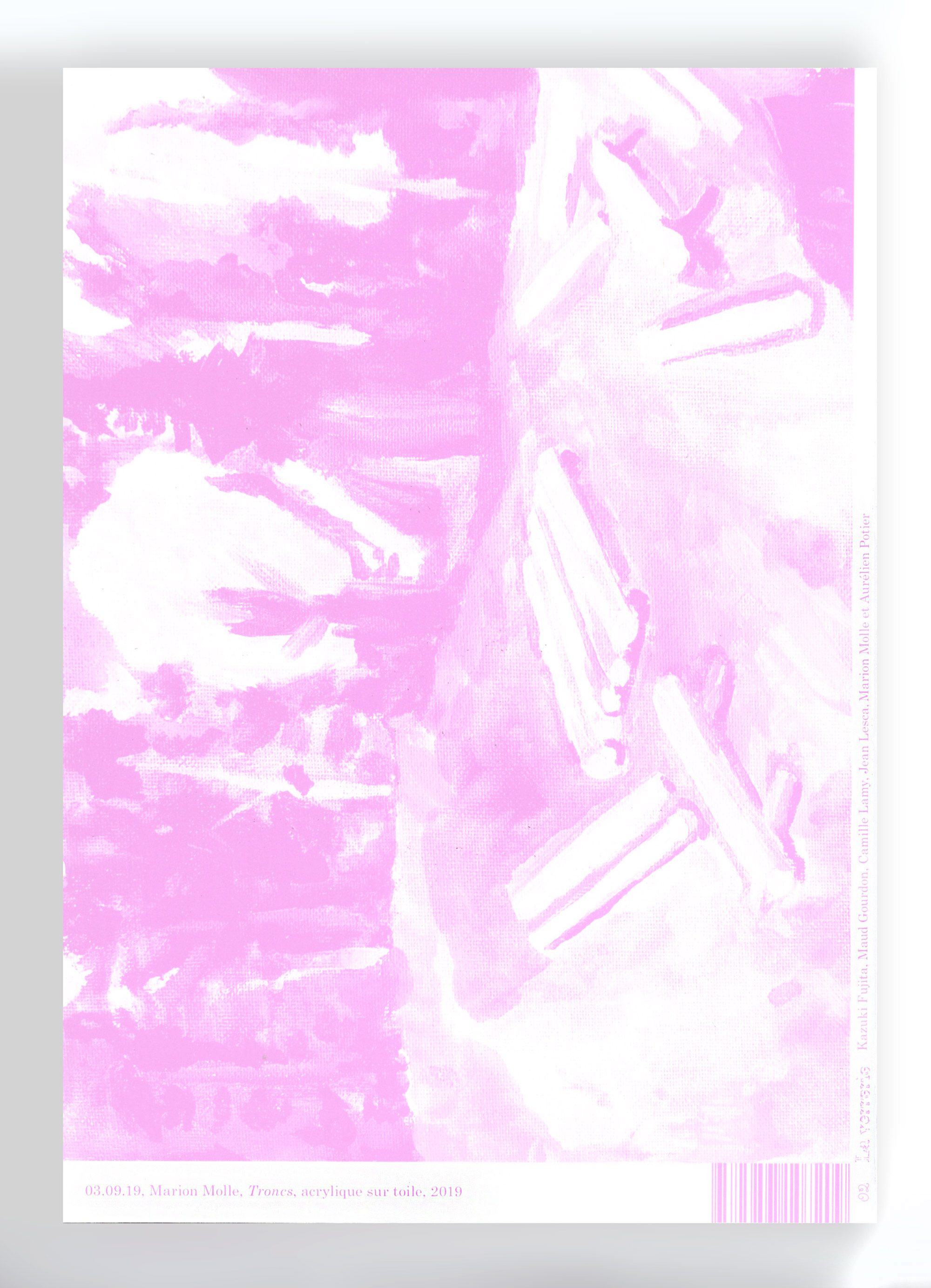
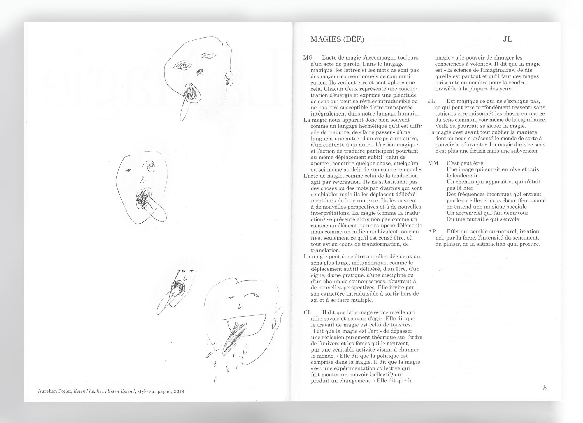
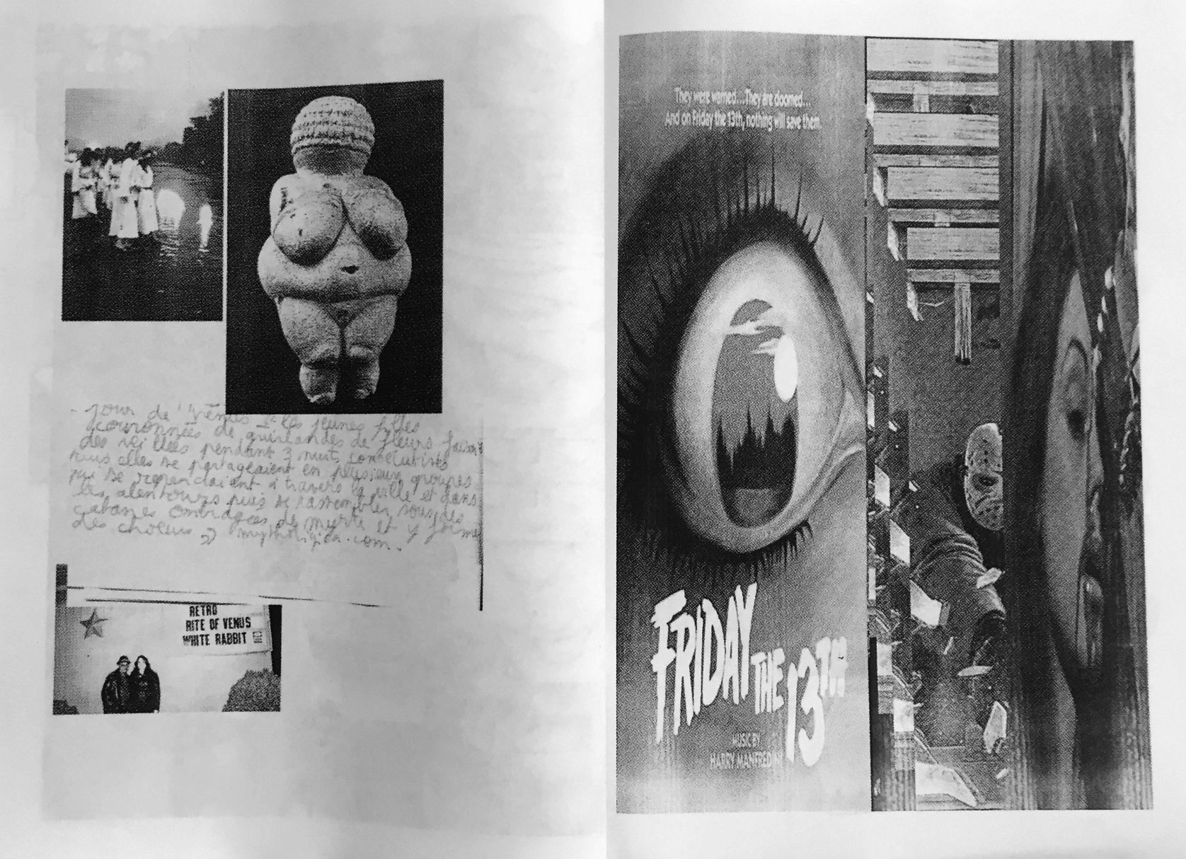
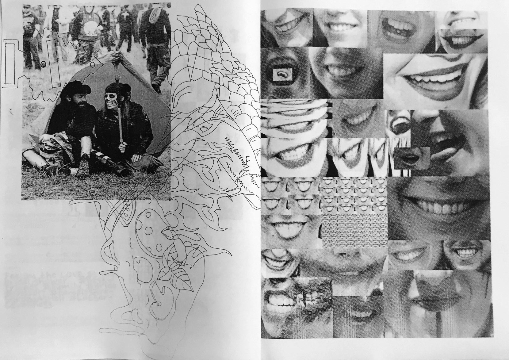
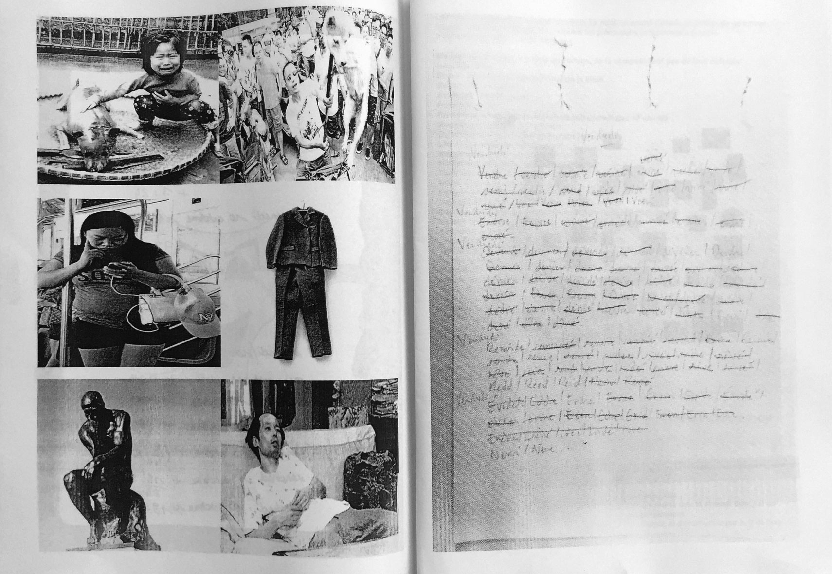
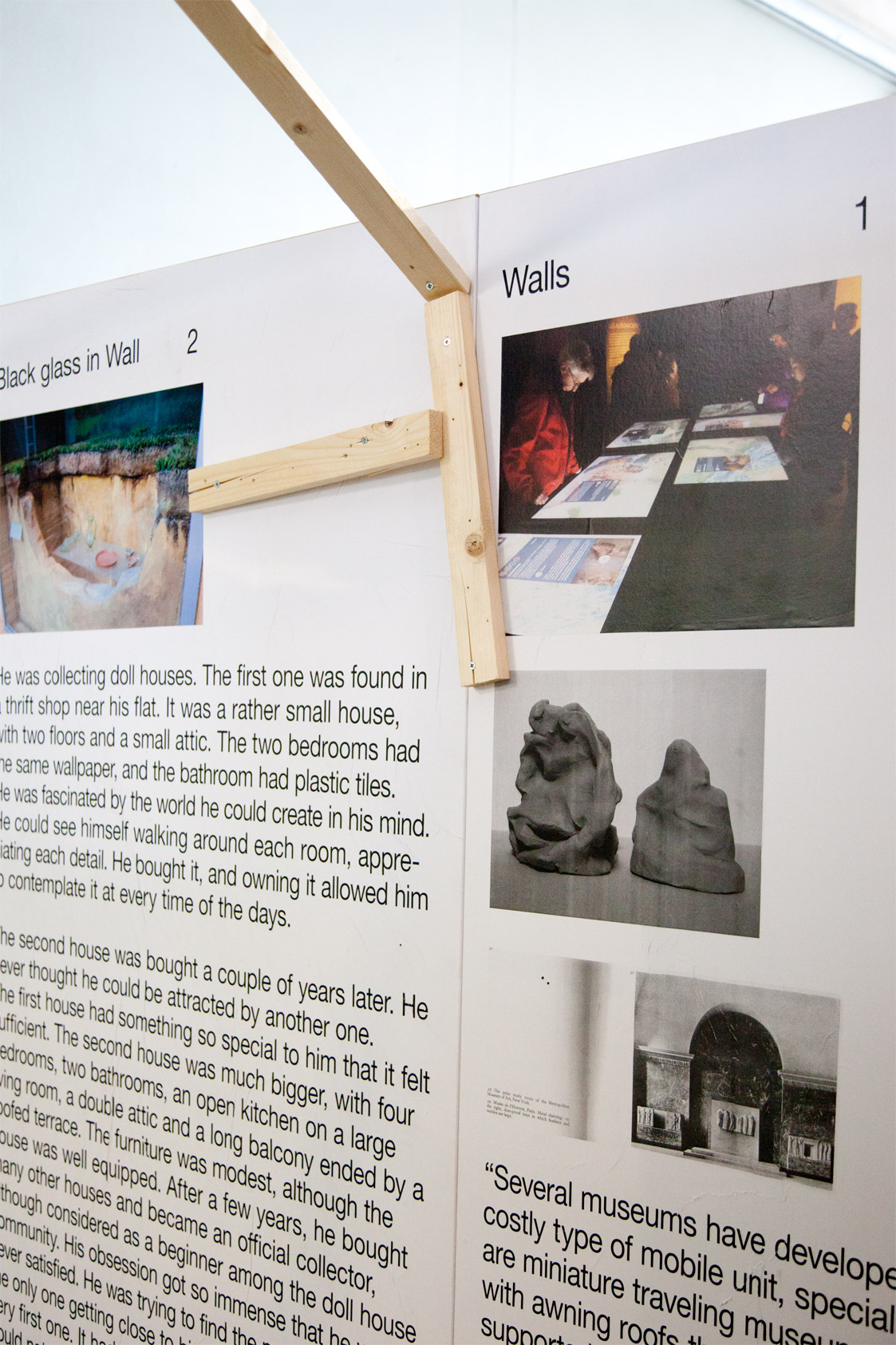
This book gathers the researches and creations of the artists in residency during the 2019 session of La Verrerie. The body of the book is constituted by texts written by the artists and the back part by images documenting the works and activities during this month of group research around the fields of believes, language, translation, transformation and magic.
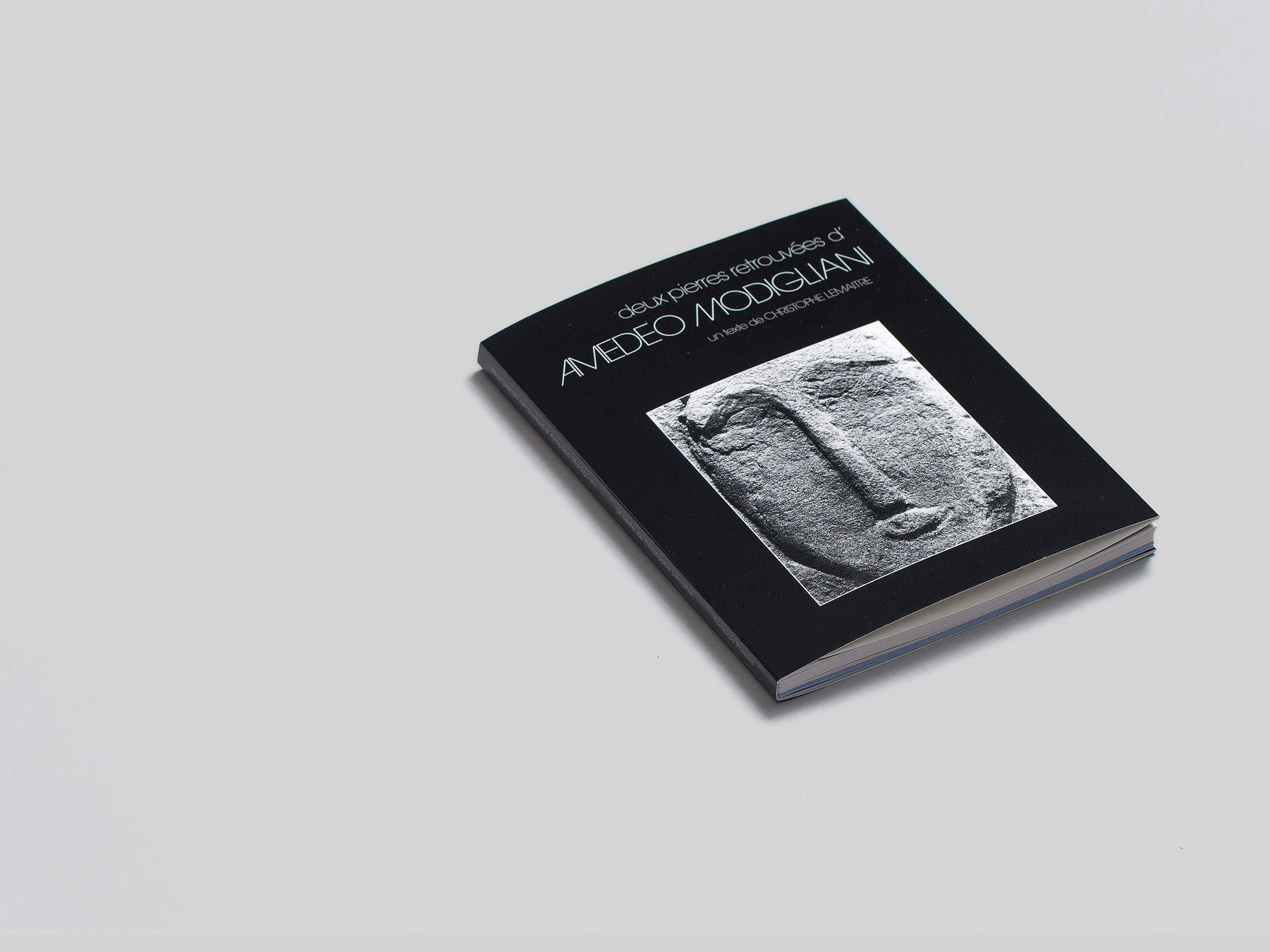
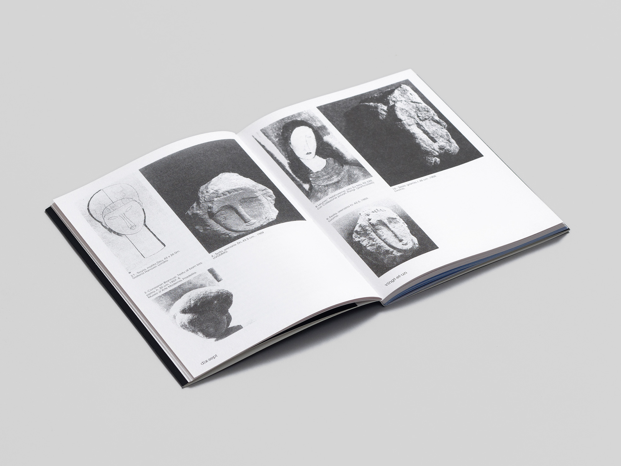
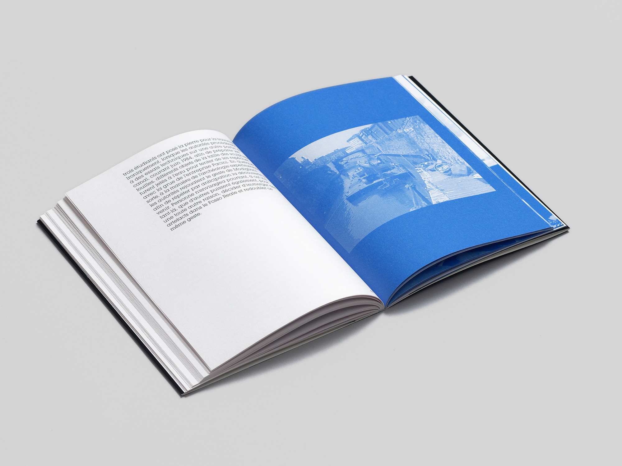
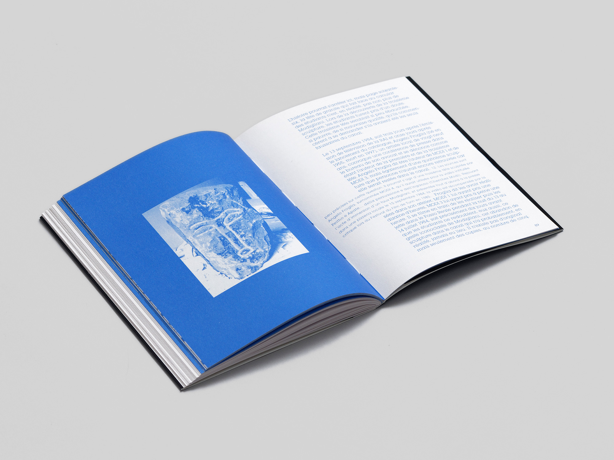
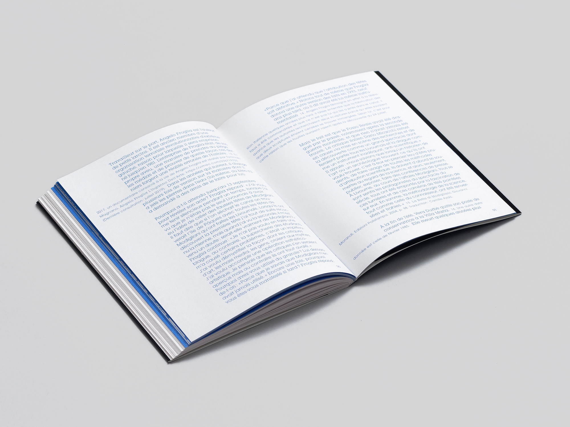
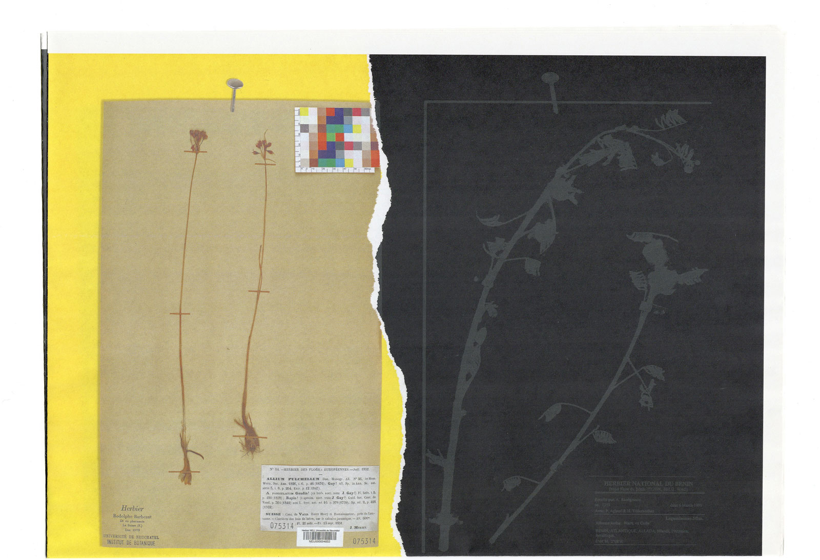
Deux Pierres Retrouvées d'Amedeo Modigliani. Book design. Concept and text by artist Christophe Lemaitre. Edited and published by Tombolo presses. Offset print, section sewn, soft cover with flaps. Edition of 350. 104 pages, 13,6 x 18 cm, 2019 (documentation by Aurélien Mole). Order here
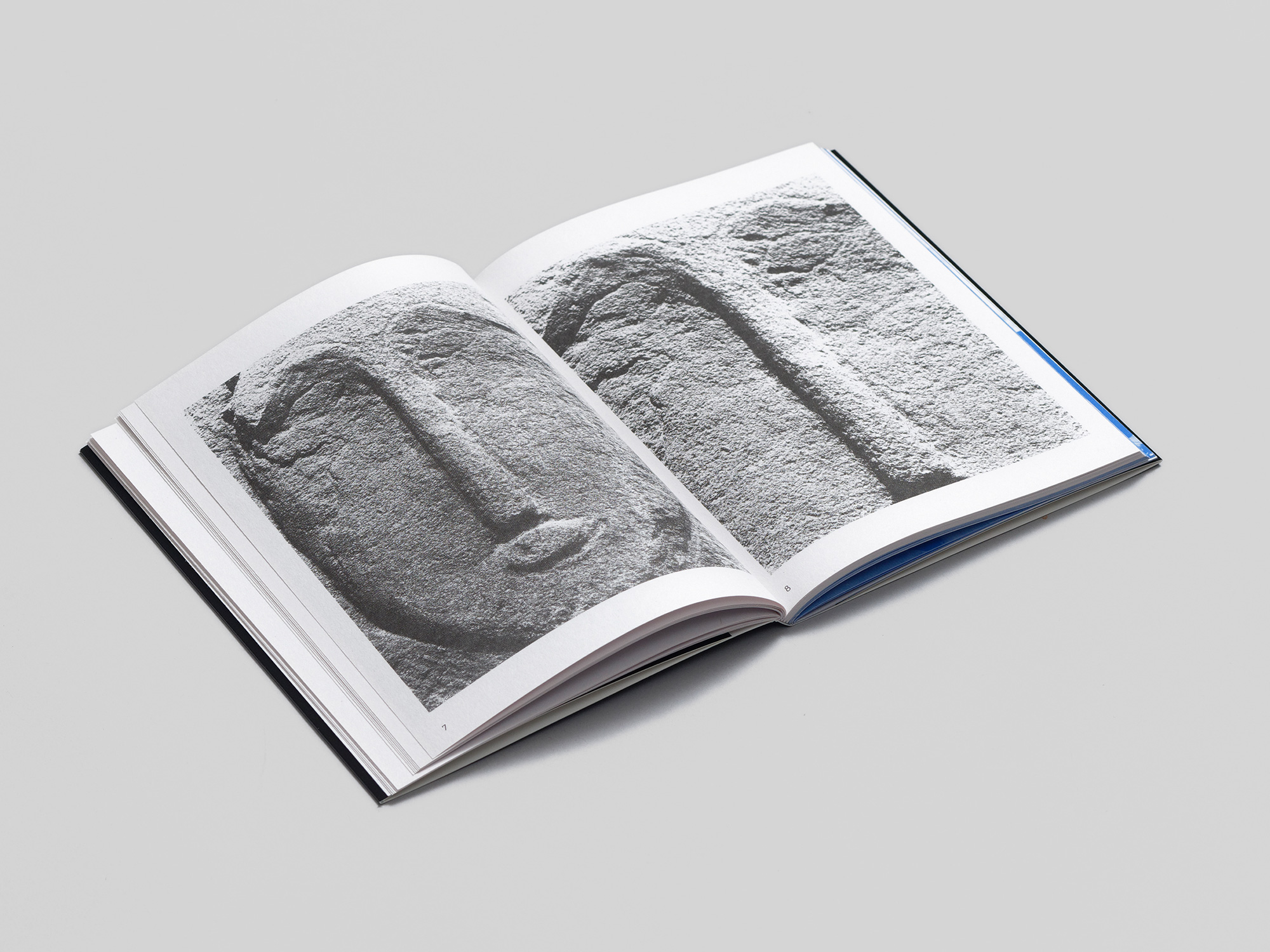
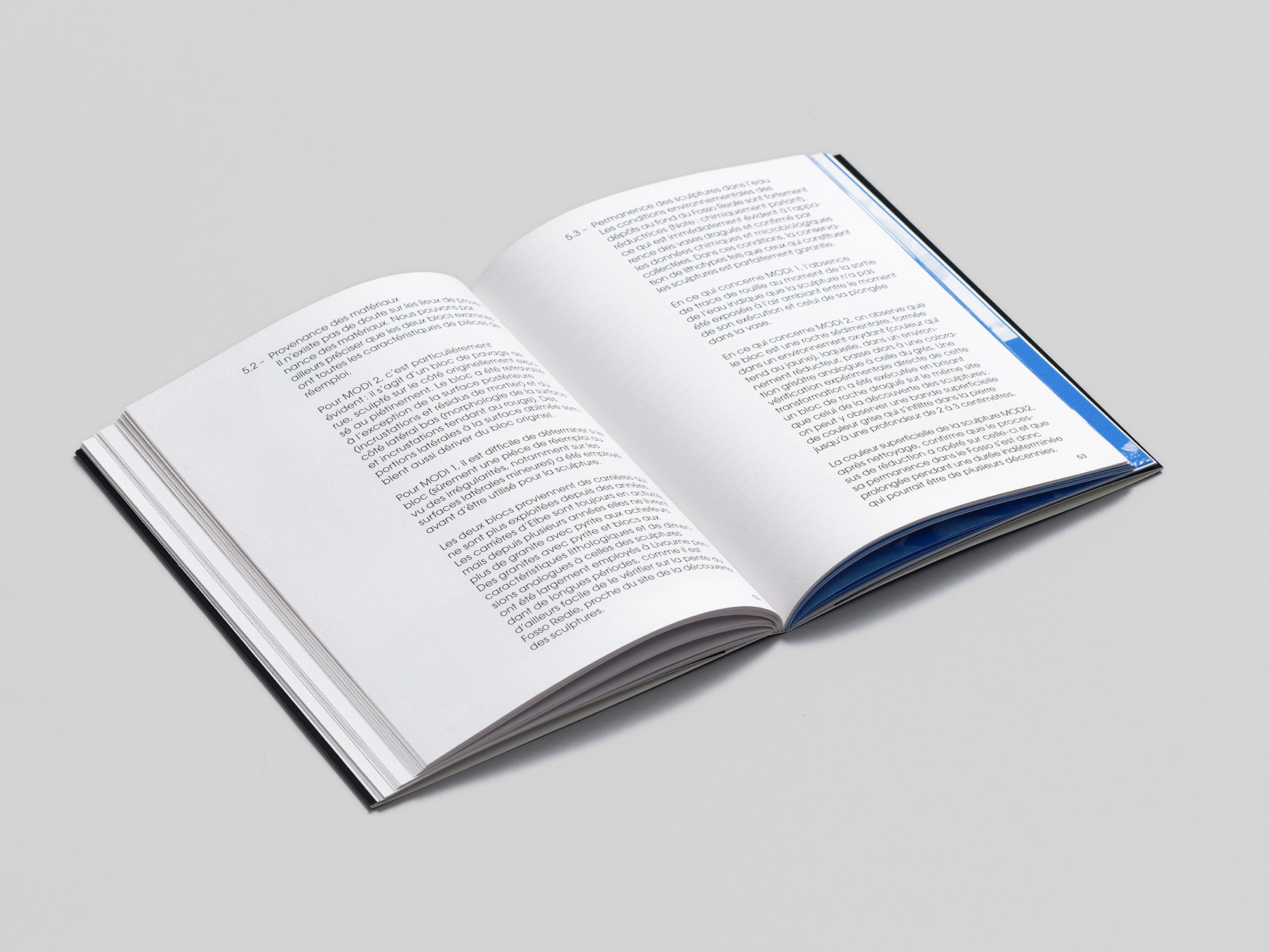
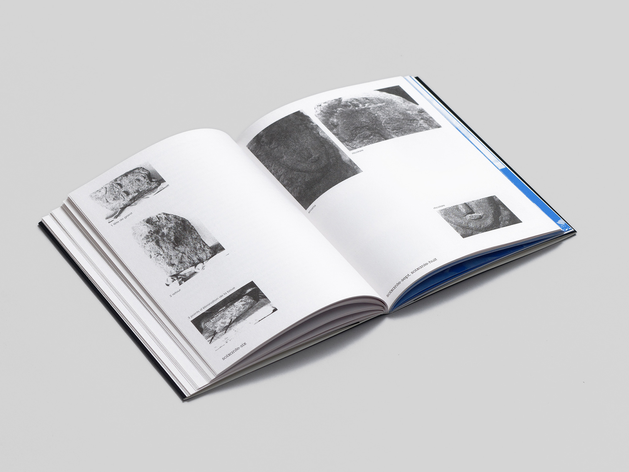
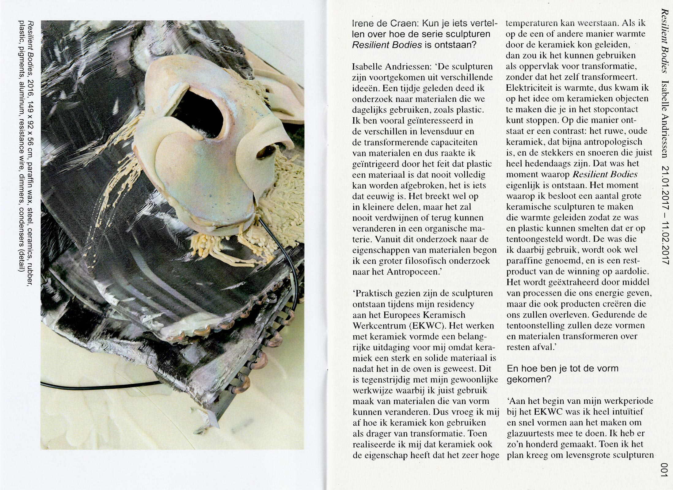
Local legend has it that in 1909, painter and sculptor Amedeo Modigliani threw several sculptures into the canal of his hometown in Livorno, Italy. In 1984, on what would have been the artist’s 100th birthday, an underwater search was organized and proved to be successful. Deux pierres retrouvées d’Amedeo Modigliani is a reading and reinterpretation of Due pietre ritrovate di Amedeo Modigliani, a catalog published in September 1984. Through texts and images, this Italian catalog describes the discovery in Livorno’s Fosso Reale of two heads sculpted by Amedeo Modigliani: photo portfolio, historical perspective, biographical approach, research progress, chemical and technical analyses. The continuity of the story surrounding the catalog reveals how the elegant Italian publication, quickly banned for sale, became a uchronia through an event that never actually took place.
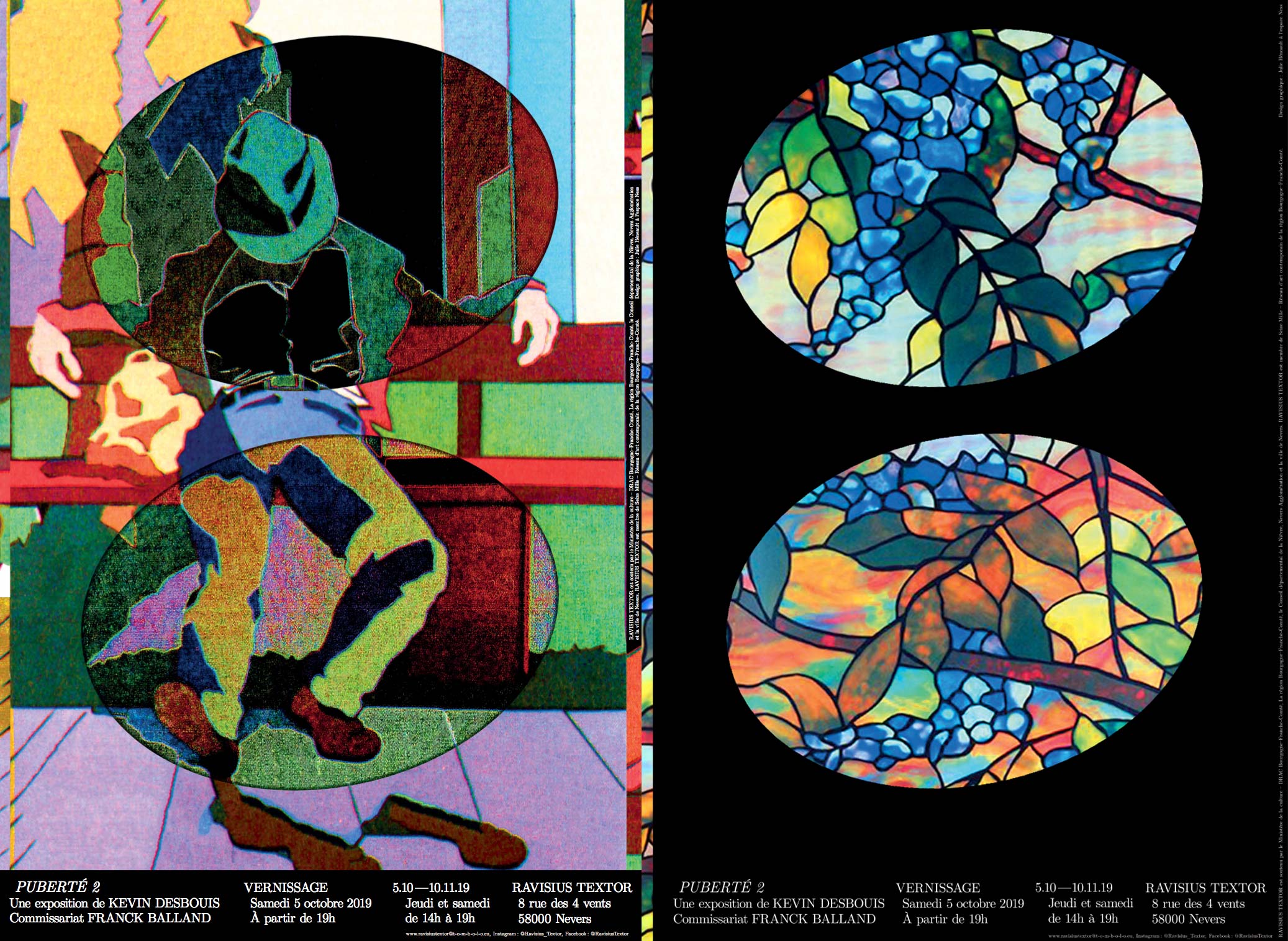
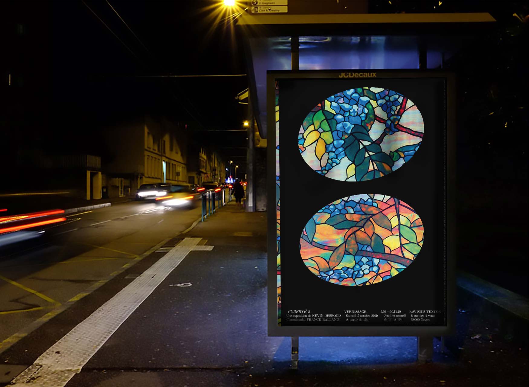
Puberté 2. Posters for Kevin Desbouis' exhibition at Ravisius Textor, Nevers.
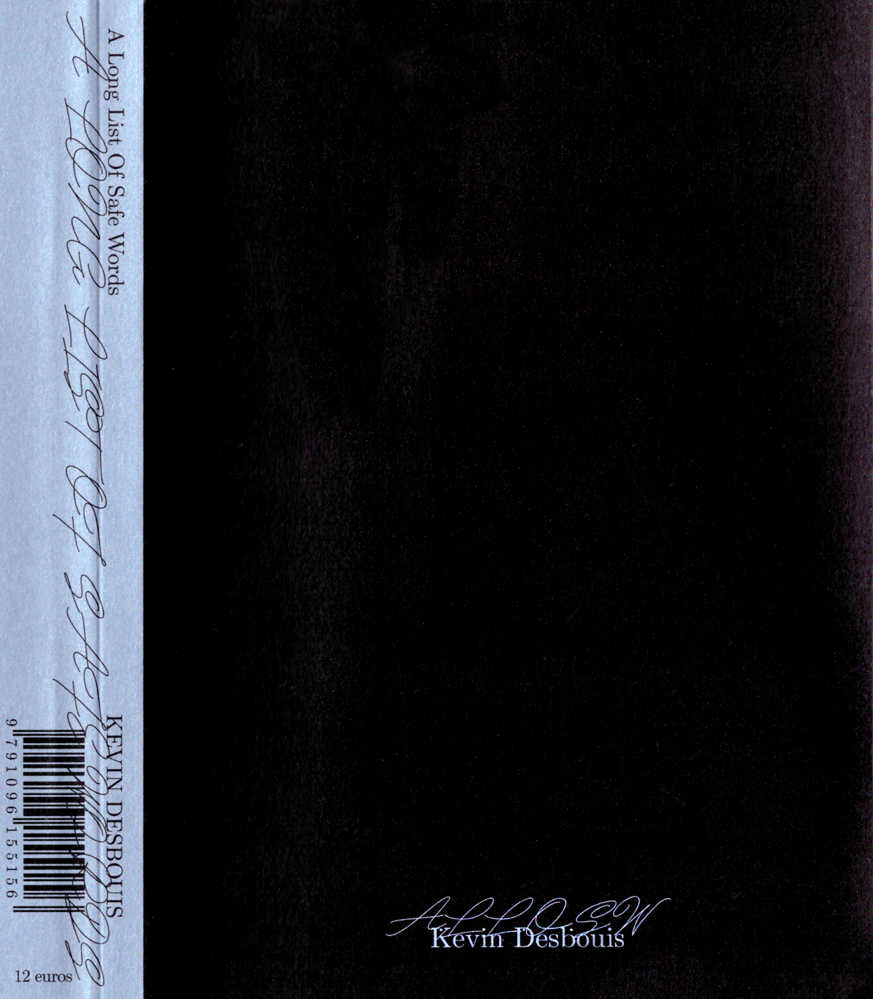
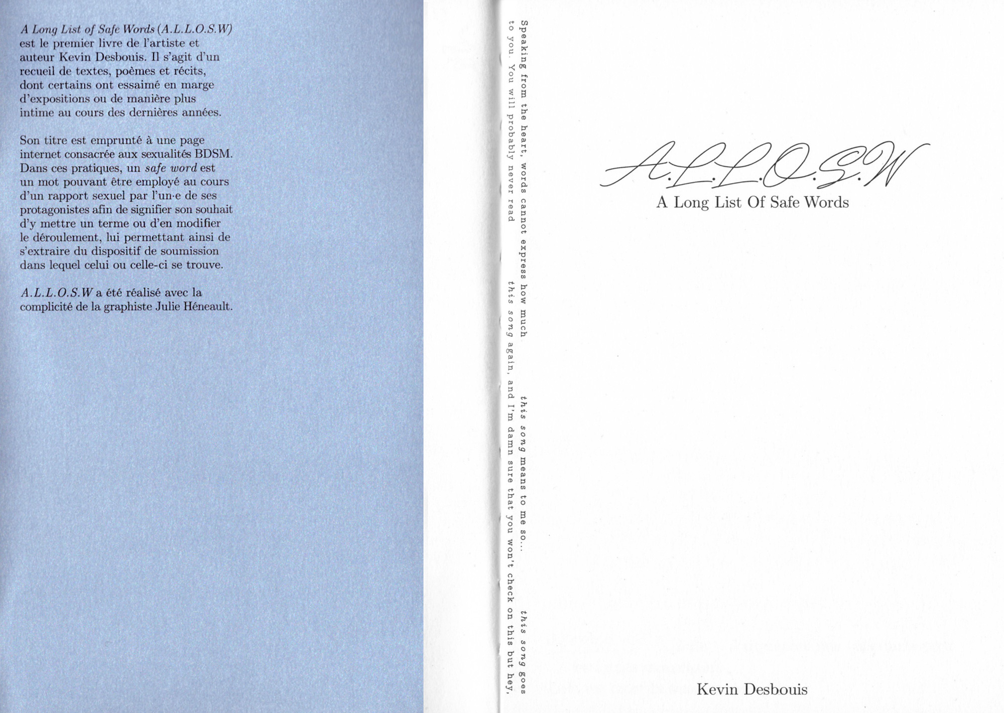
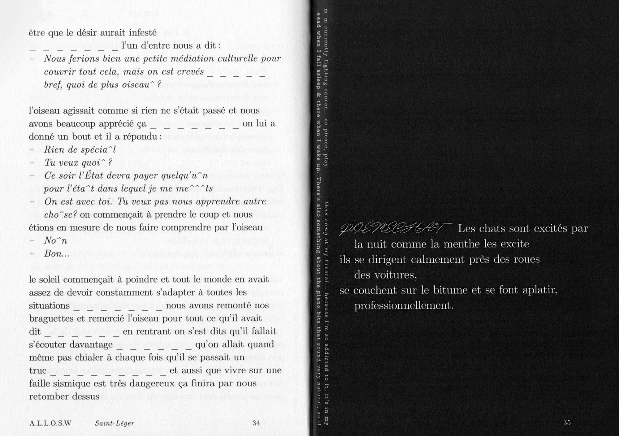
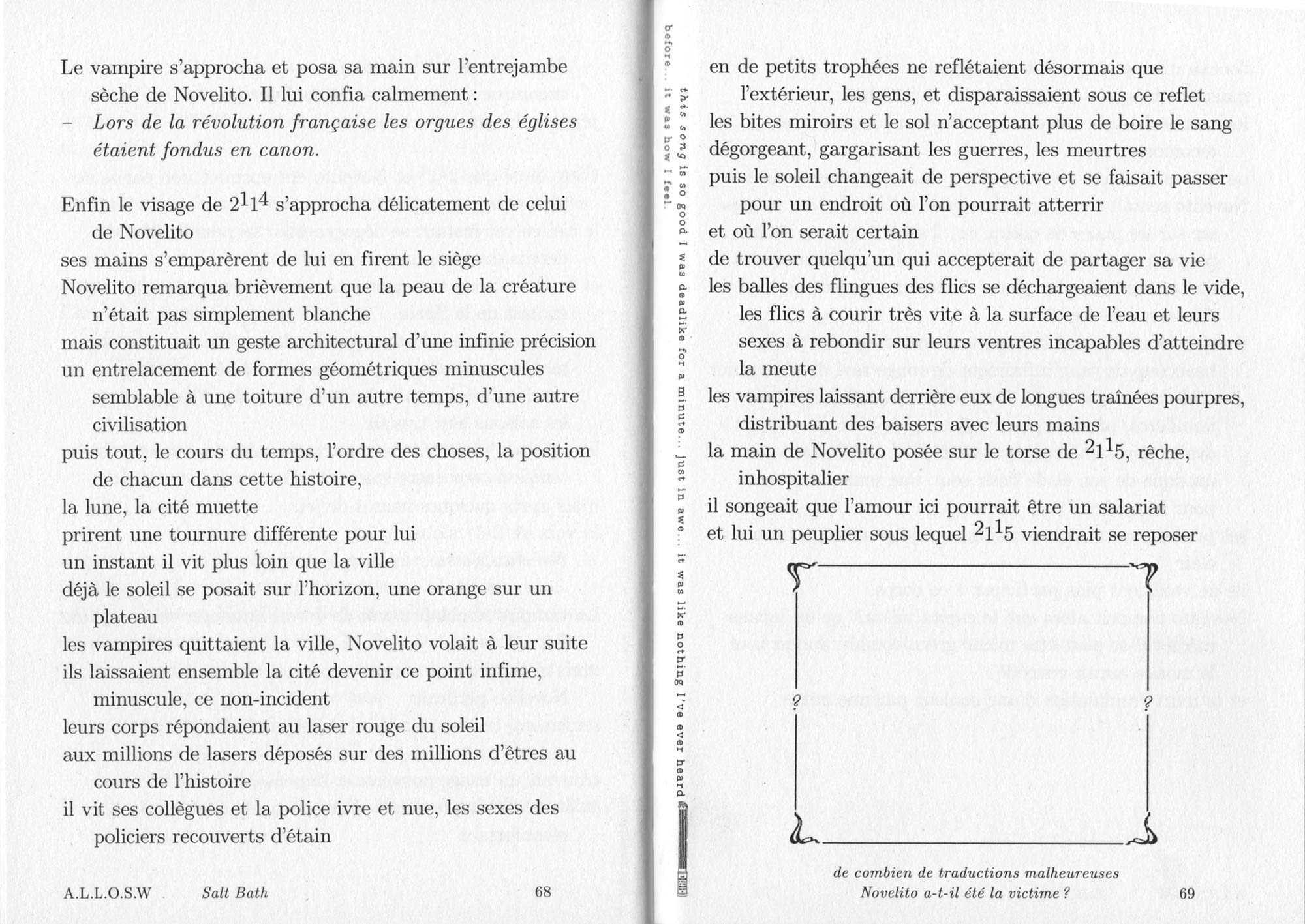

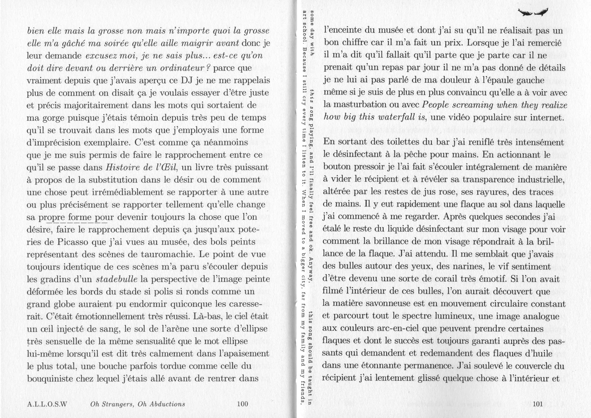
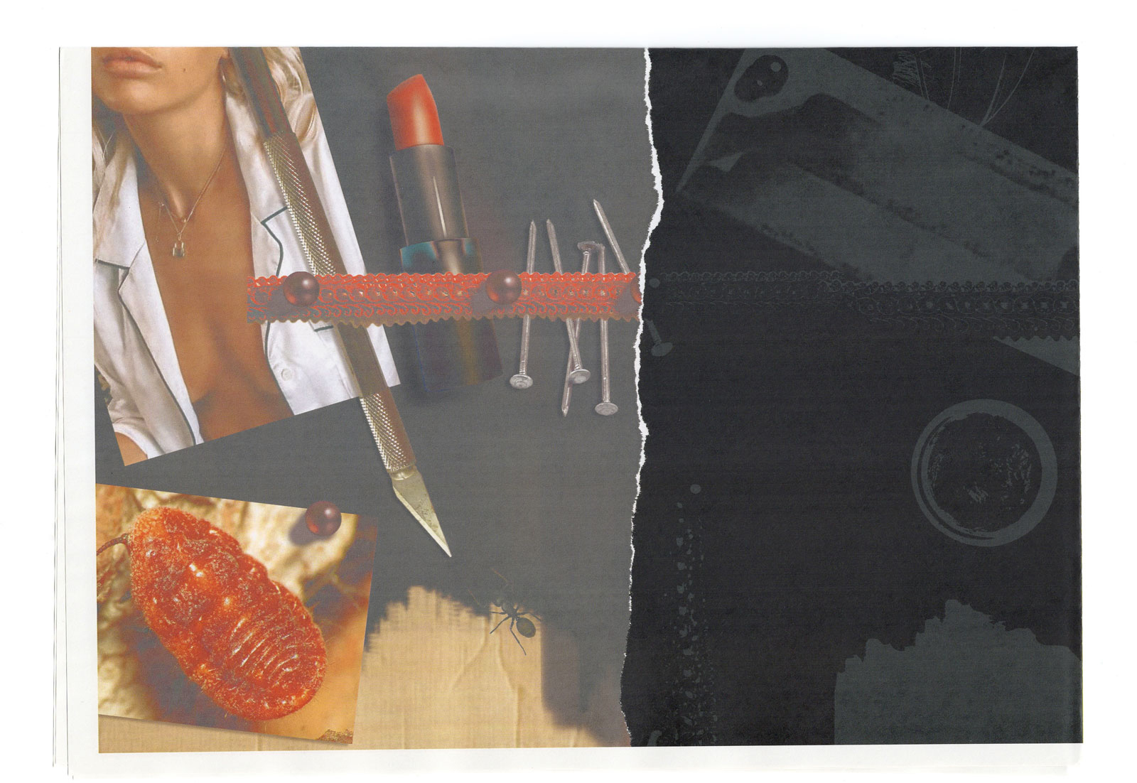
A Long List Of Safe Words (A.L.L.O.S.W). Book concept and design. Texts, essays, poems and haïkus by artist and poet Kevin Desbouis. Edited and published by Tombolo Presses. Offset and HUV soft cover. Inverted swiss binding. Edition of 350. 120 pages, 128 x 180 mm, 2019. Order here.
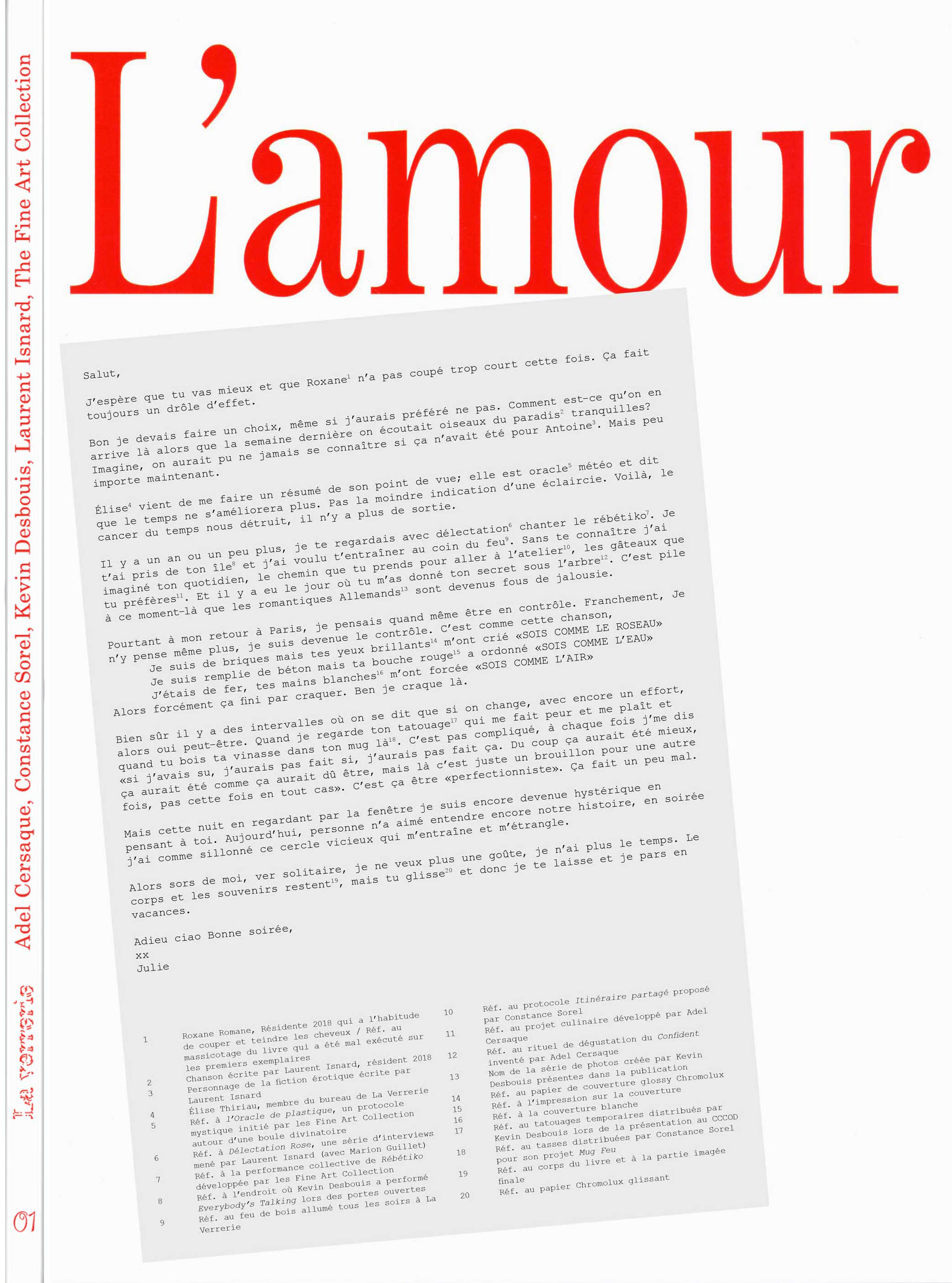
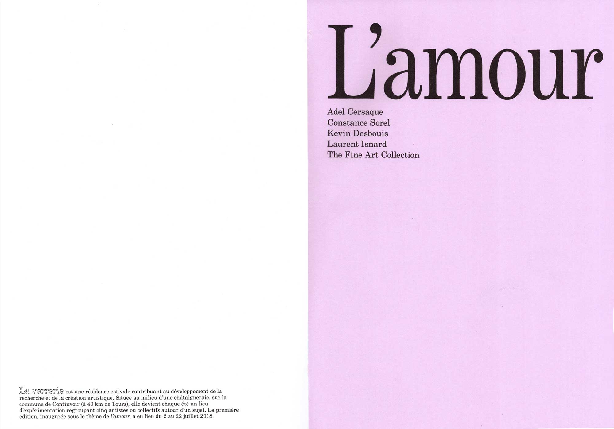
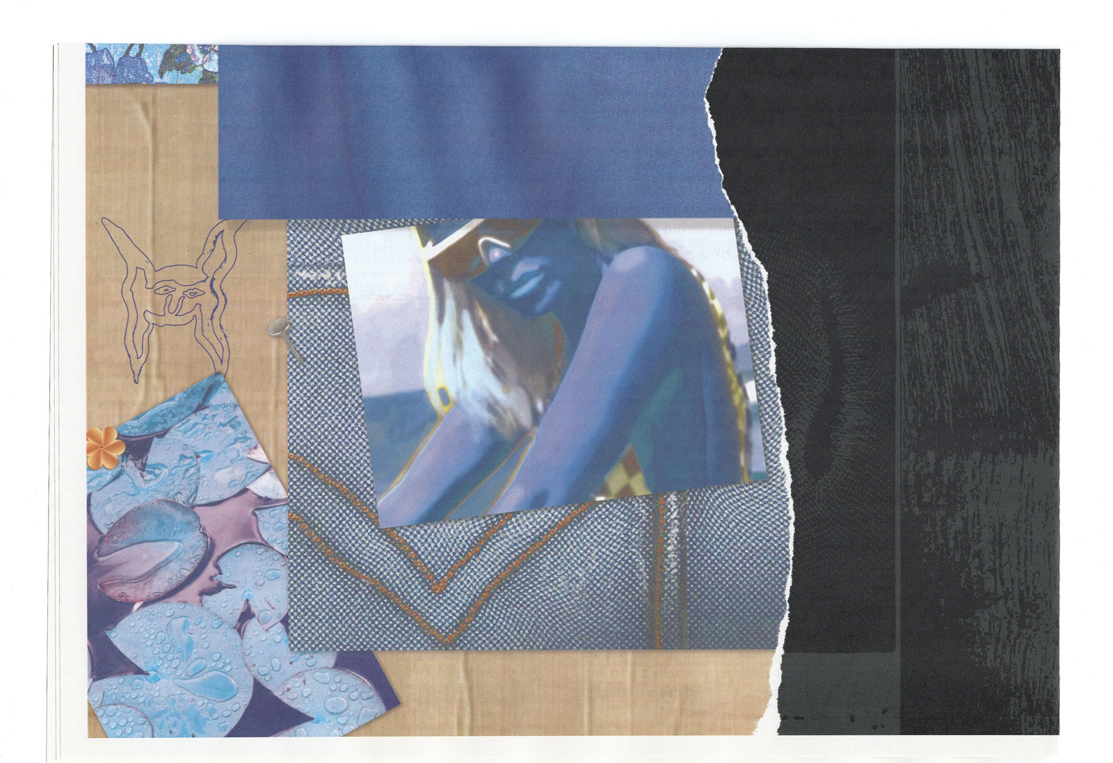
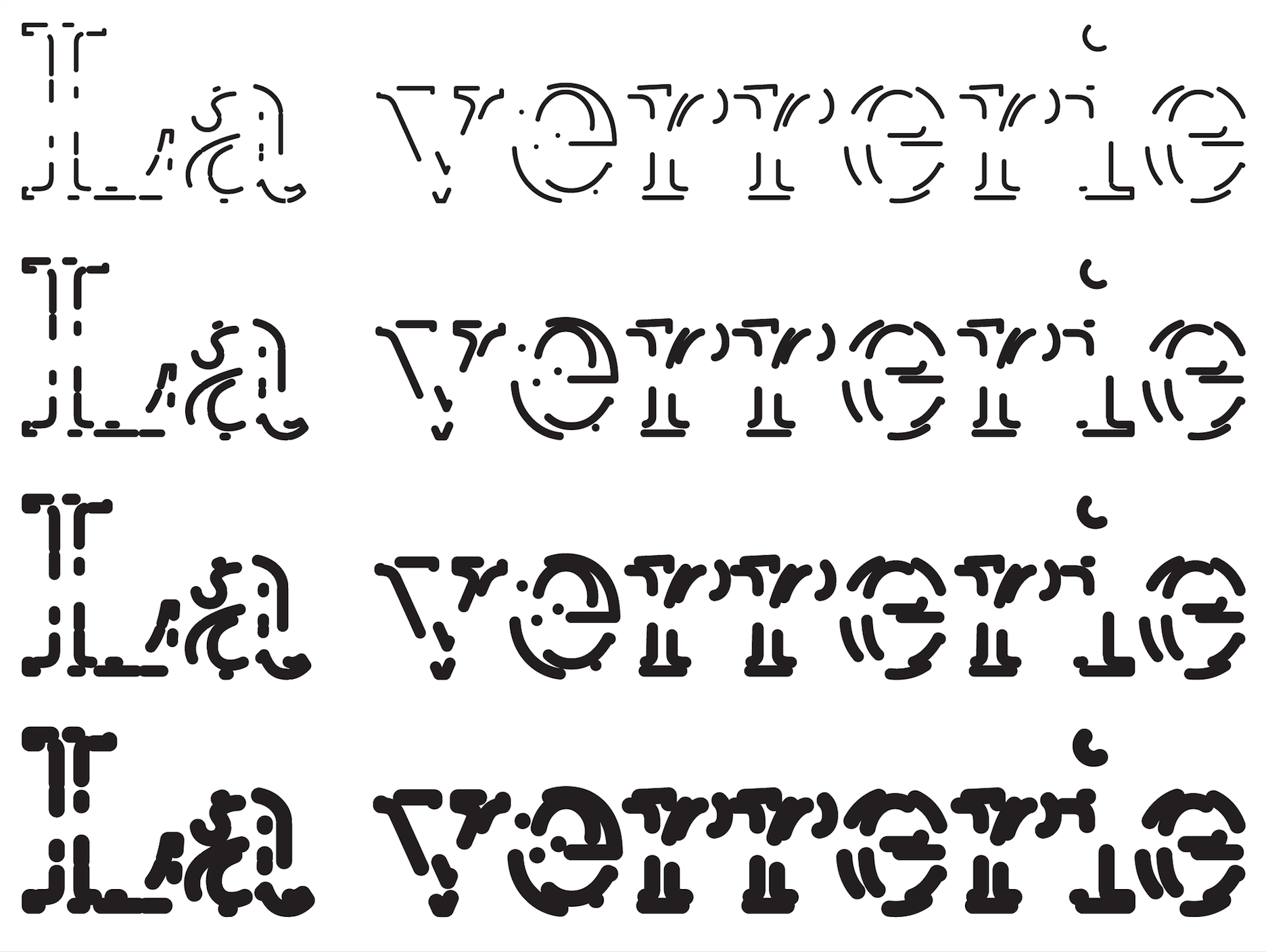
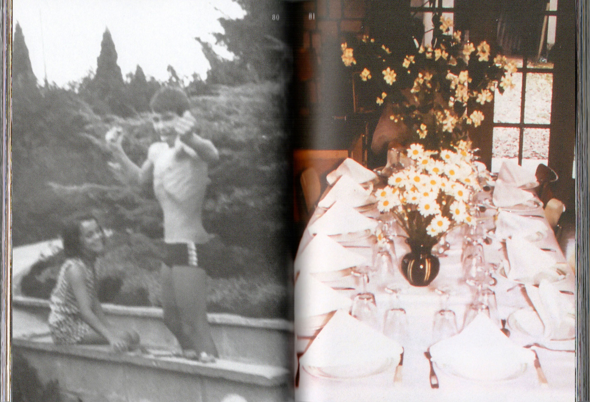
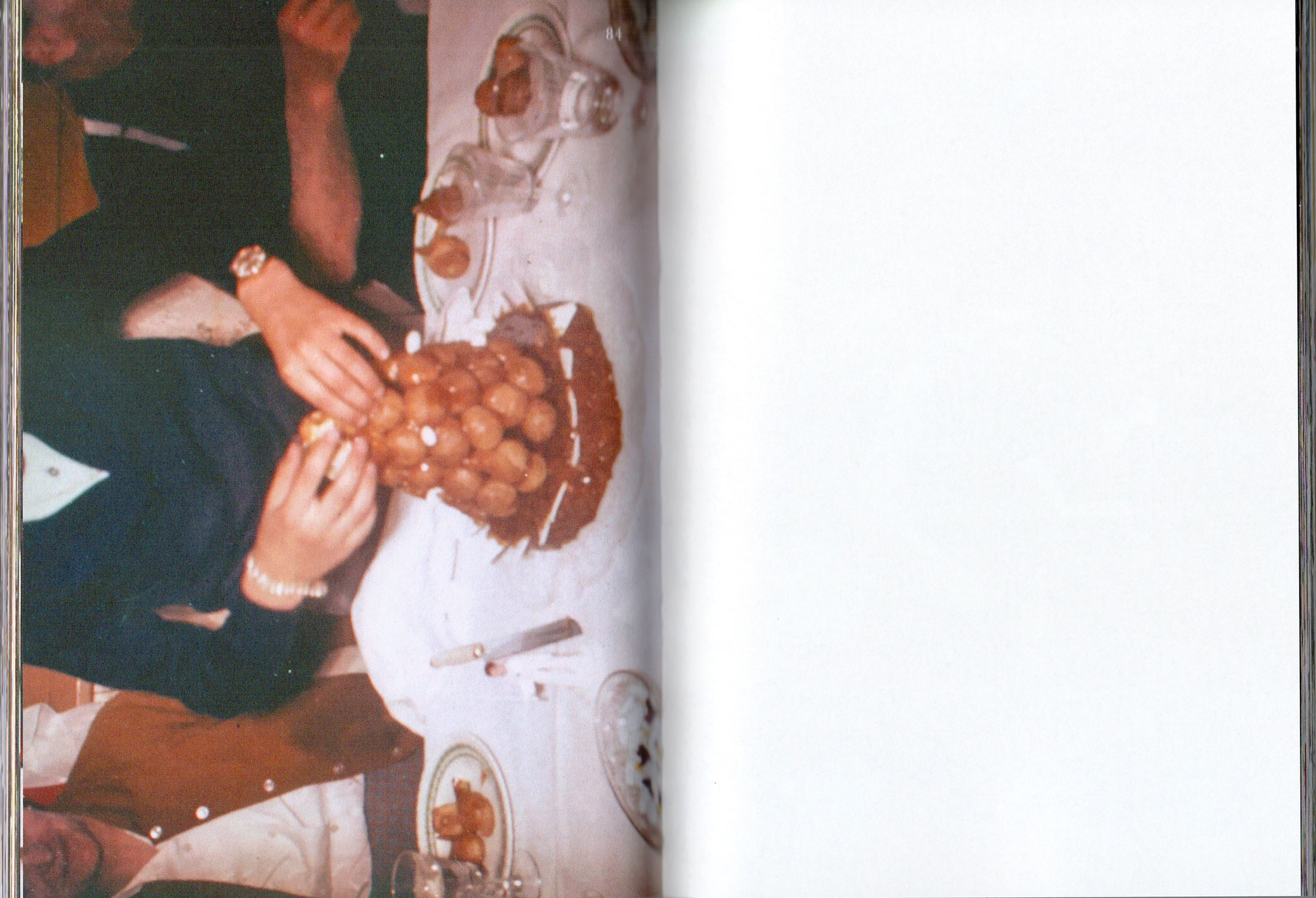
L'Amour. Book concept and design. Artworks and texts by Adel Cersaque, Constance Sorel, Kevin Desbouis, Laurent Isnard, and The Fine Art Collection. Edited and published by La Résidence la Verrerie. Riso-printed and hand-bound at l'espace Ness. Limited edition of 100. Order here.
This book gathers the researches and creations of the artists in residency during the 2018 session of La Verrerie. The body of the book is constituted by texts written by the artists and the back part by images documenting the works and activities during this month of group research around the topic of love.
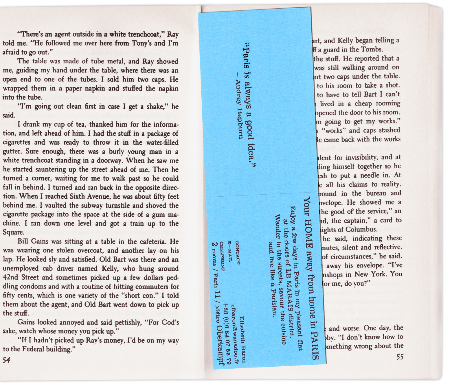
Business card design i.c.w Émilie Ferrat. Makiwara typeface by Paul Bernhard.
Riso-printed at l'espace Ness, edition of 200.
Half fold double sided business card including a map of the neighbourhood at the back. If unfolded, the card is thought to be used as a bookmark for a pocket book.
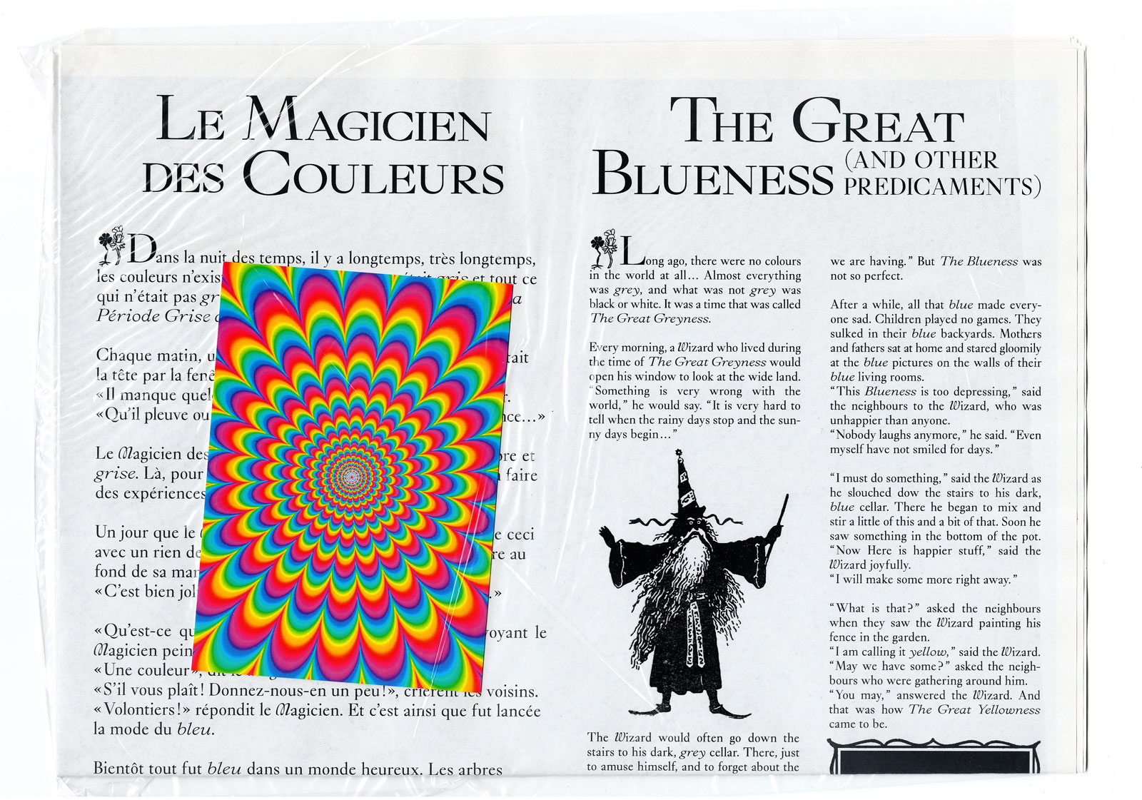
The Great Blueness. Newspaper designed i.c.w Émilie Ferrat, artworks by Louise Moins.
Printed in Glasgow, limited edition of 50 copies, 8 pages, 350 x 500 mm, 2018. order here.
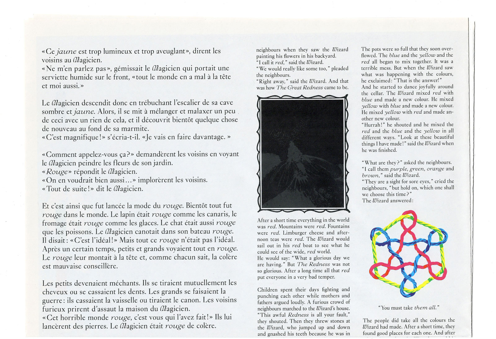
Newspaper produced on the occasion of the exhibition "The Great Blueness" by artist Louise Moins at l'espace Ness. The title of the show is borrowed from the eponymous tale written in 1968 by American author Arnold Lobel which the artist has been using as a starting point for the creation of her works. Typography Glossy Display by Bold Decisions. Wizard’s glossy stamp taken from the quarterly pamphlet The Marijuana Review (Vol. 1, No. 2, Jan – Mar 1969), The Pleasantries of the Incredible Cannabis or: How to Grow Grass.
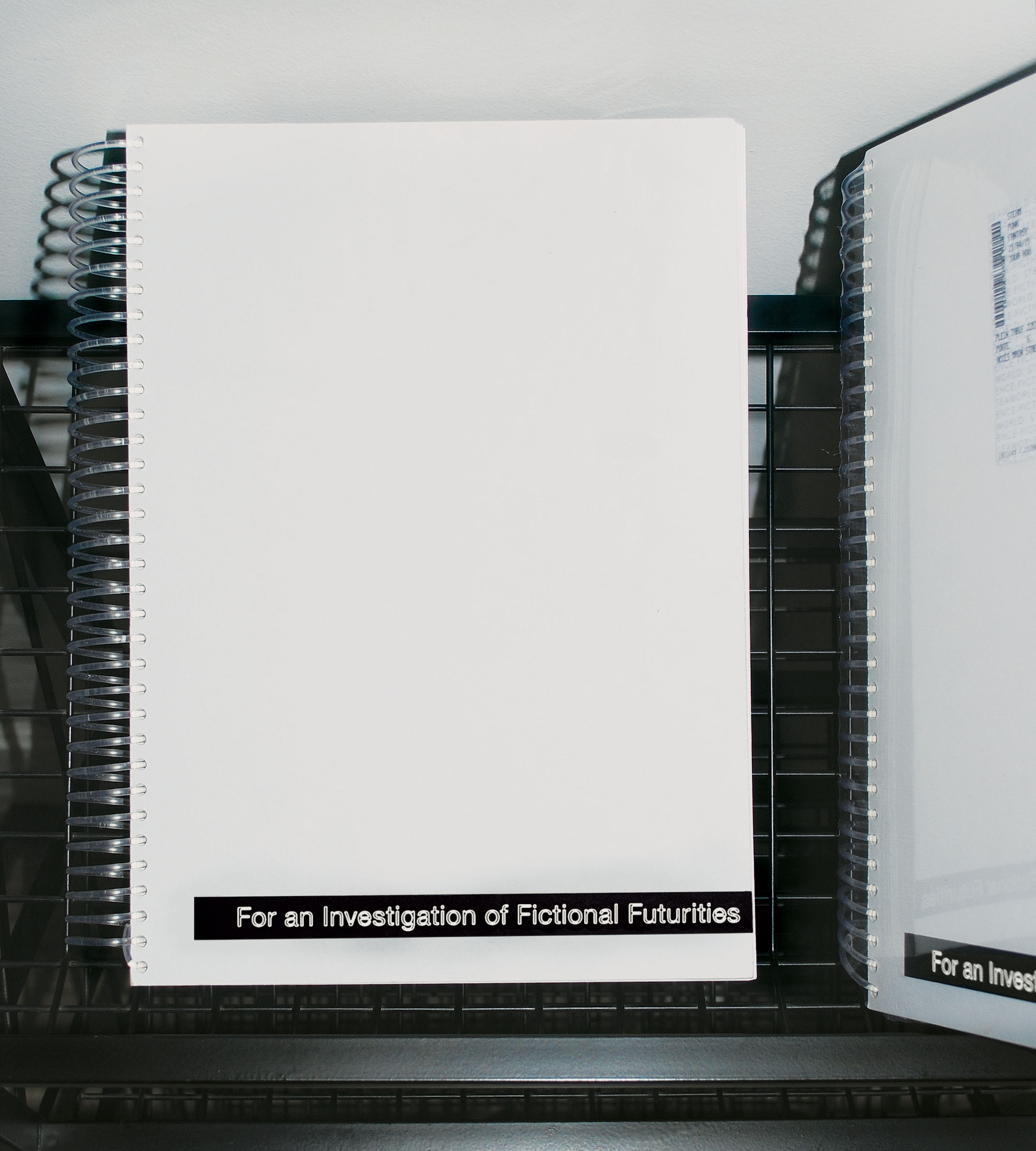
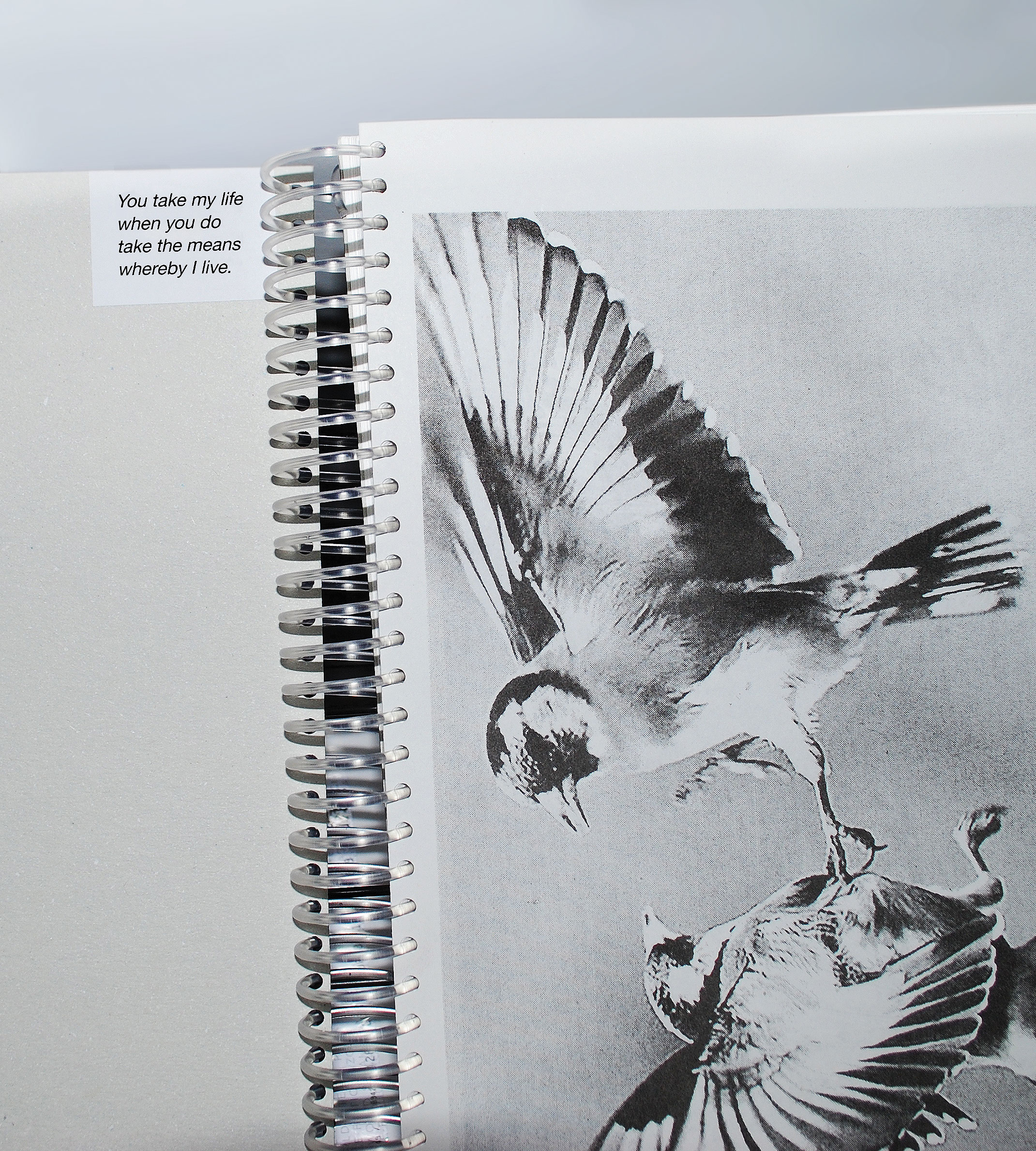
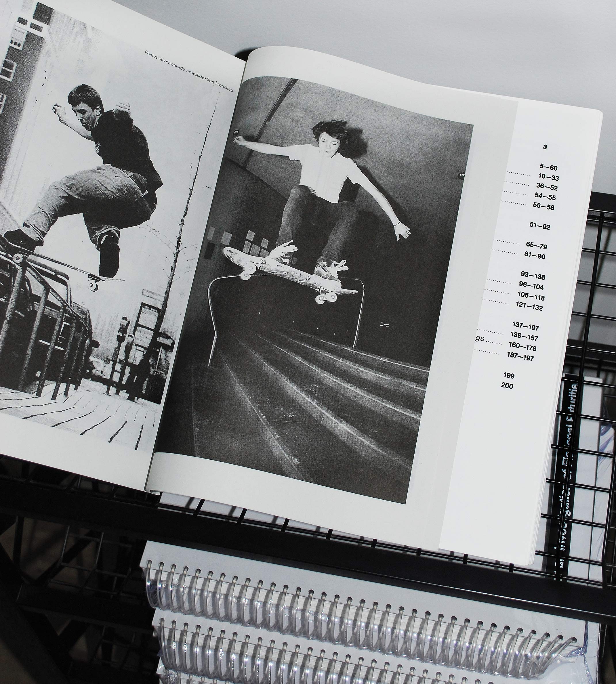
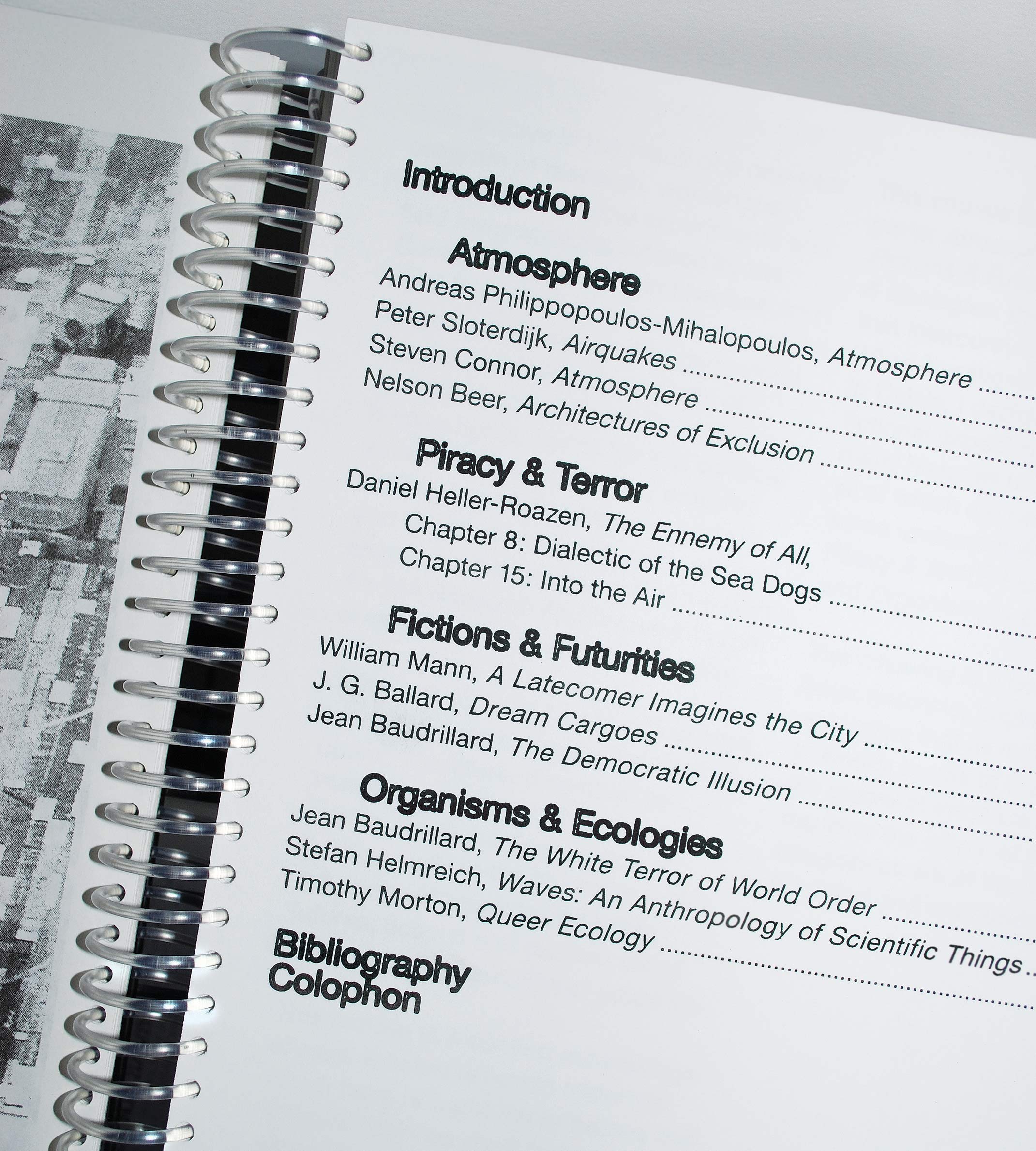
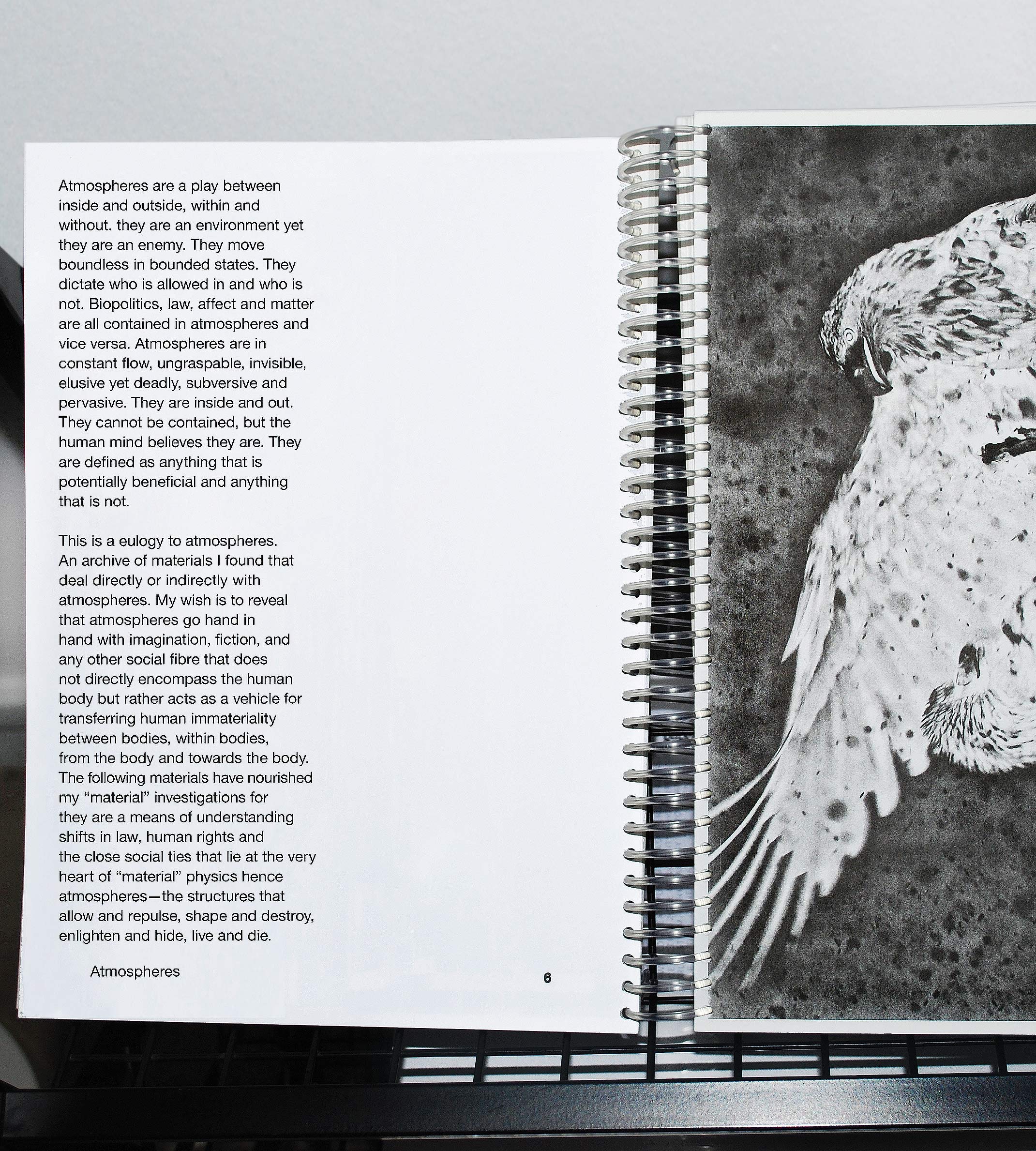
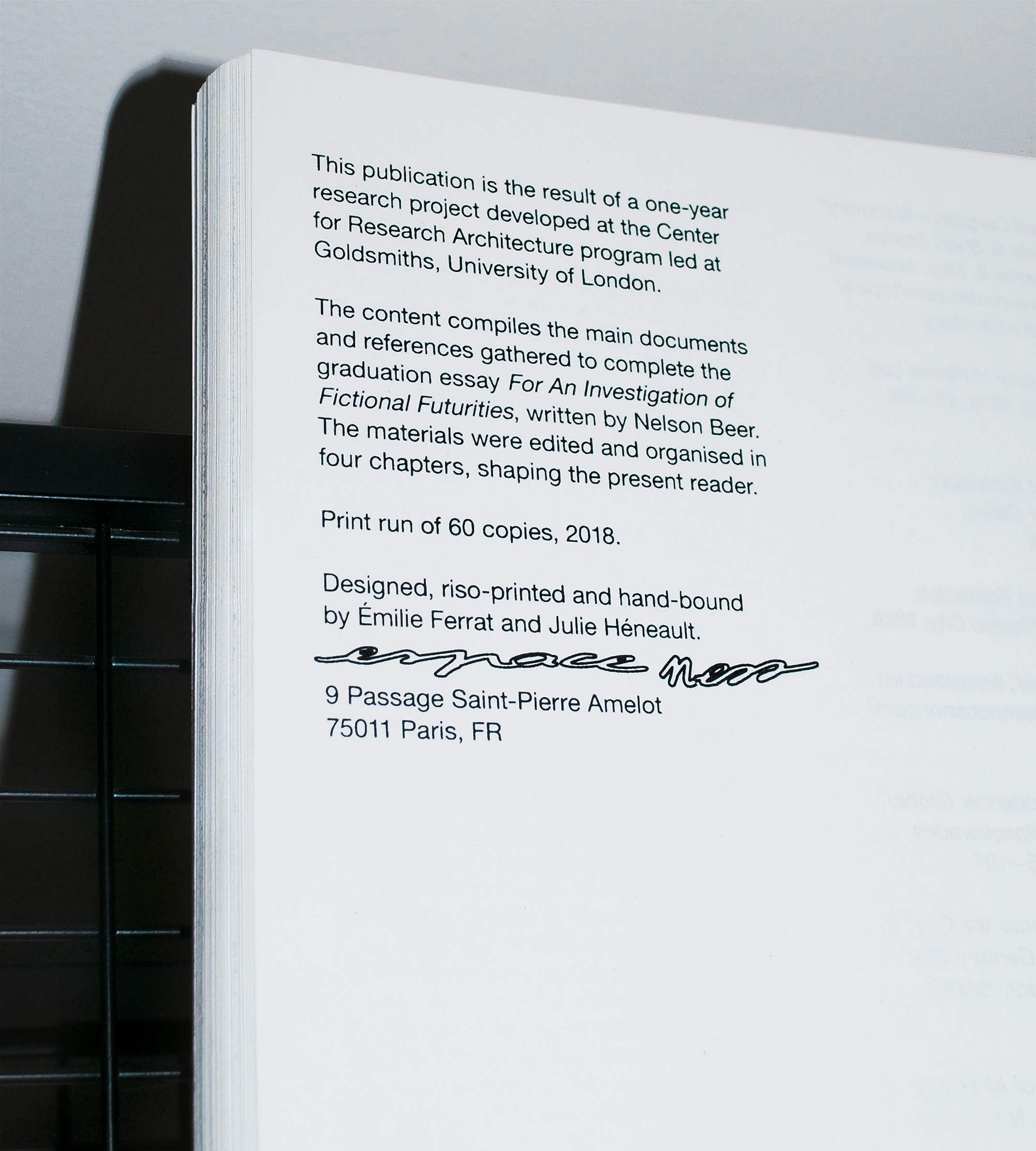
For An Investigation of Fictional Futurities. Archive edited by Nelson Beer. I.c.w Émilie Ferrat.
Black riso-printed, hand-bound, edition of 60, 200 pages, A4, 2018. order here.
This publication is the result of a one-year research project focusing on the structures and speculative narratives that emerged from the Jungle camp in Calais. Developed at the Center for Research Architecture, Goldsmiths, University of London.
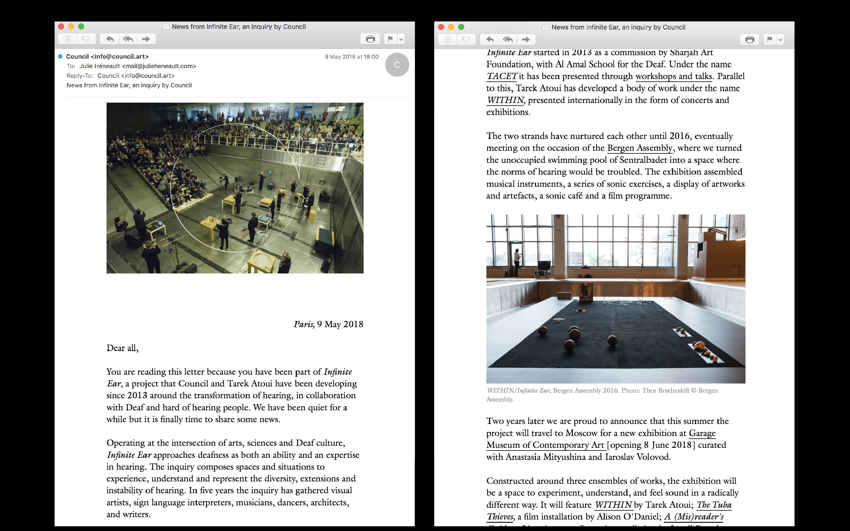
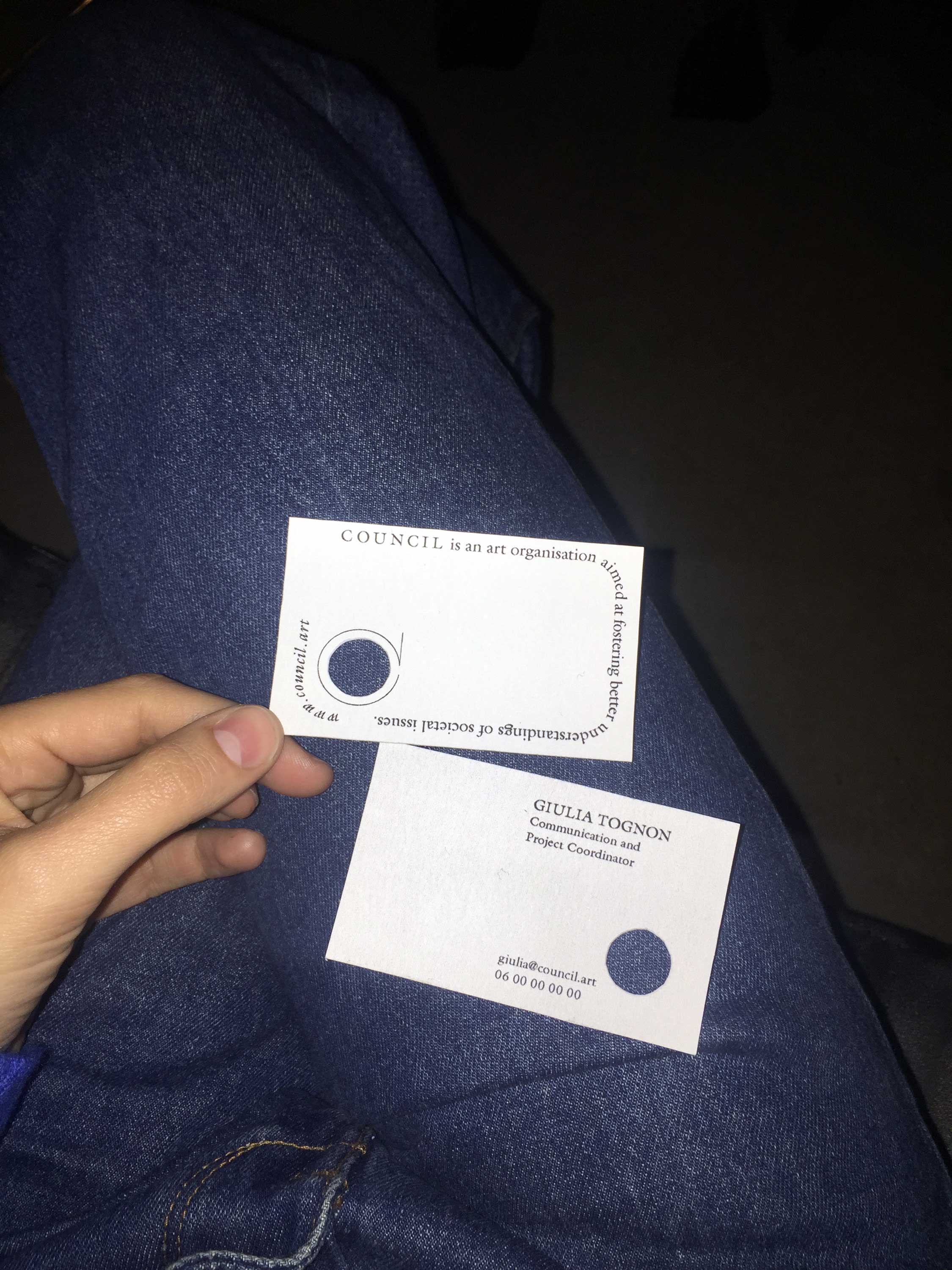
Council. Identity declination on various communication mediums. 2018, ongoing.
Harmonisation of Council's visual identity made by Remco van Bladel in order to adapt and implement it to new medias and formats such as brochures, newsletters and printed and screen templates, business cards, office supplies and social medias. Newsletter development by Paul Bernhard.
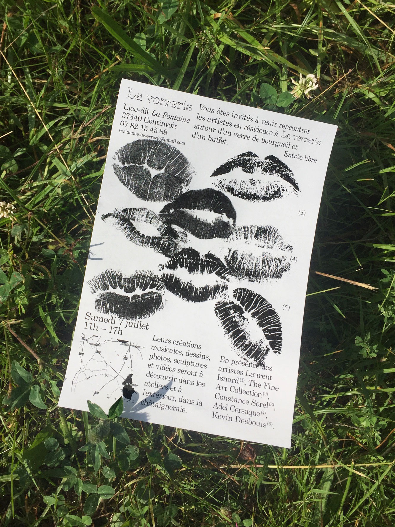
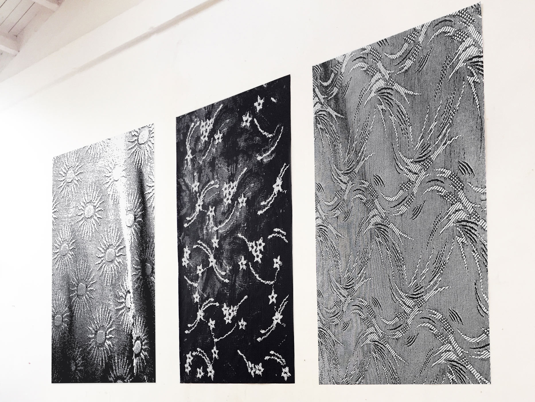
La Verrerie. Visual identity. 2017, Ongoing.
Conception and declination of the identity for the artistic summer research residency program Résidence La Verrerie.
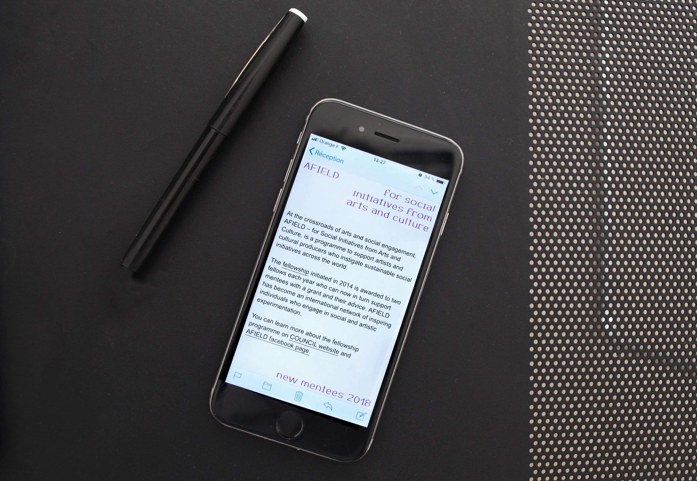
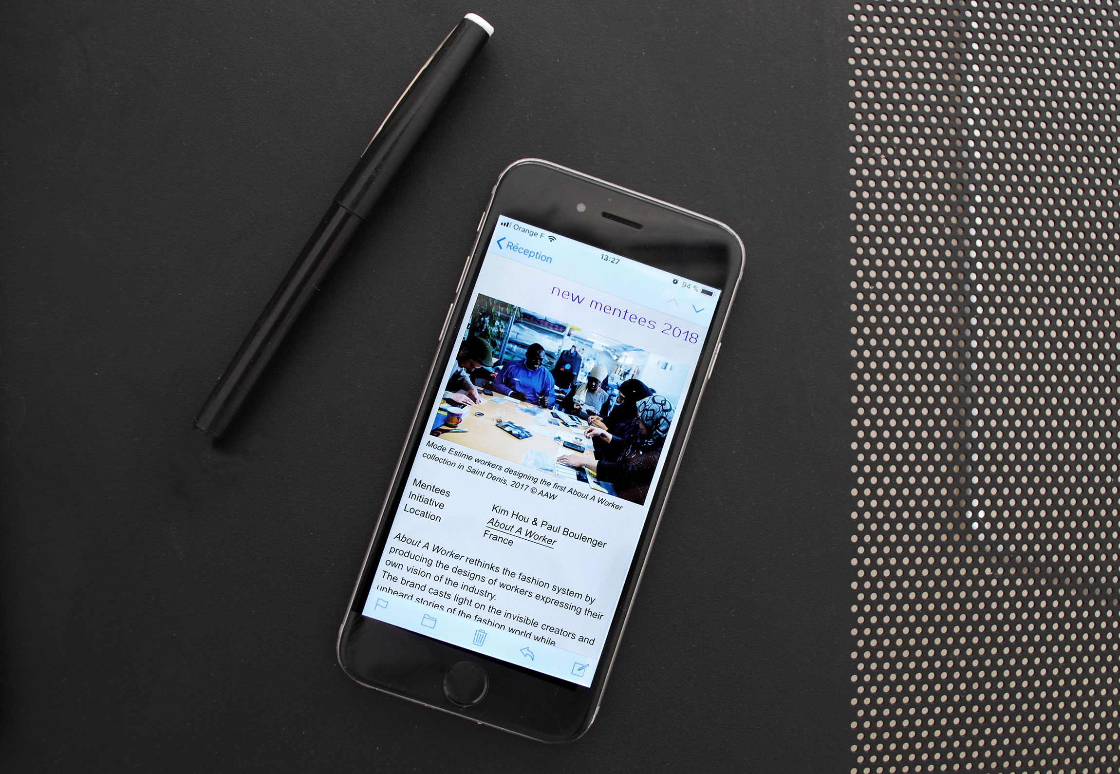
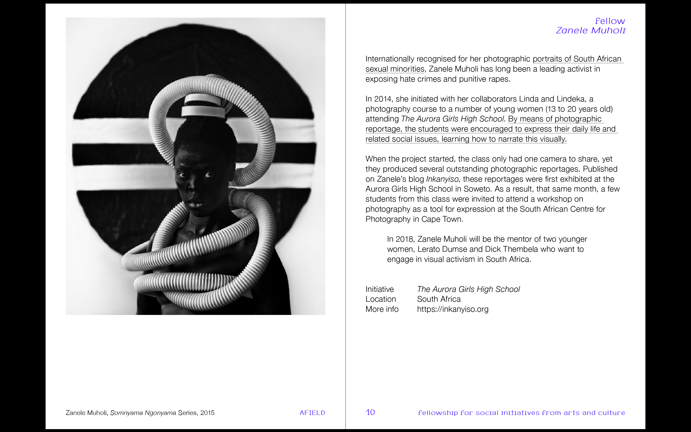
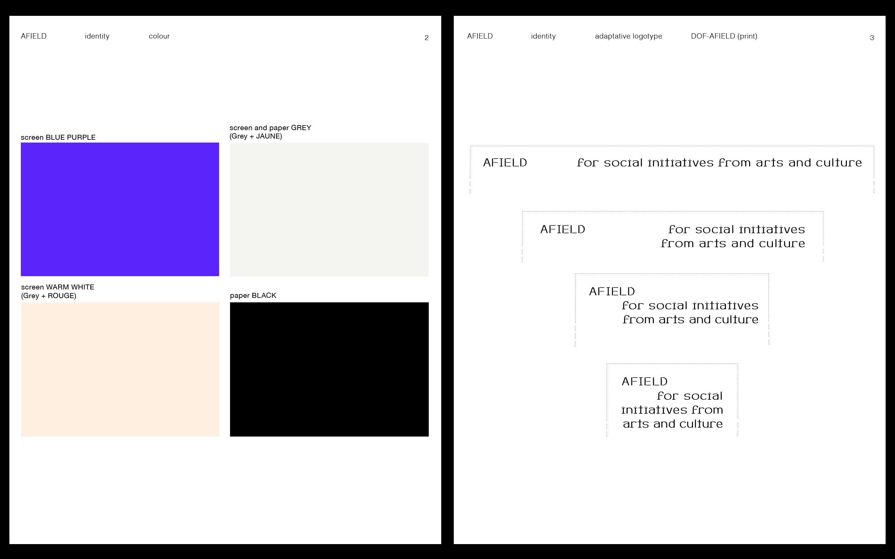
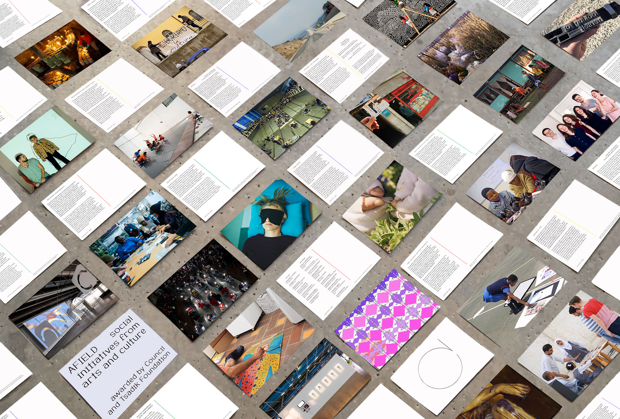
AFIELD. Visual identity. 2018, ongoing.
Visual identity for AFIELD – for social initiatives from arts and culture, an internatinal fellowship program awarded by Council and Tsadik Foundation. Typography DOF-Afield by Paul Bernhard made using Metafont.
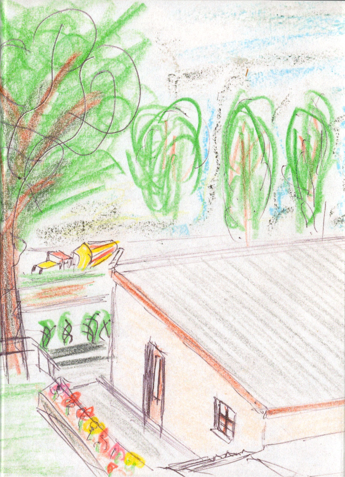
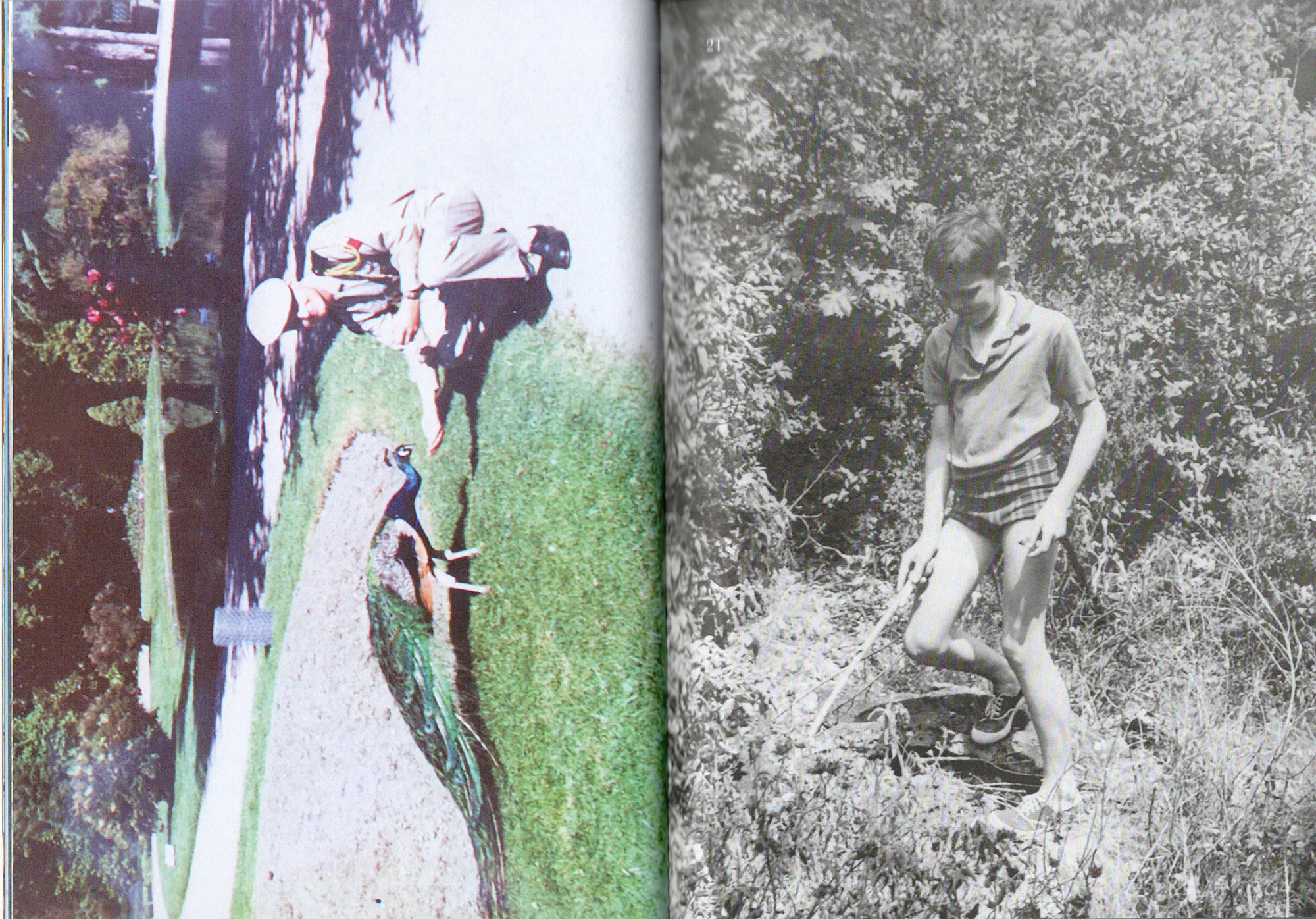
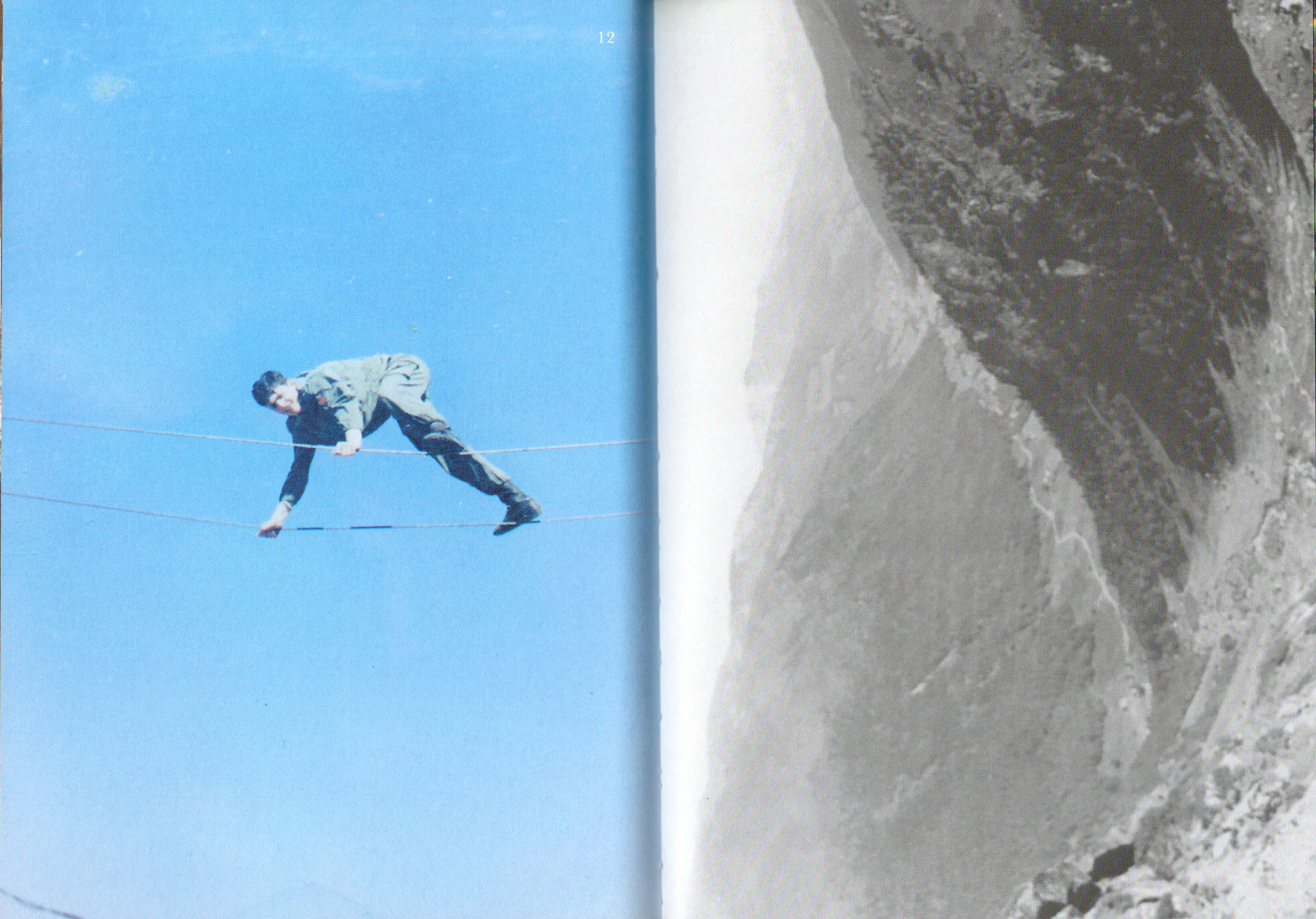
Papi de la Montagne. Personal Project. Indigo digital offset, edition of 40, 196 pages, 13cm x 18cm, 2017.
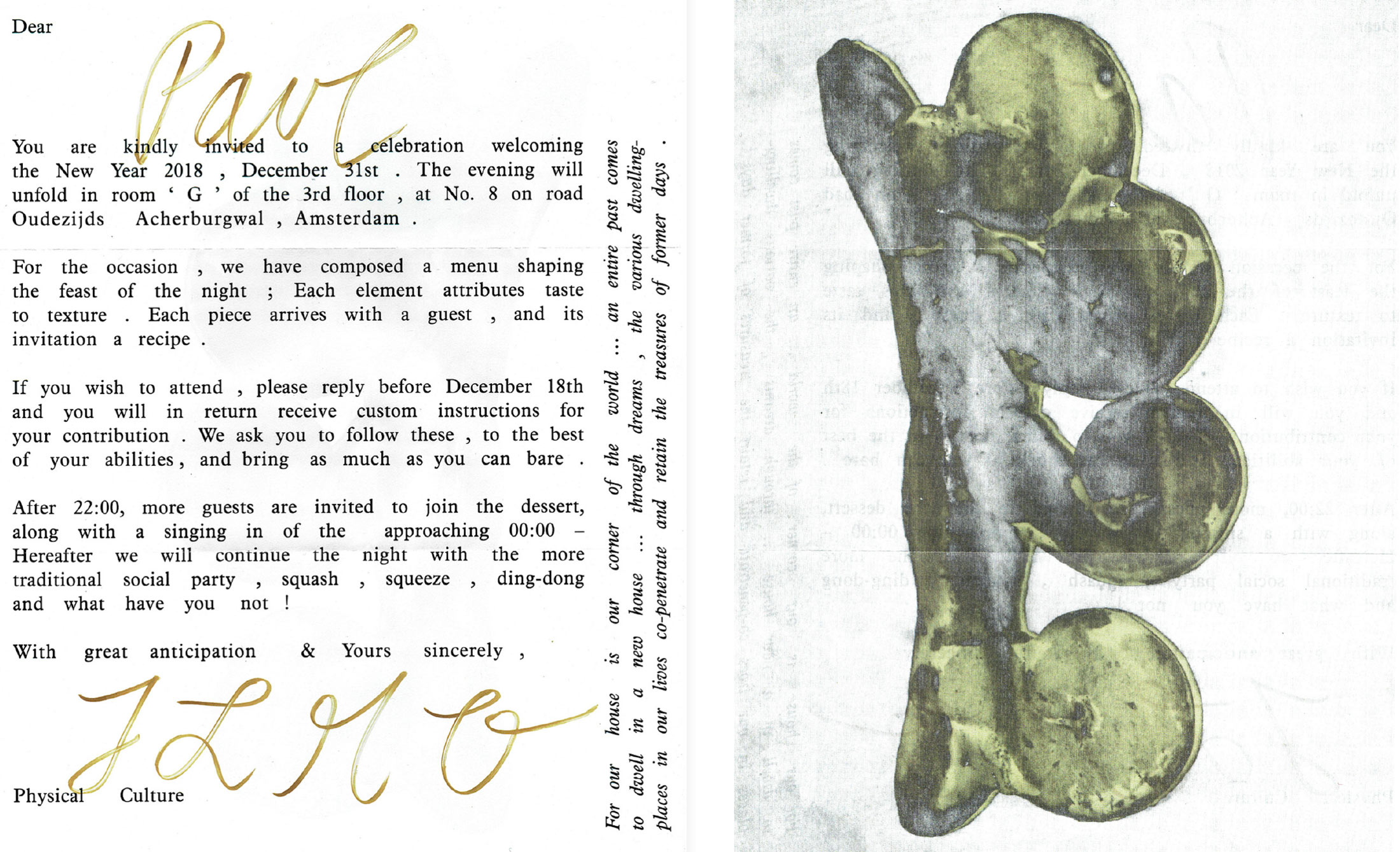
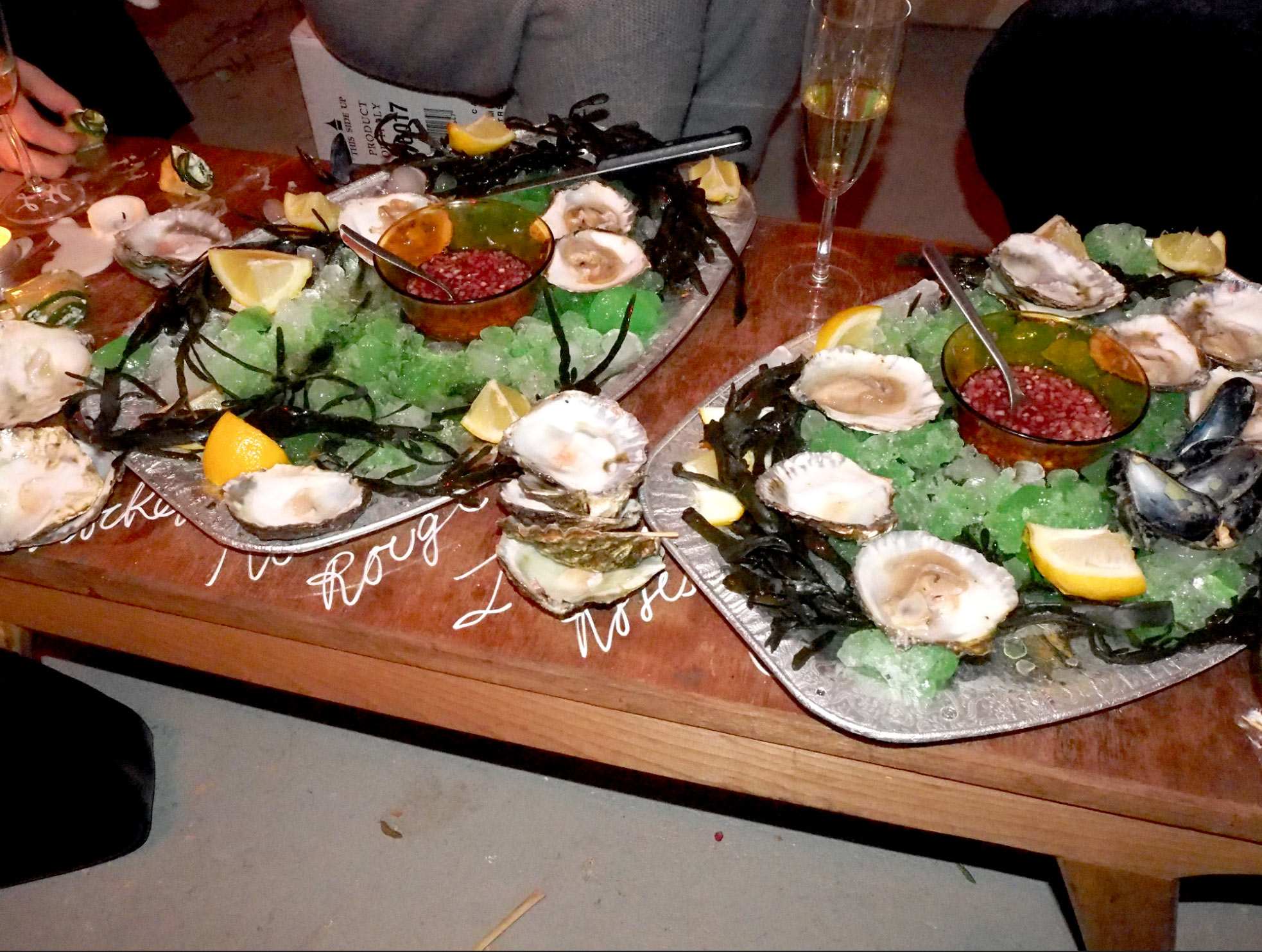
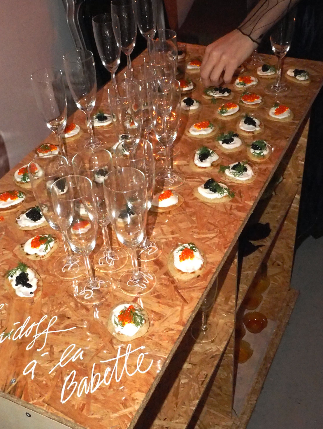
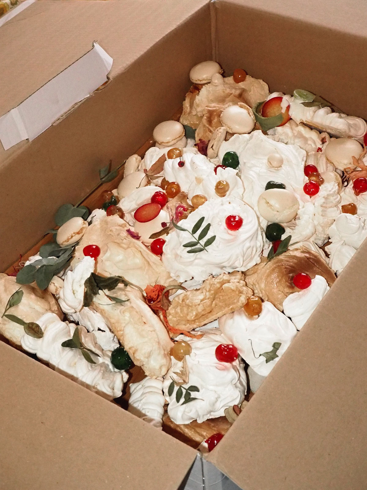
Re: Invitation. With Physical Culture. Event for New Year’s eve 2017.
Composition of a menu where every guest was attributed with a piece of the feast to prepare, a task to do and/or object to bring.
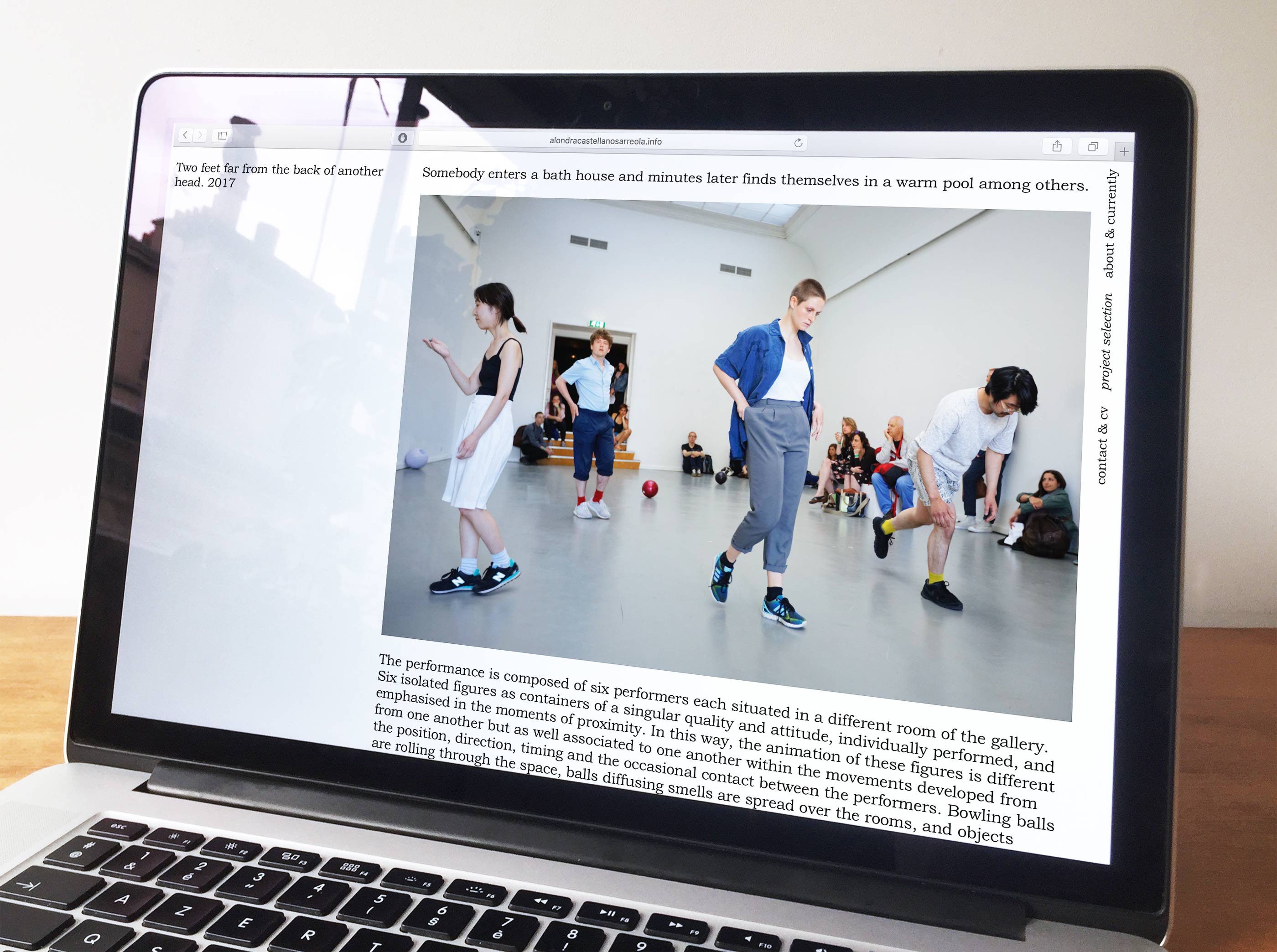
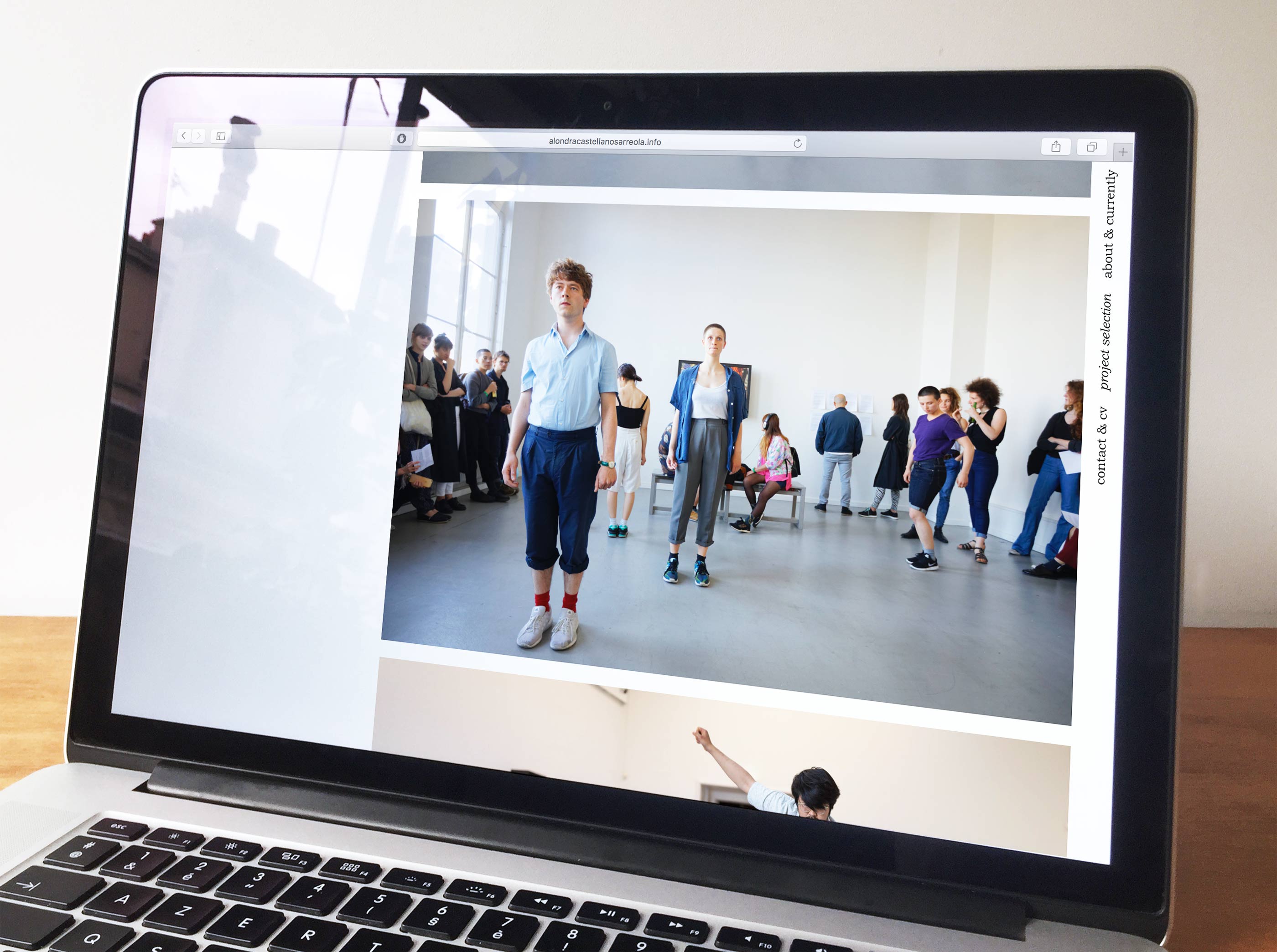
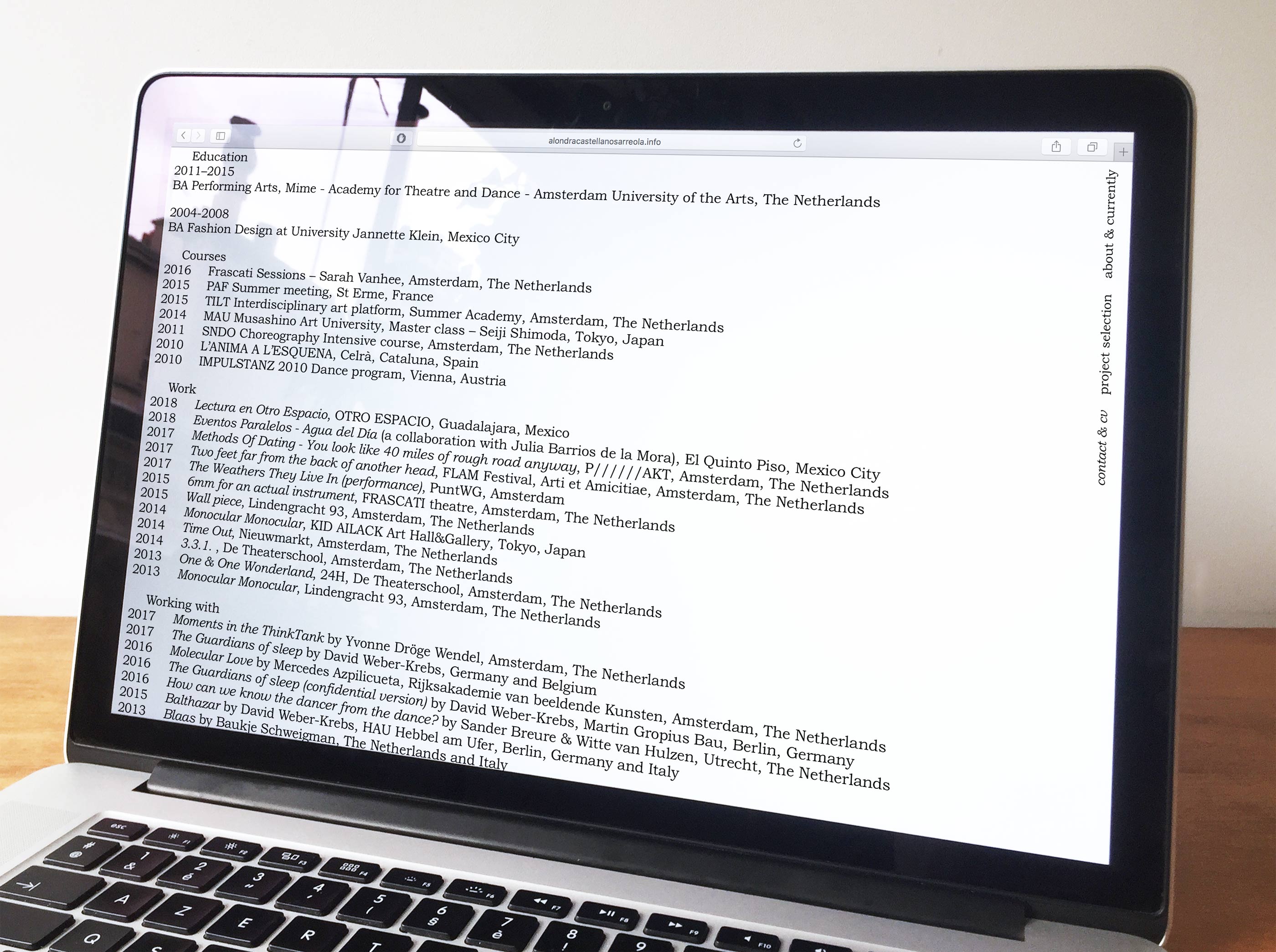
Alondra Castellanos Arreola's portfolio website with fully editable back-end using Kirby. 2017.
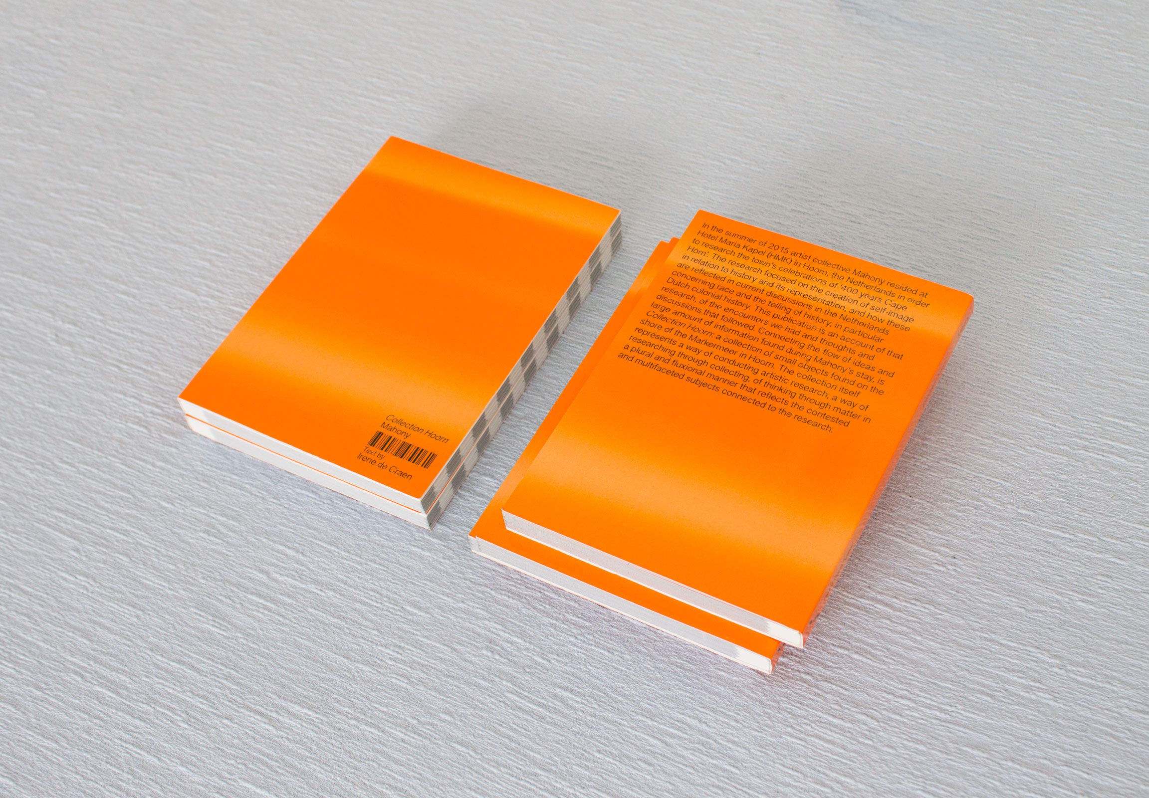
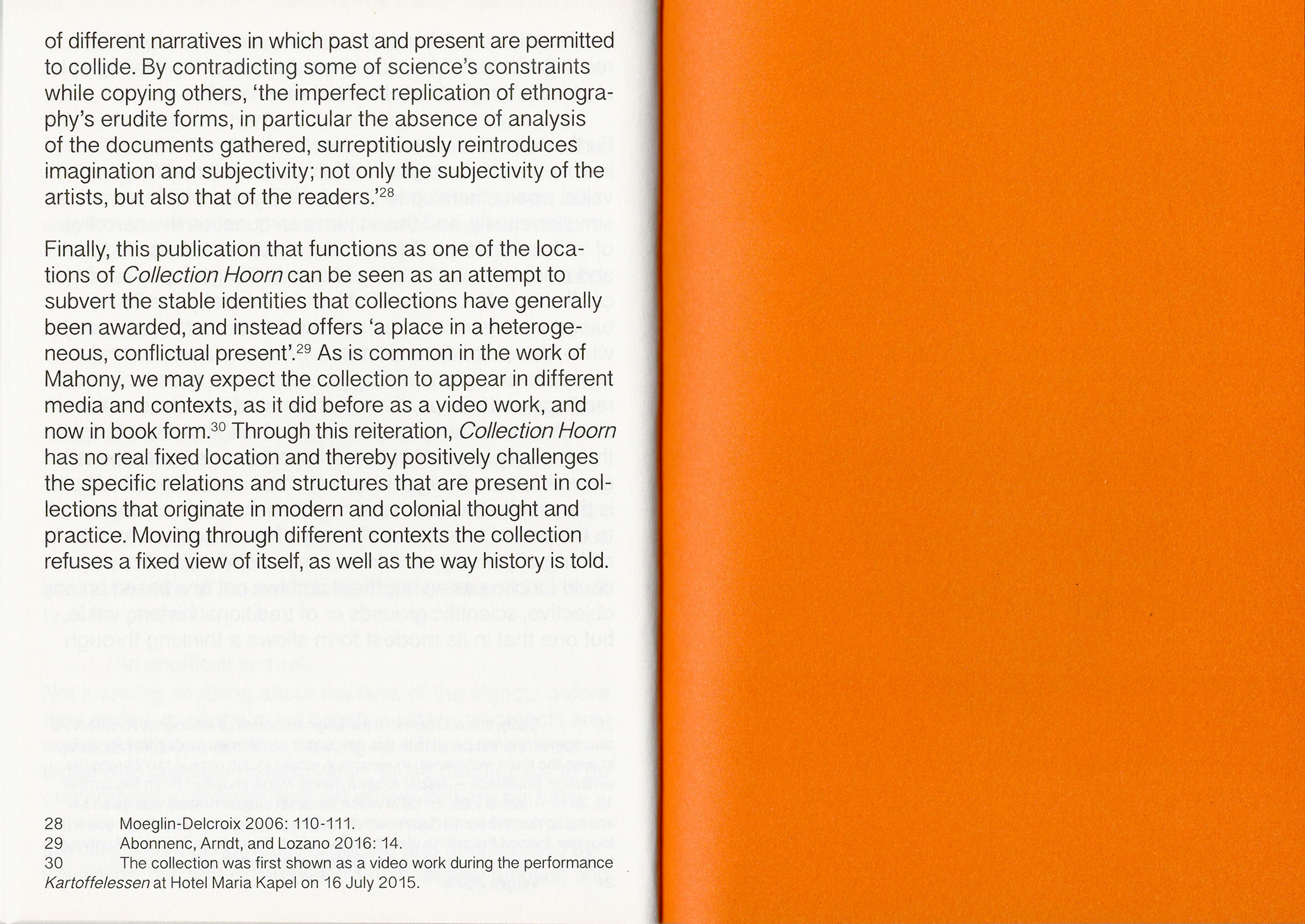
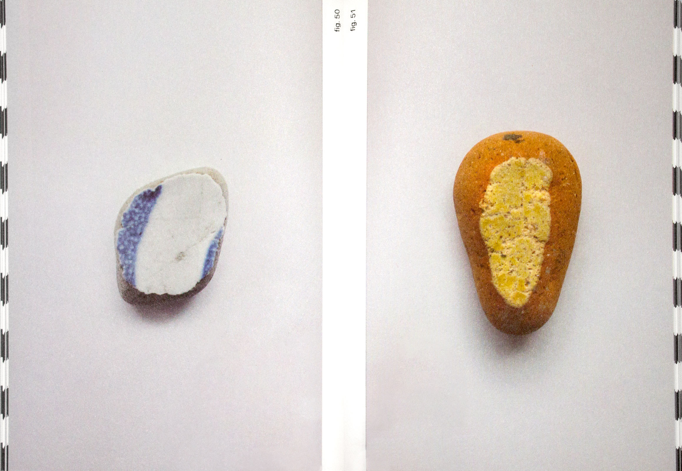
Collection Hoorn. Book design. Offset, edition of 300, 128 pages, 12cm x 16.5cm, 2017.
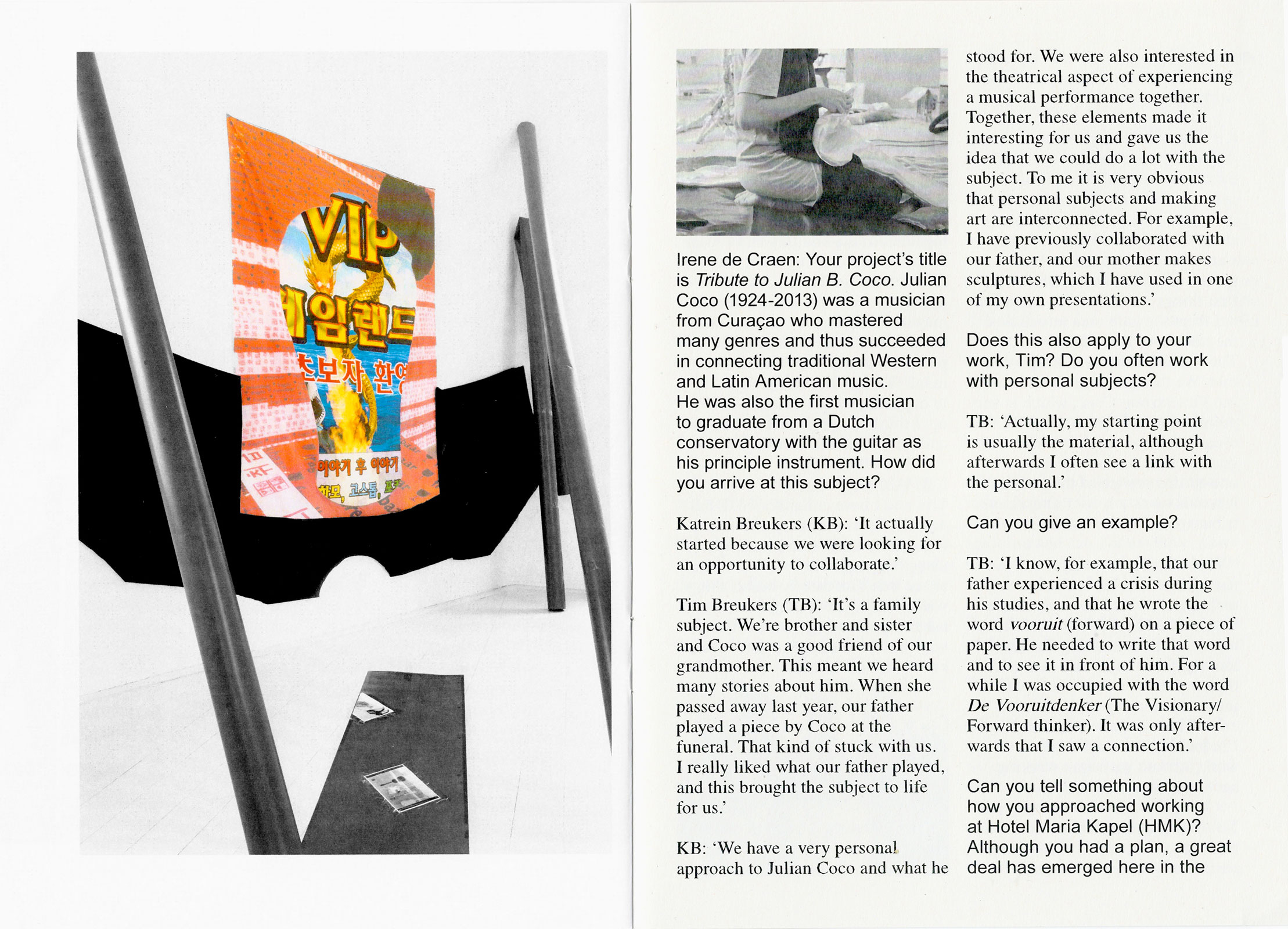
Publication for artist collective Mahony with a text by Irene de Craen, after their residency at Hotel Maria Kapel. In the summer of 2015 artist collective Mahony resided at Hotel Maria Kapel (HMK) in Hoorn, the Netherlands in order to research the town’s celebrations of ‘400 years Cape Horn’. The research focused on the creation of self-image in relation to history and its representation, and how these are reflected in current discussions in the Netherlands concerning race and the telling of history, in particular Dutch colonial history. This publication is an account of that research. Images by Mahony and text by Irene de Craen. Order here.
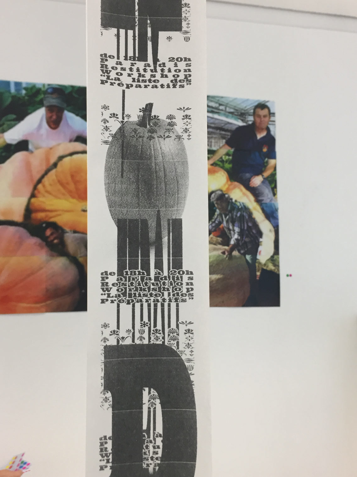
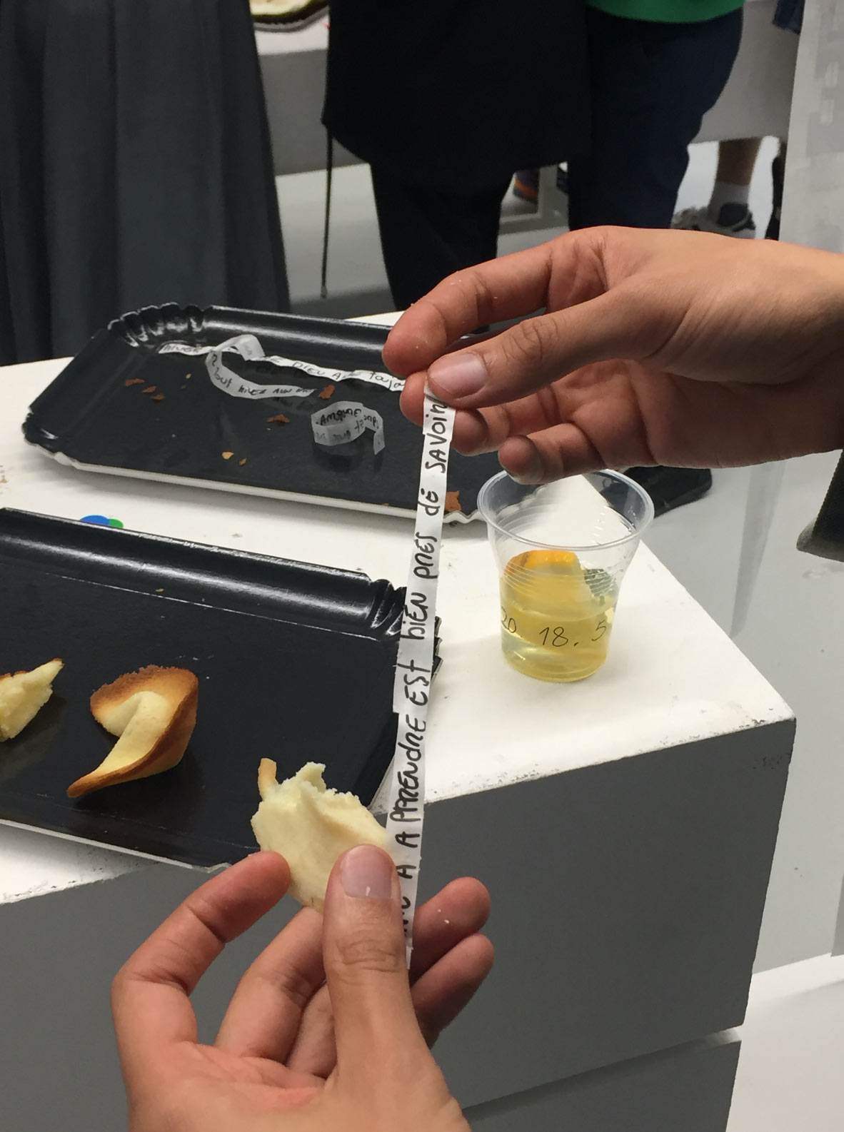
La liste des préparatifs. Workshop at the ISBA, by invitation of Thomas Bizarri. With Physical Culture. October 2017.
Written, visual and spatial experiments around the theme of the list, leading to a publication and an event.
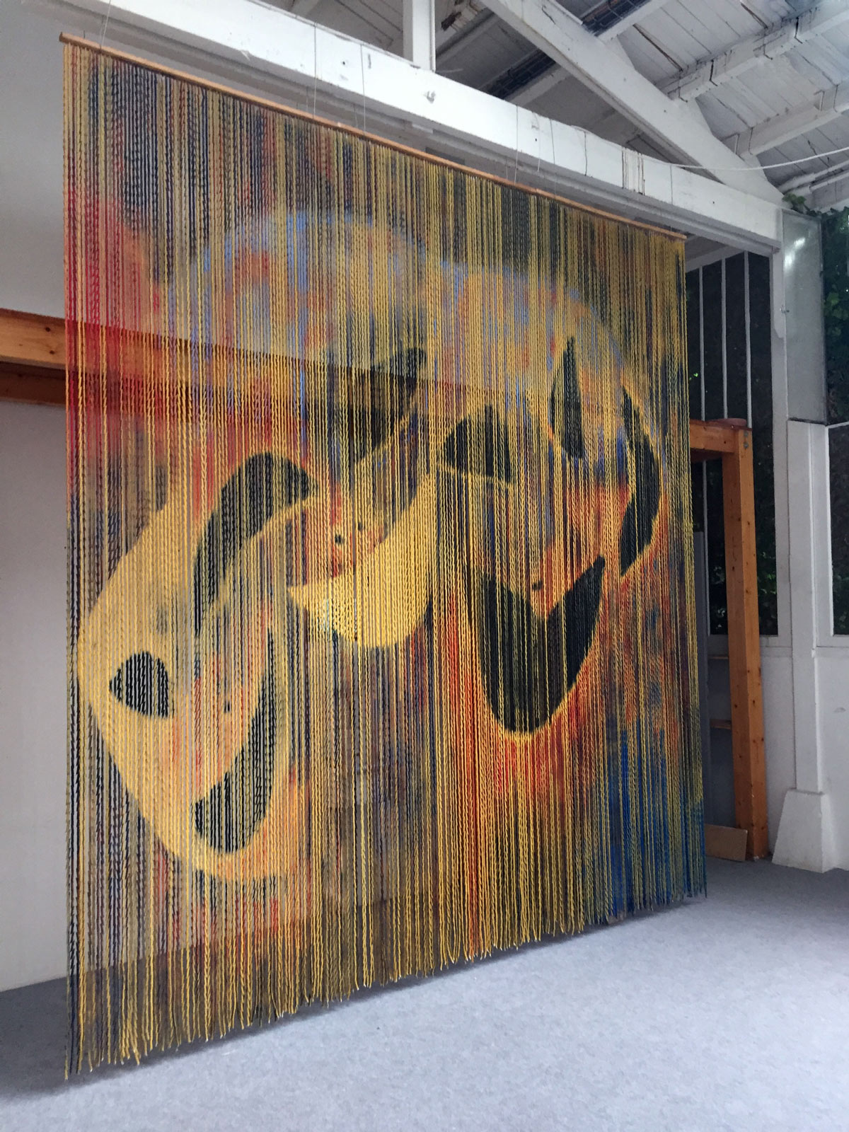
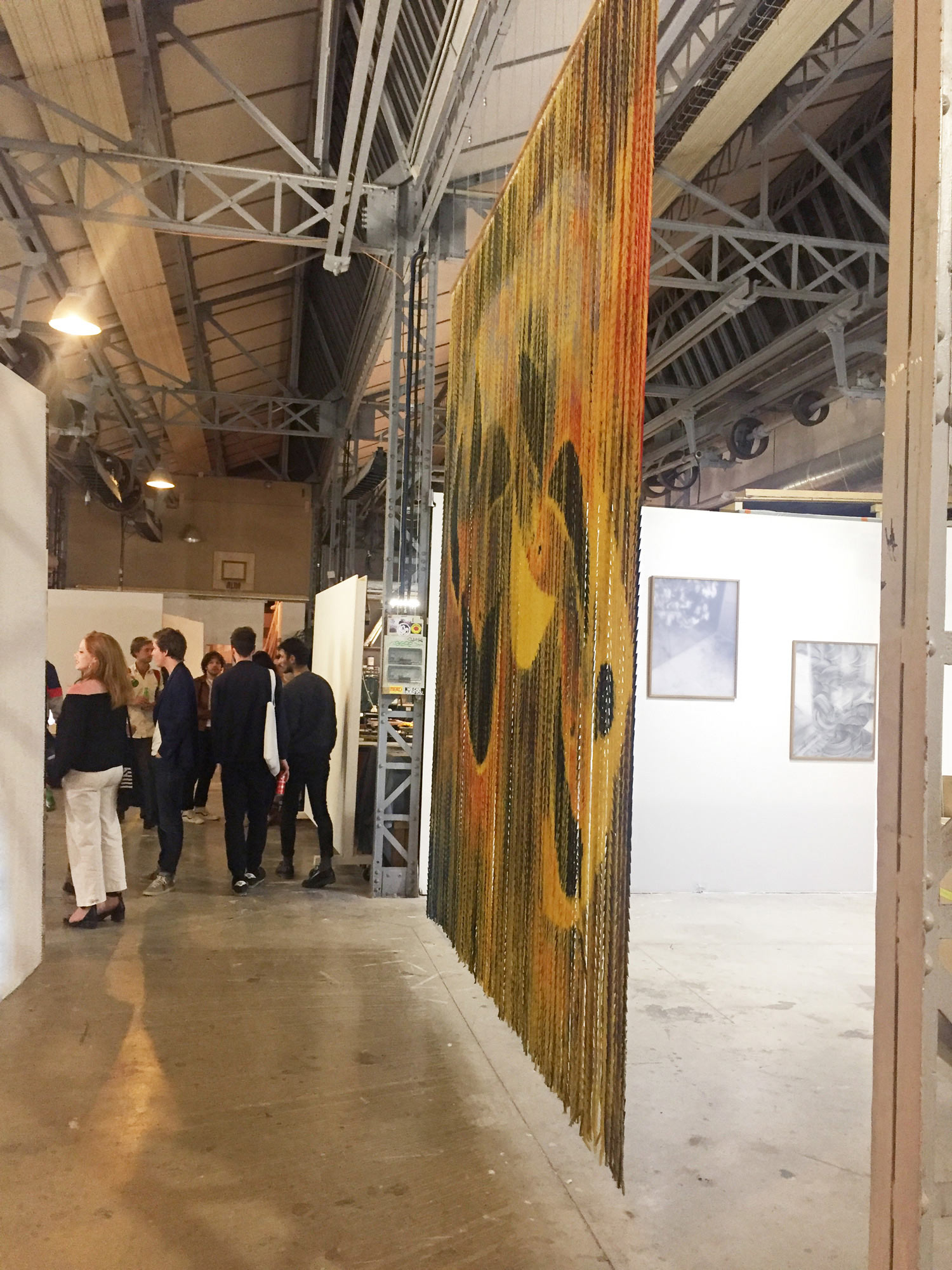
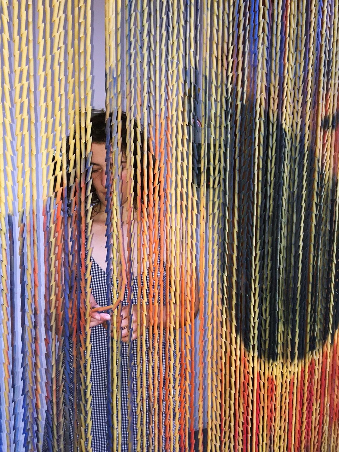
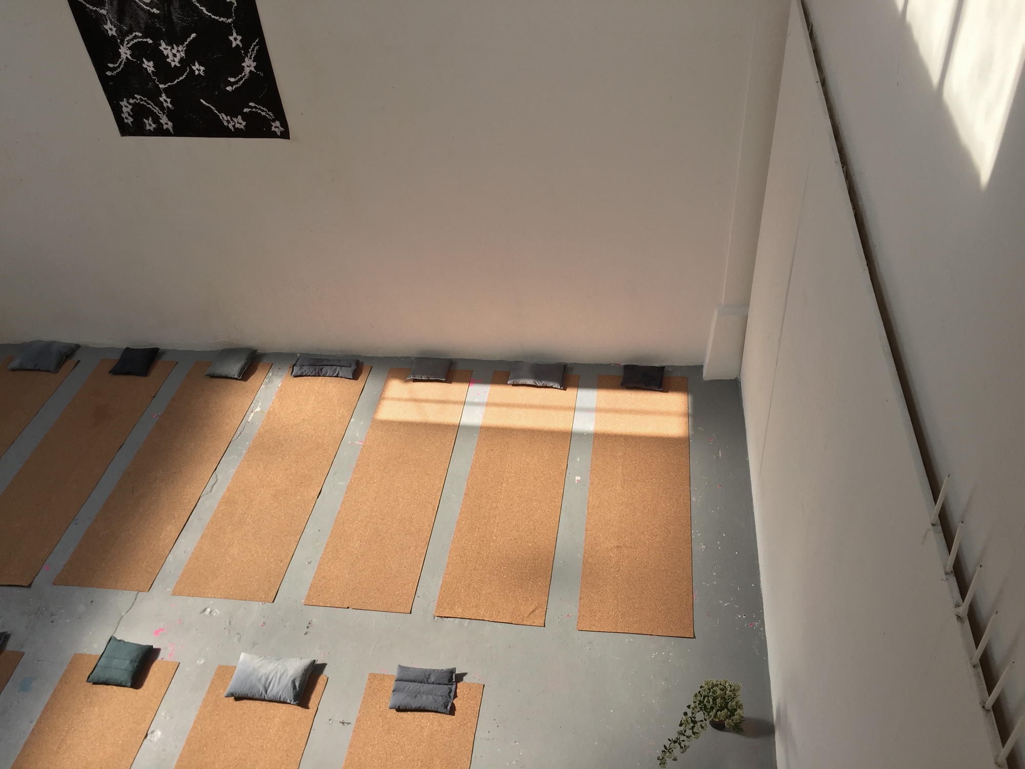
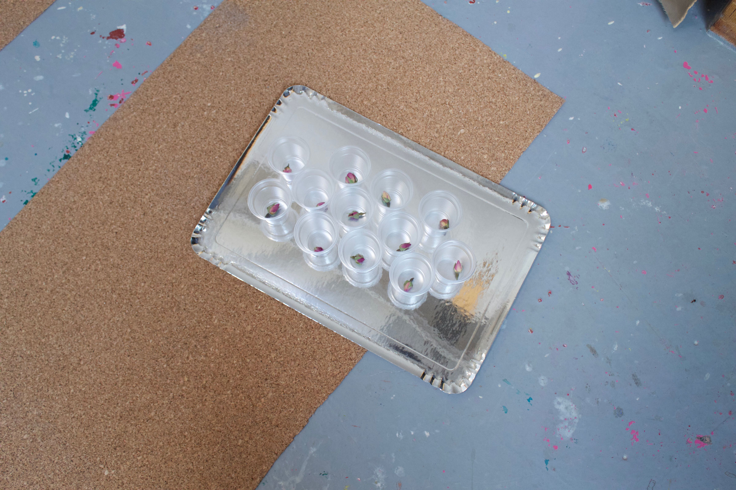
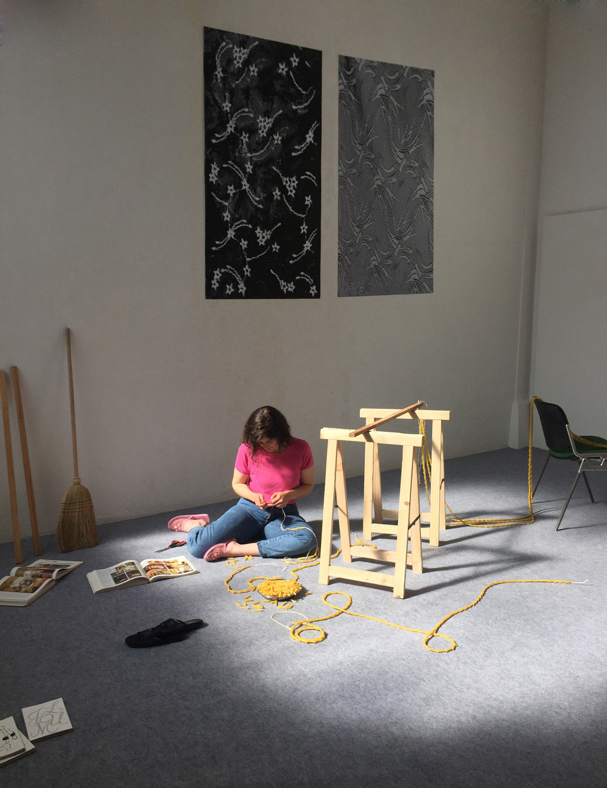
“Plans Change, That’s What Happens” (Le Rideau). With Physical Culture. Sprayed penne pastas, ropes and wood beams. 3m60 x 3m. Spring 2017.
Le Rideau was produced during a residency at Villa Belleville. The beaded pasta curtain is a testimony of our time and labour in the room. The piece resonates with the verticality of the space and functions as a constantly moving image, stretched and deformed by the coming and going of people. The curtain served as a backdrop for poetry reading, a décor for a bar, and a dividing wall for an exhibition space.
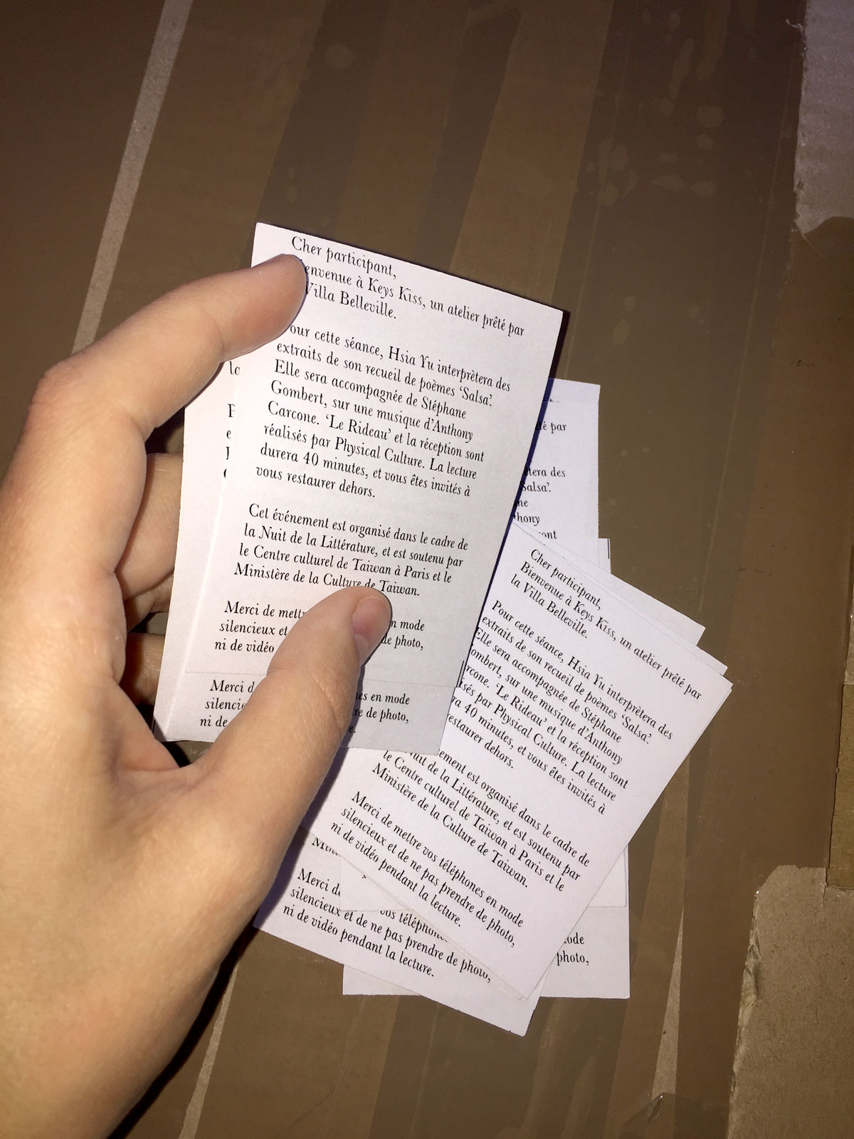
Keys Kiss. Space and program of sensorial experimentations. Atelier in the Villa Belleville and lent by the city of Paris. With Physical Culture. April and May 2017.
With presentations by Camille Doiseau, Louise Moins, Margaux Parillaud, Paul Bernhard, Line-Gry Hørup, Ursula Marcussen, sophrologist Julia Bortot, and poetess Hsia Yu.
Hotel Maria Kapel, residency, exhibition and cinema space. Declination of Identity. Posters, flyers, social medias. 2016–2017.
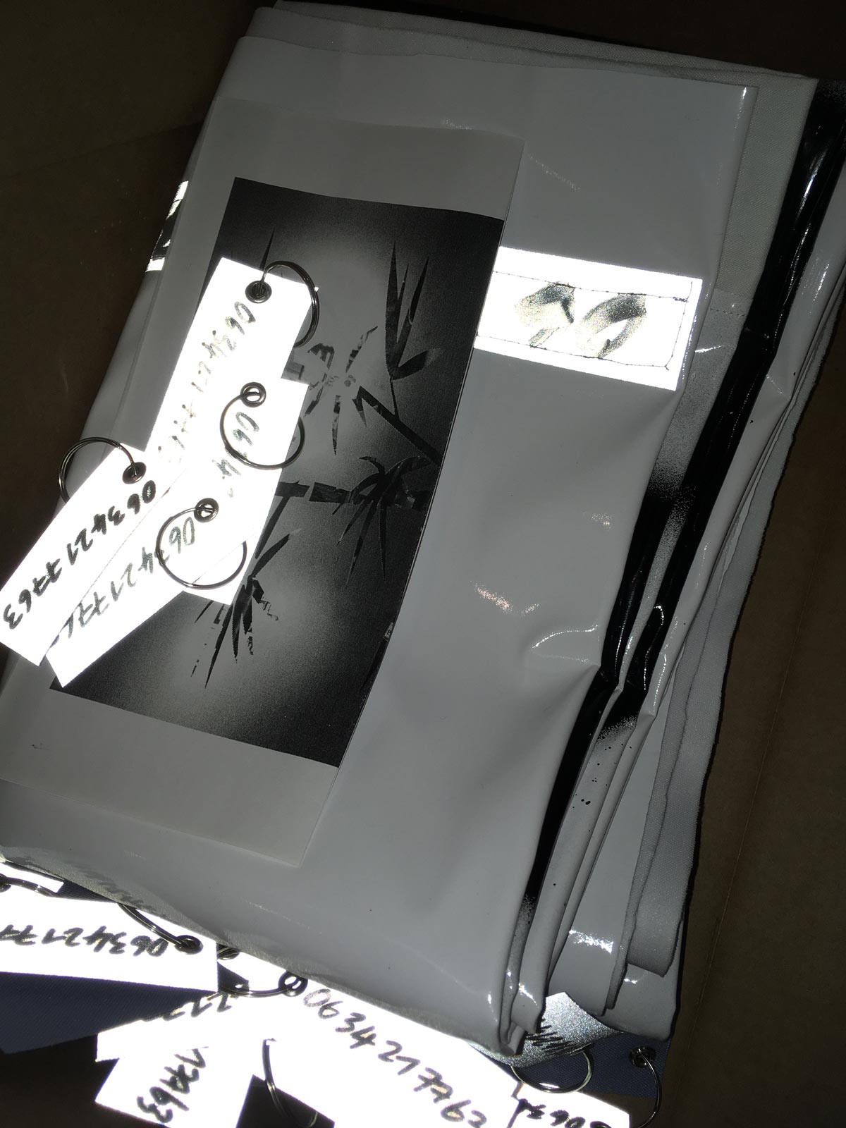
Daisy0634217763. Outdoor textile installation, conceptual goodies and sound piece. 2017.
I.c.w Raoul Audouin and Paul Bernhard. Farewell piece presented during the exhibition Maxi Hard Lounge Discount 5K, at PC artspace, Annecy, FR.
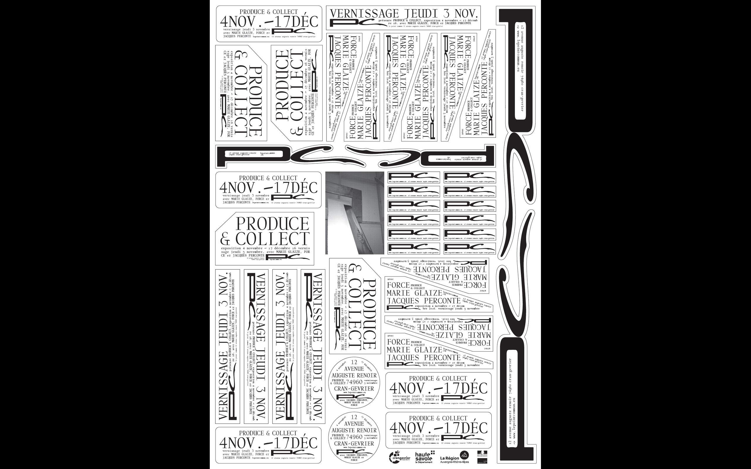
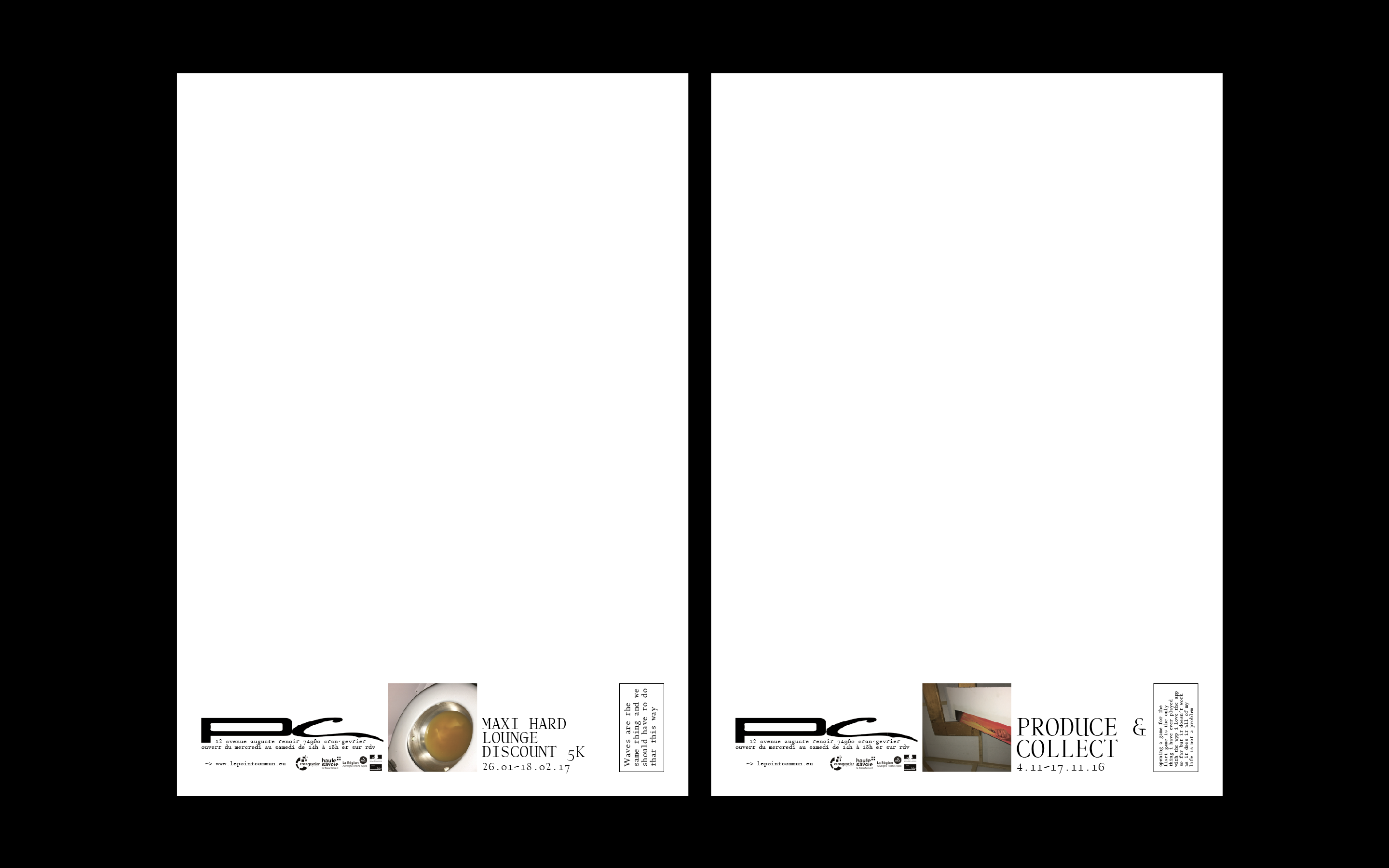
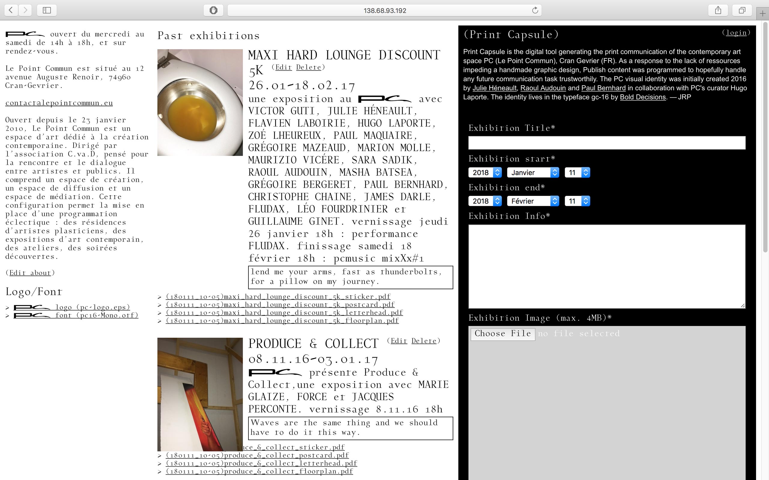
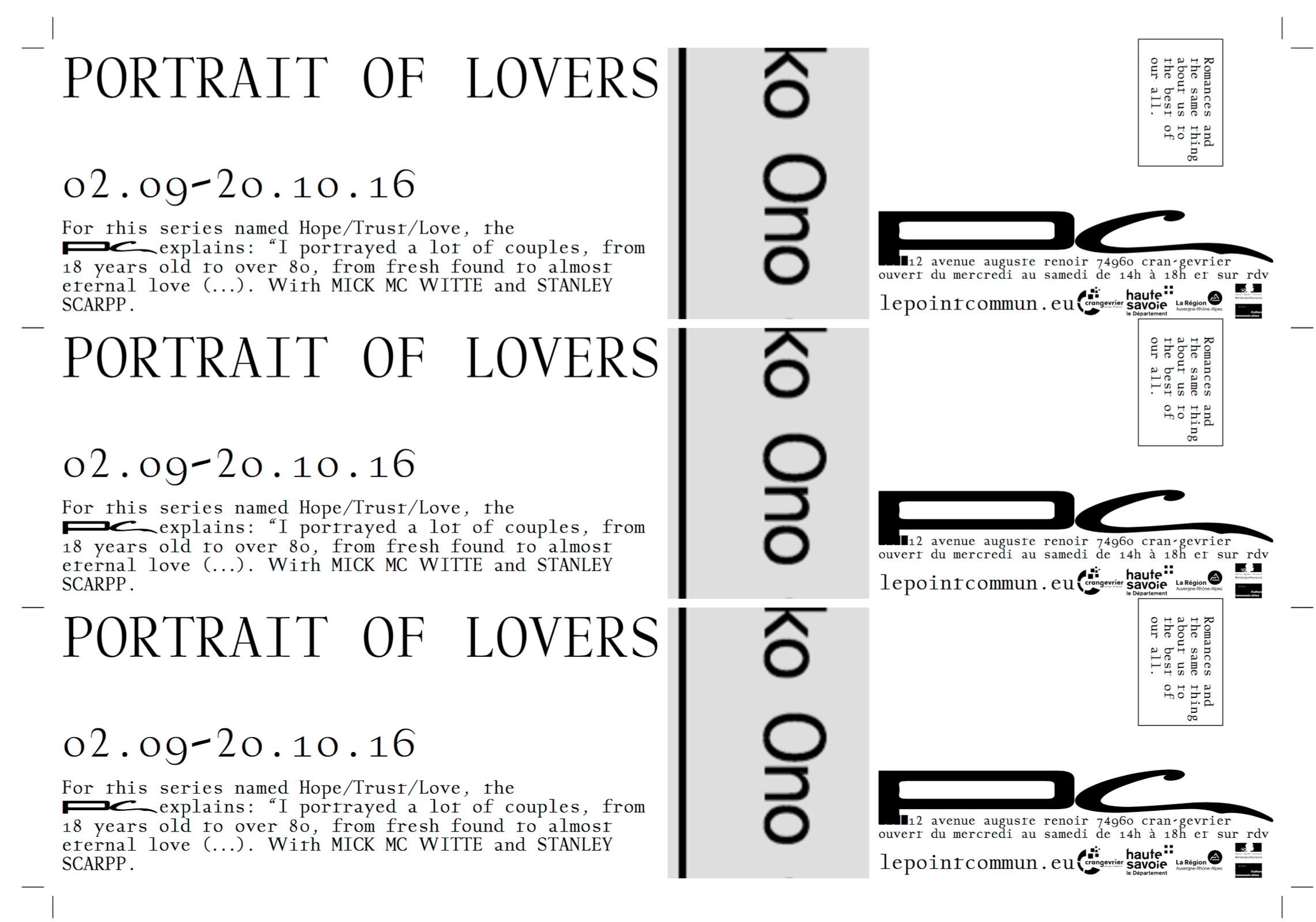
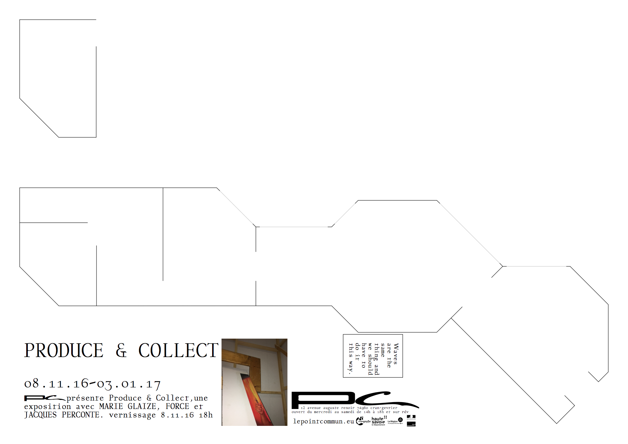
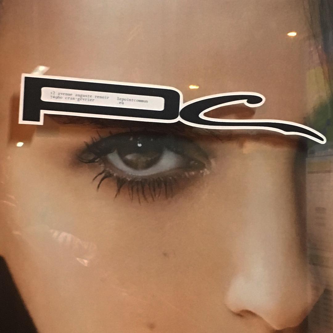
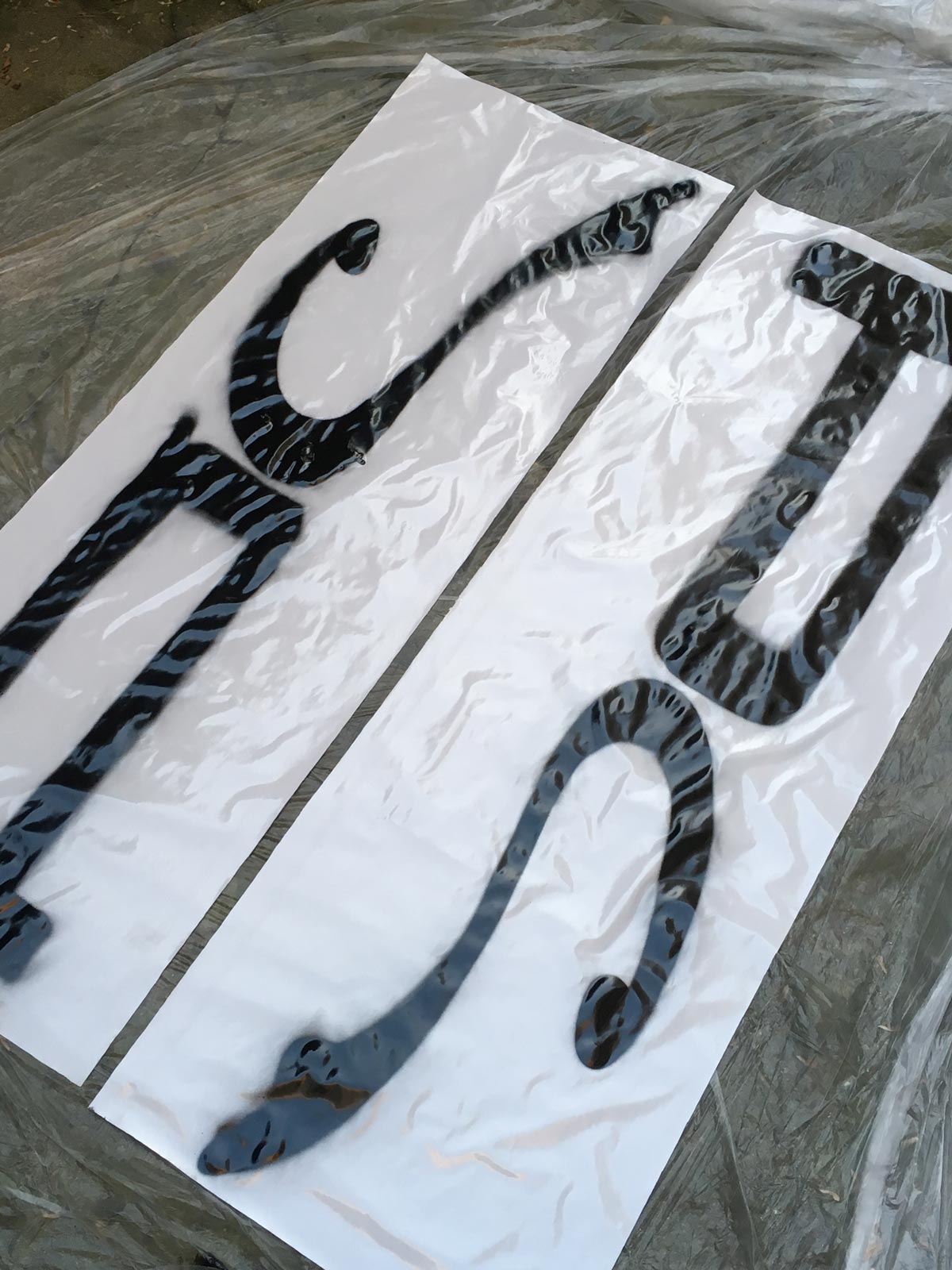
PC, espace d'art contemporain. Identity.
Visual identity made i.c.w Raoul Audouin and Paul Bernhard. Typography G16 by Bold Decisions. The identity is centred around a monogram logotype and a strong typeface. For each exhibition a visual is picked by the curator. As a response to the lack of ressource, the printed campaigns are generated thanks to the print capsule.
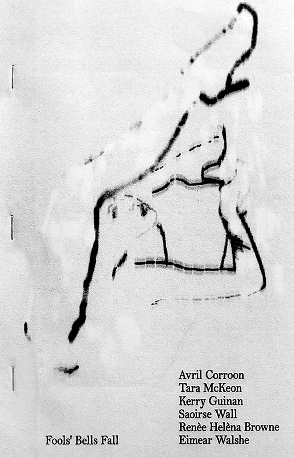

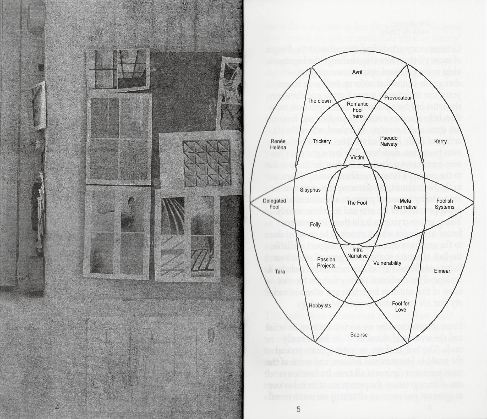
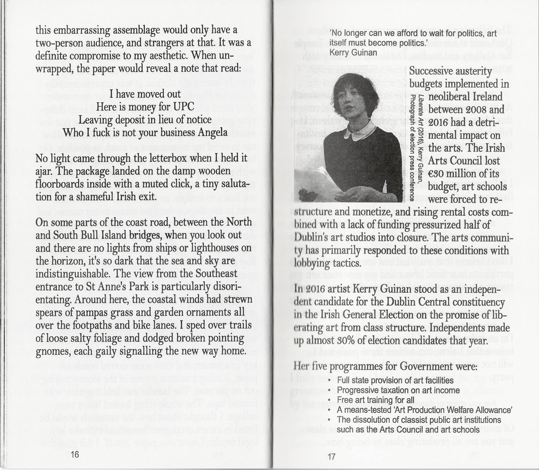
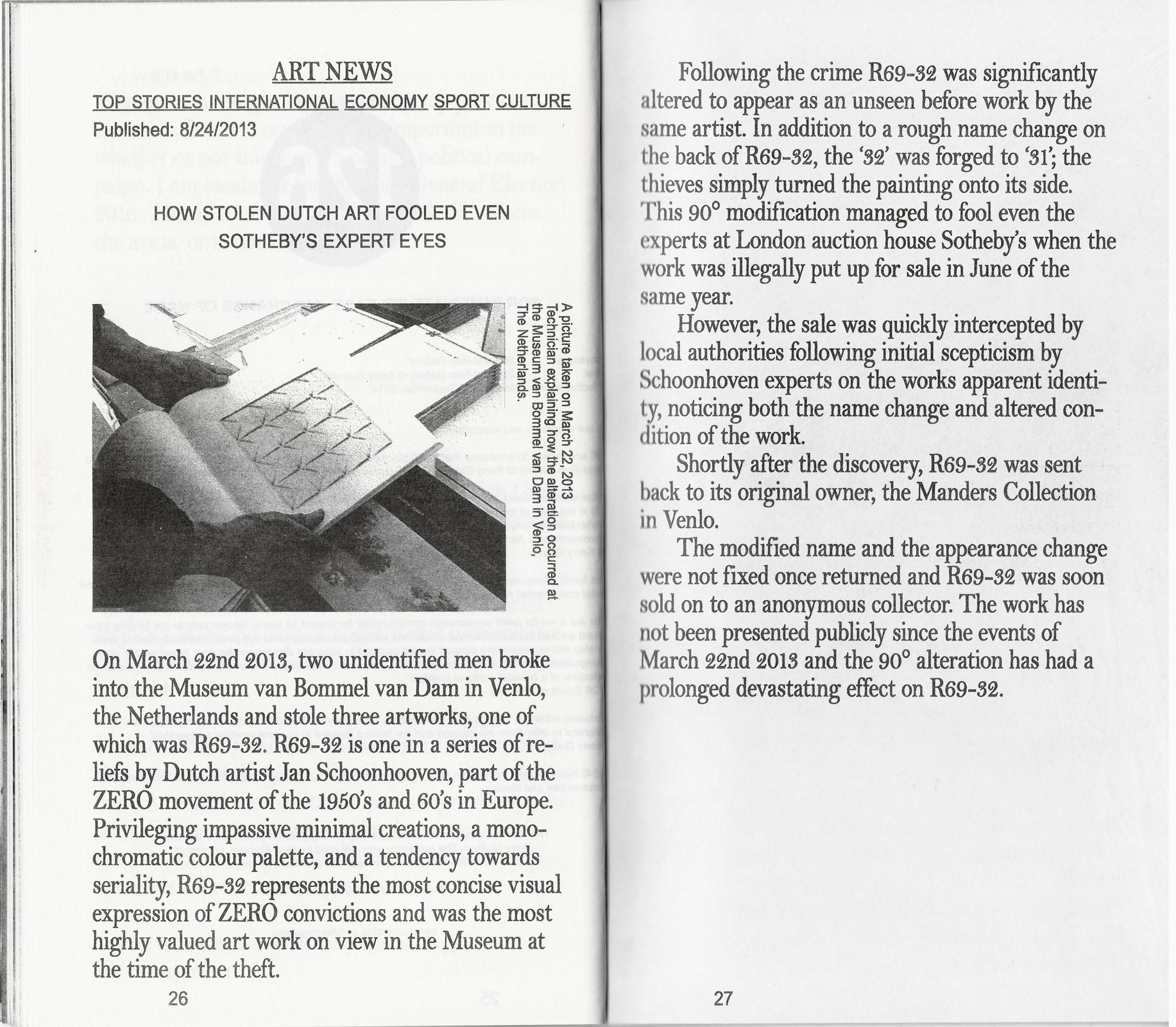
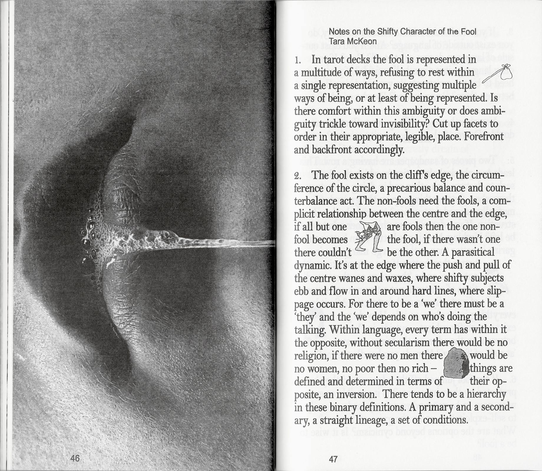
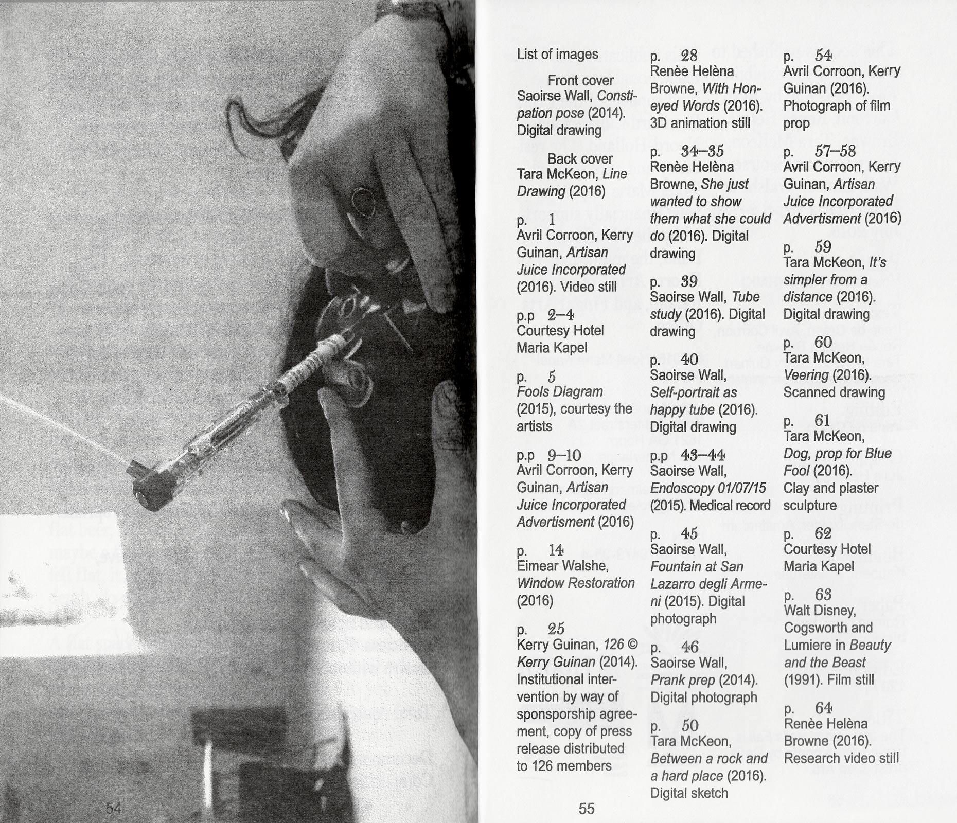
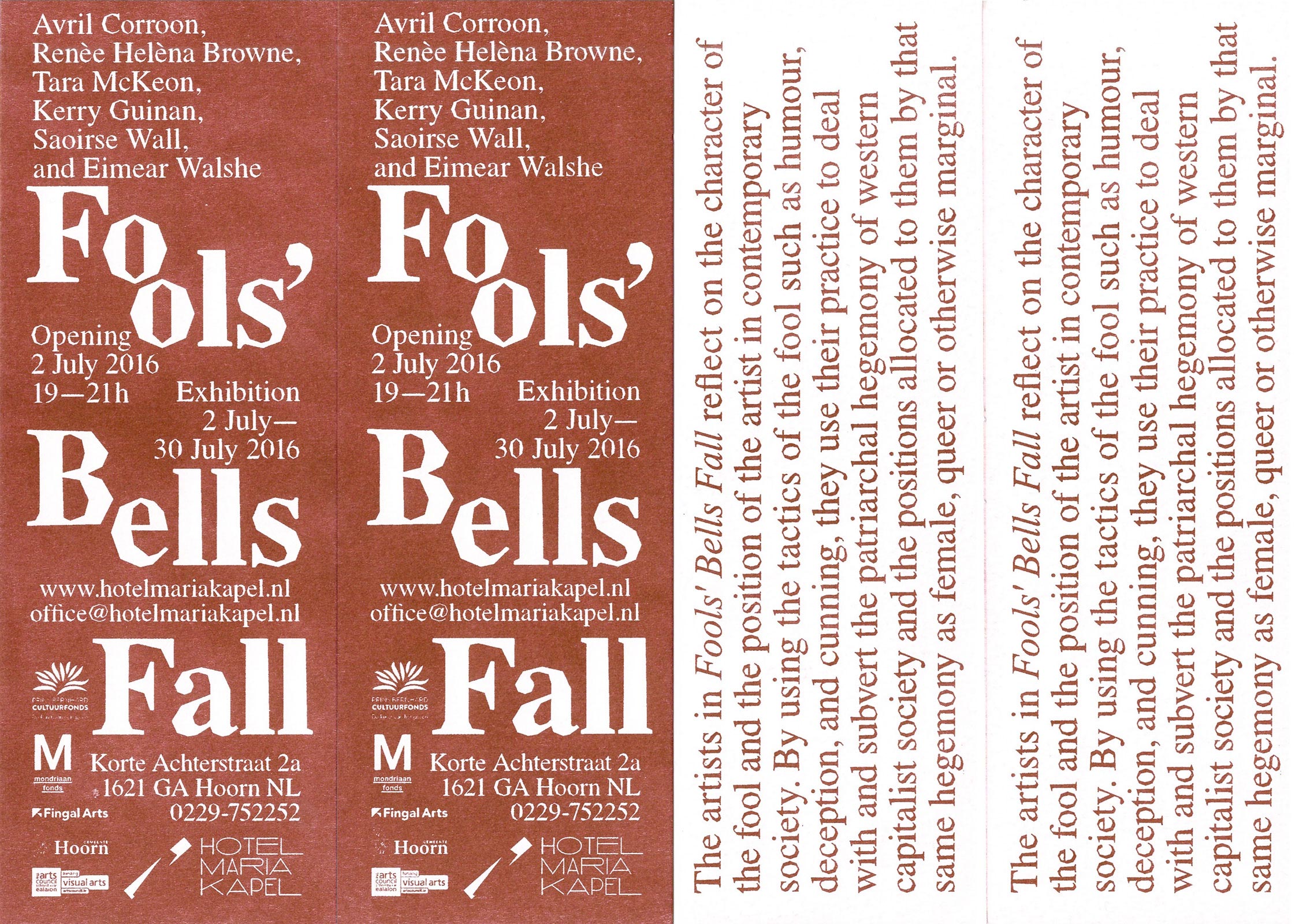
Fool’s Bells Fall. Publication. Risography, edition of 150, 64 pages, 17cm x 27cm. 2016.
Publication accompanying the exhibition Fool's Bells Fall at Hotel Maria Kapel. Texts and images by Avril Corroon, Renèe Helèna Browne, Tara McKeon, Kerry Guinan, Saoirse Wall, Eimear Walshe and introduction by Irene de Craen.
Vitrines also die. Scenography made for and i.c.w Lisa Sudhibhasilp. Graduation Show, Gerrit Rietveld Academie. July 6, 2016 – July 10, 2016.
Glued pages on the outside walls of the installation creating links between the objects displayed and their captions. To each item corresponds a page, a number, and a text selected or written by the artist.
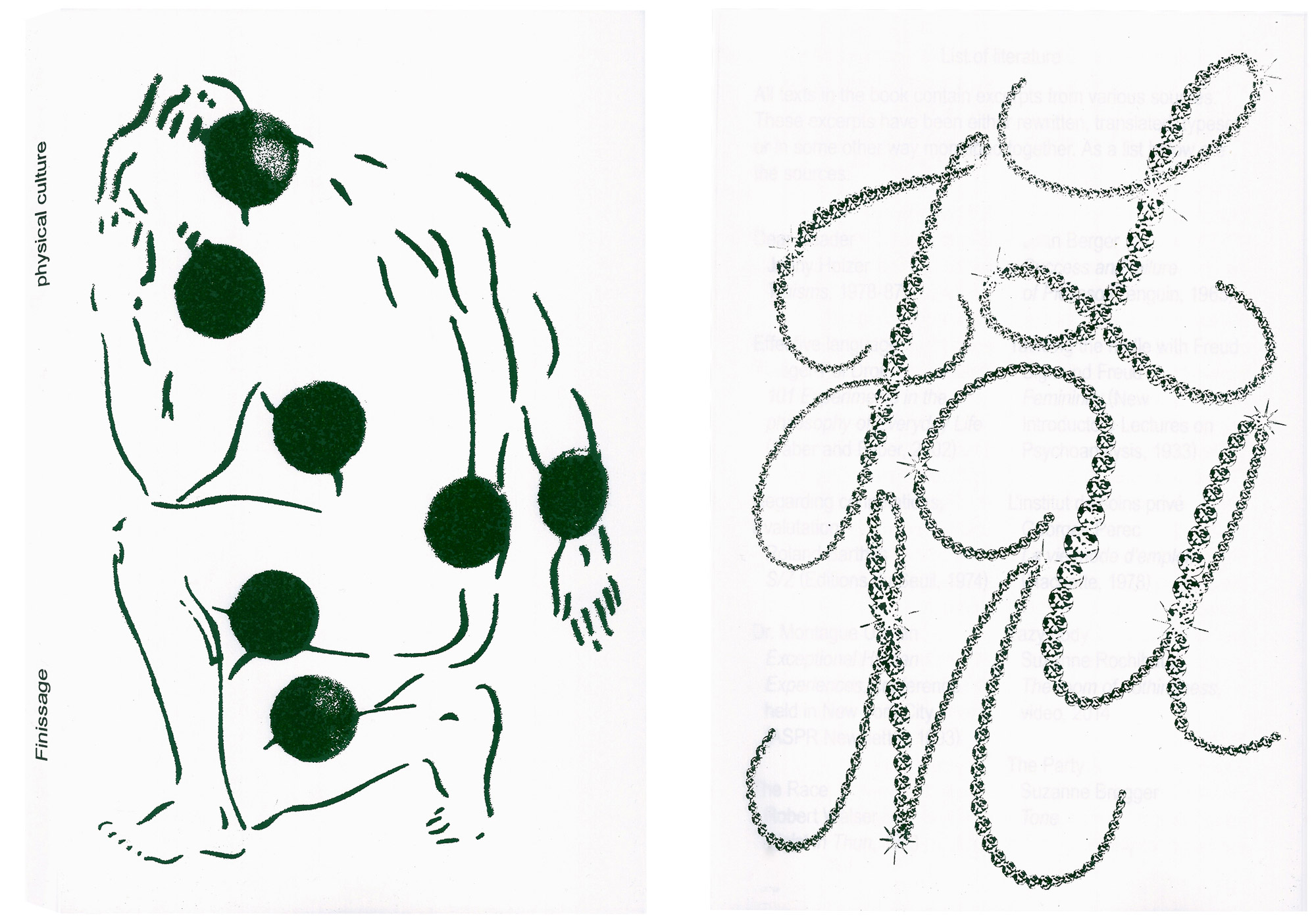
Finissage. Book. Offset printed and silkscreened cover, edition of 250. 128 pages, 13.5cm x 20.5cm, 2016. With Physical Culture. With contributions from Paul Bernhard, Raoul Audouin, Jérémie Rentien and Robin Bantigny. Order via hello@physicalculture.nl.
Publication from and after our residency at the Art Department of Subbacultcha, Amsterdam. This book functions as the third and last event of our residency at Da Costakade. The first part of the book compiles excerpts of found and written texts shared during and after the residency. The image part documents the wall-to-wall carpet presented during the first event (1. The opening, 17th Dec 2015) and a re-enactment of the series of exercises performed during the second event (2. The reception, 31st Dec 2015). For the occasion of the launch we organised a small reading series at San Serriffe (Amsterdam).
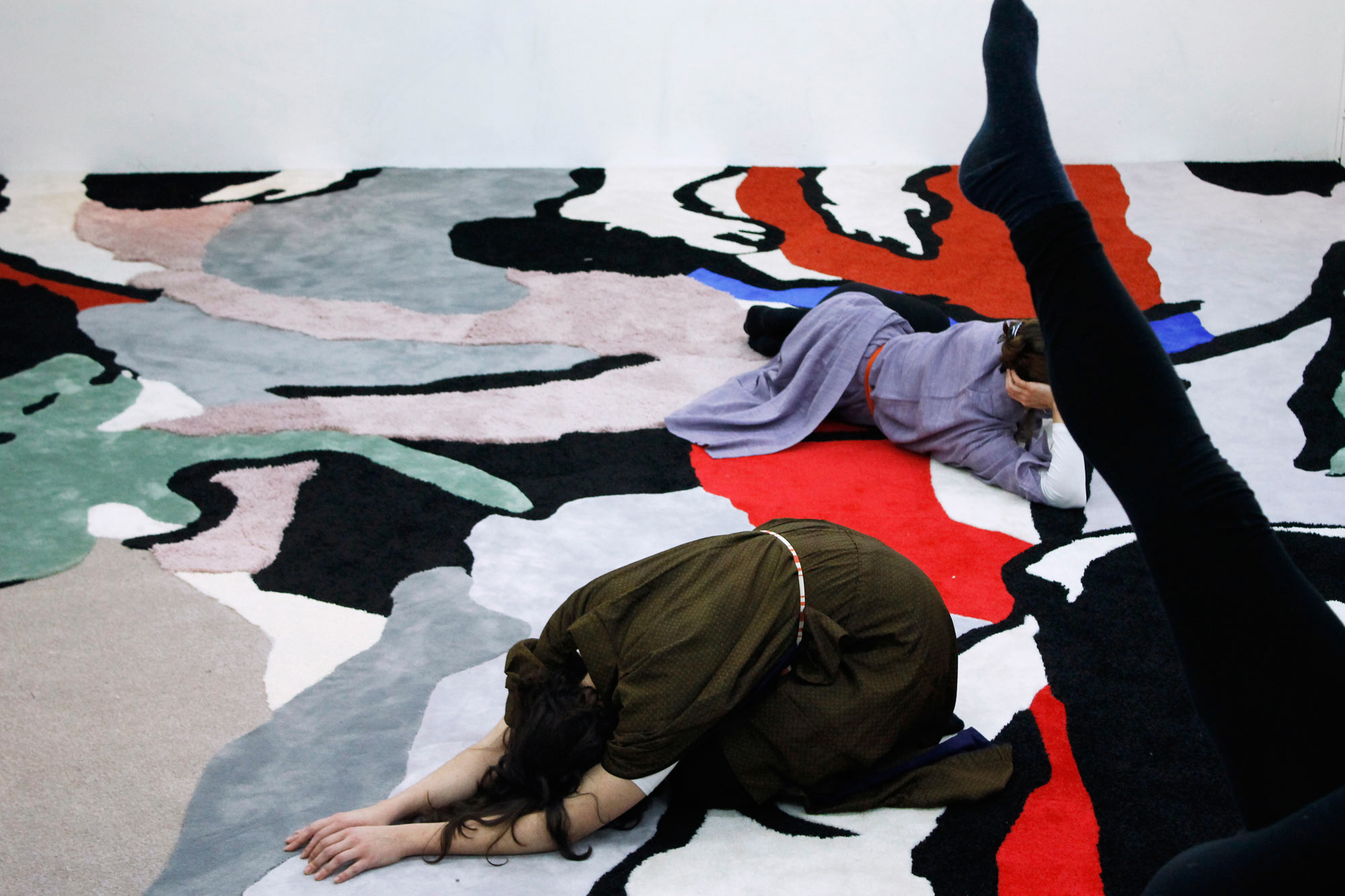
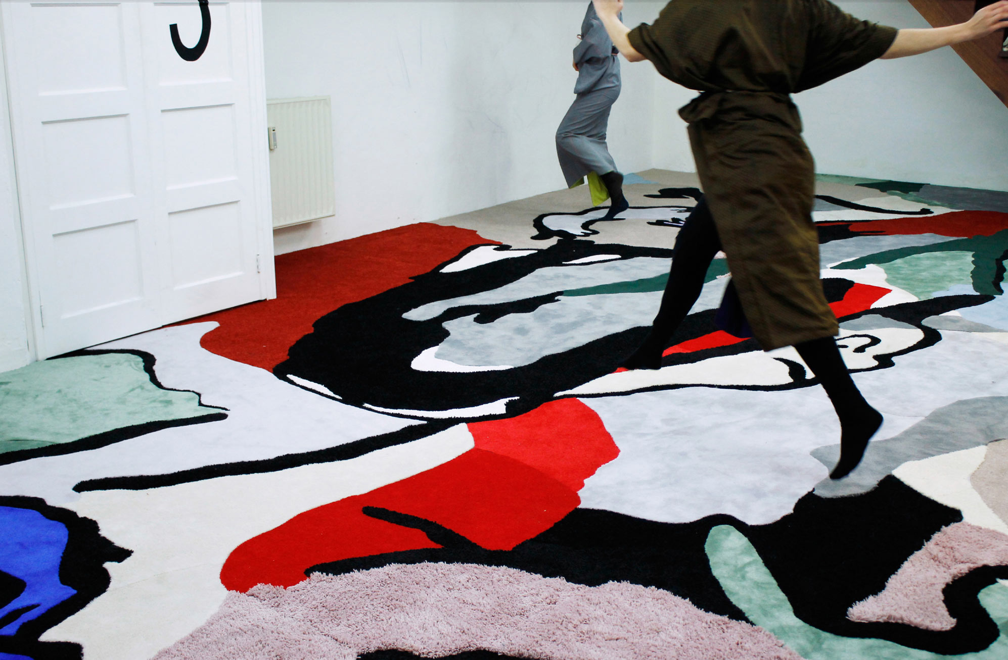
Residency at the Art Department, Da Costakade, Amsterdam. December 2015 and January 2016. With Physical Culture.
During the timeframe of the residency the different facets of the basement were activated; a place where societies gather, a provisional home, an exercising room and an visual archive department. It became an enclosed environment where the rules of agenda and schedule were altered. First, a carpet was executed by hand, to fit the entire ground surface; a basis and a witness for researches and public openings. 3 build-in closets already present in the basement opened for each event; the Opening, the Reception and the Finissage. Researches circulated around the themes of renewal of time, in the context of the end of the year, and the idea of training. A series of stretching exercices were performed during the last day of the year, as a resistance to show a prefixed and final result. The Finissage was presented in another space than the basement, at San Serriffe (Amsterdam).
In the meantime, we coded physicalculture.nl/agenda—a display of visual input turned output as a modern day convertible calendar.
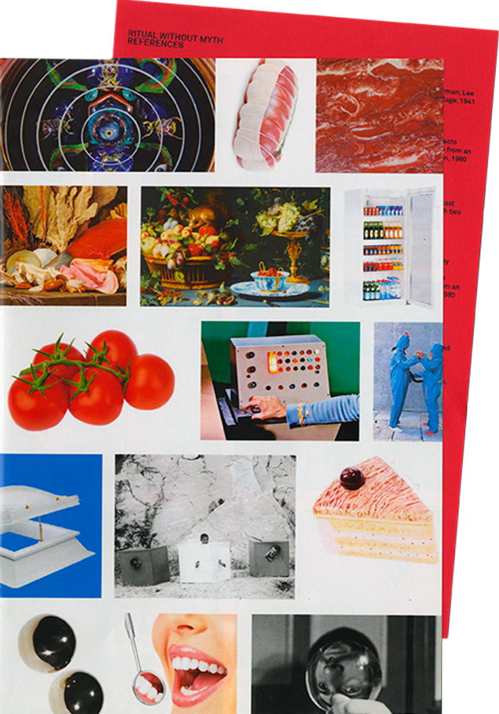
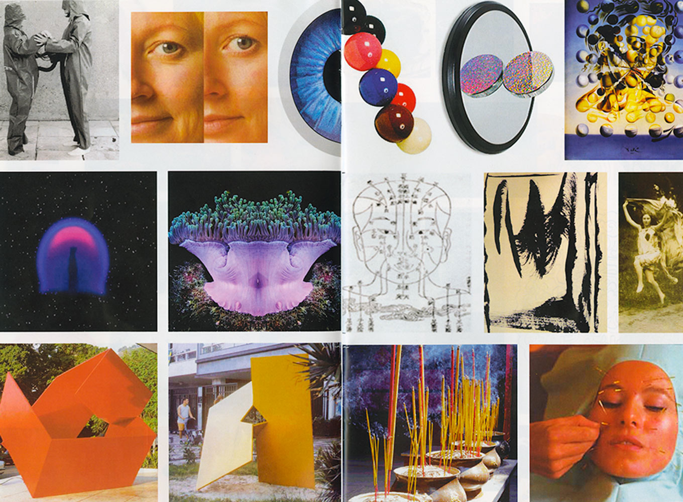
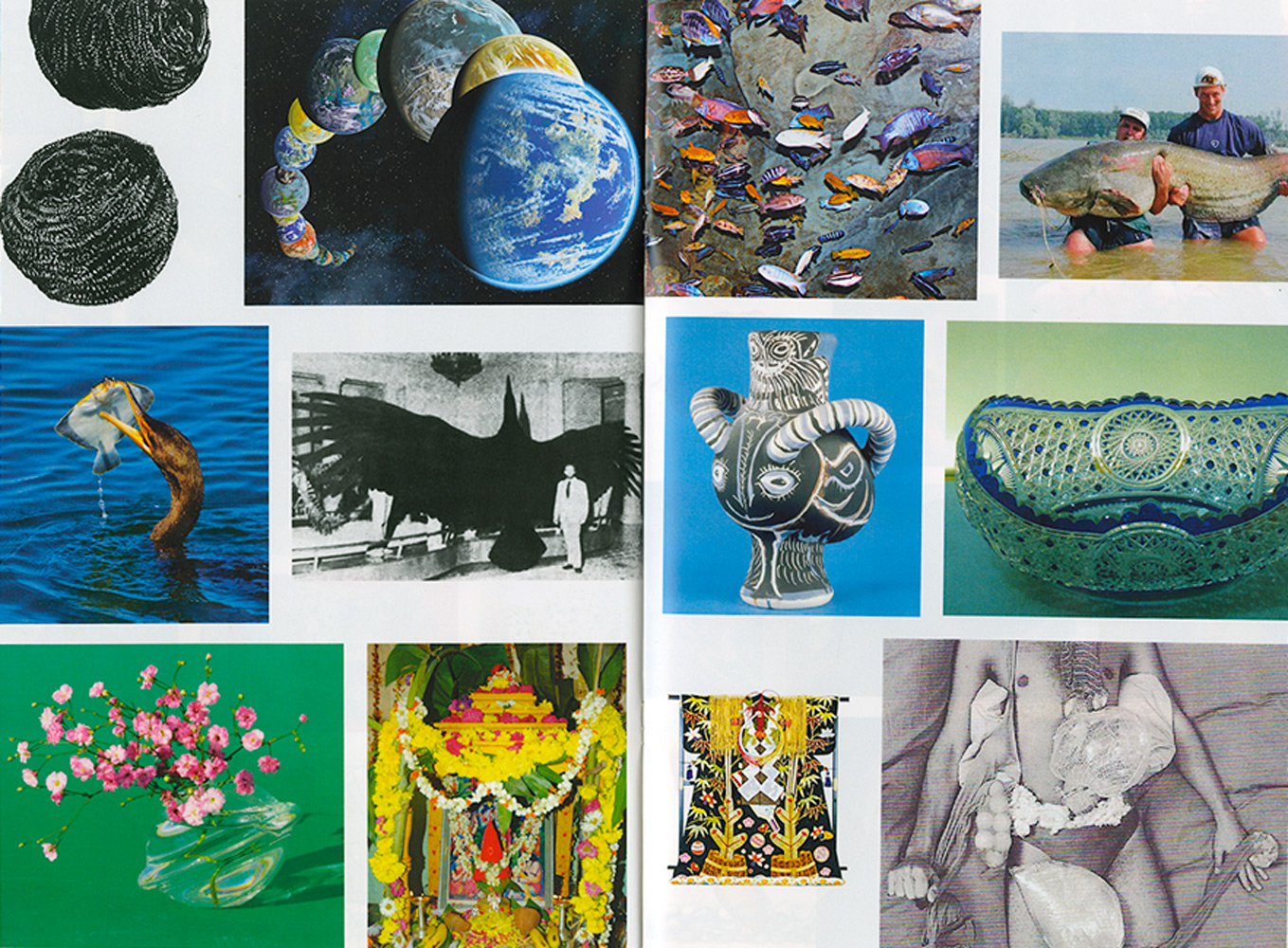
Ritual without Myth. Publication. Personal research. 16 pages, 18.5cm x 27.5cm. 2013.
Imaginary catalogue for an invented exhibition. Along with some Brazilian artists such as Amilcar de Castro, Franz Weissmann, Lygia Pape and the poet Ferreira Gullar, Lygia Clark co-founded the Neo-Concretist art movement. The Neo-Concretists believed that art ought to be subjective, organic and not theorised. During the 1970's, Clark explored the role of sensory perception and psychic interaction that the participants would have with her artwork. She referred to this as the "Ritual without Myth". In the final years of her career, Clark focused on psychotherapy and the use of art as a healing method.
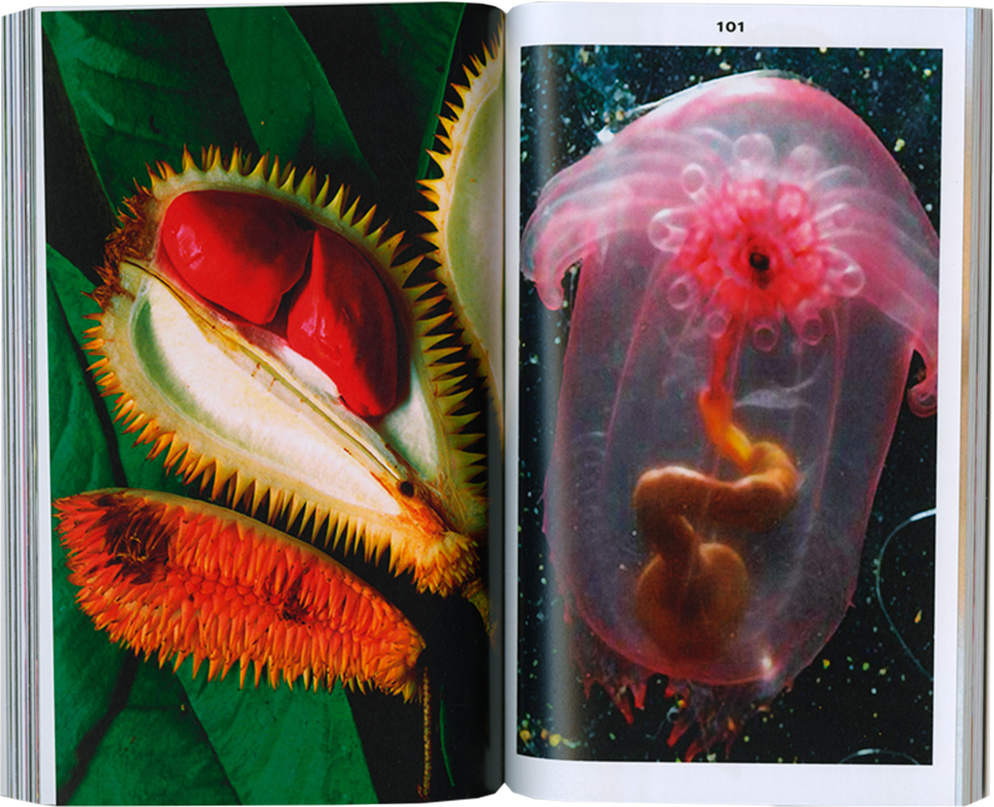
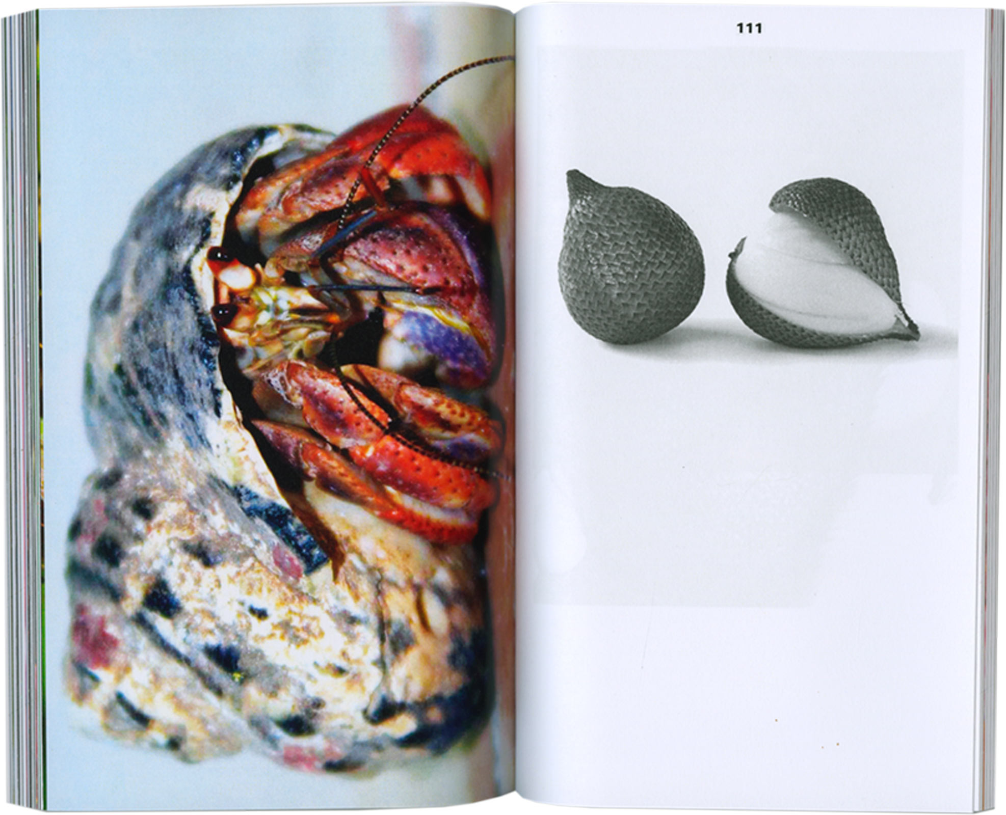
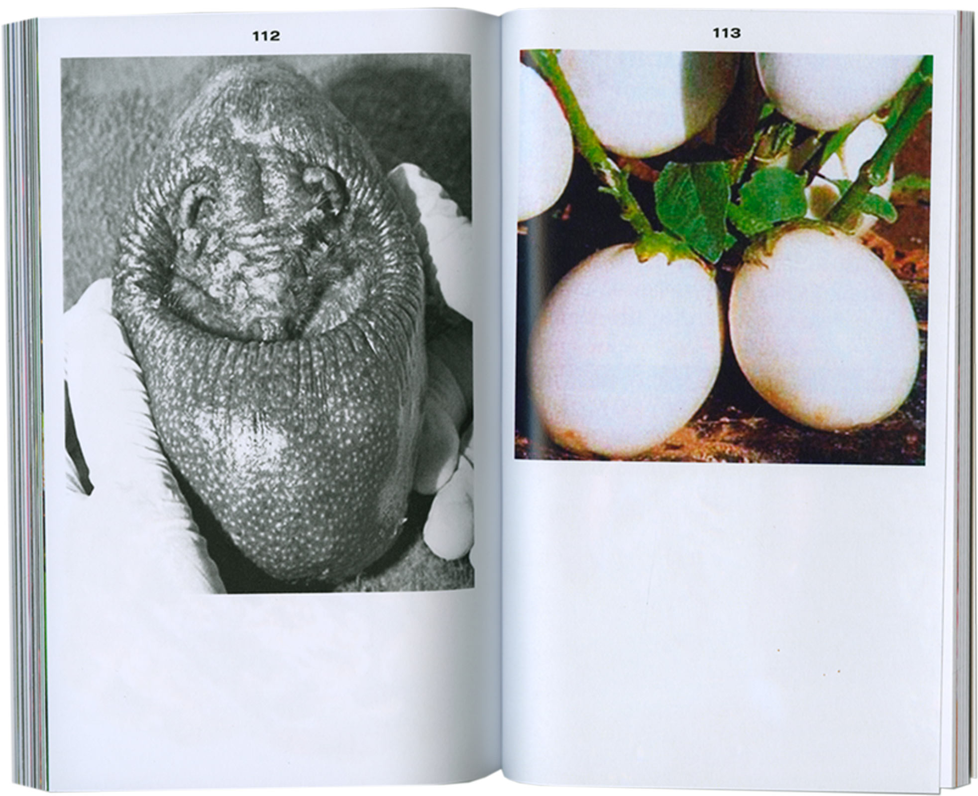
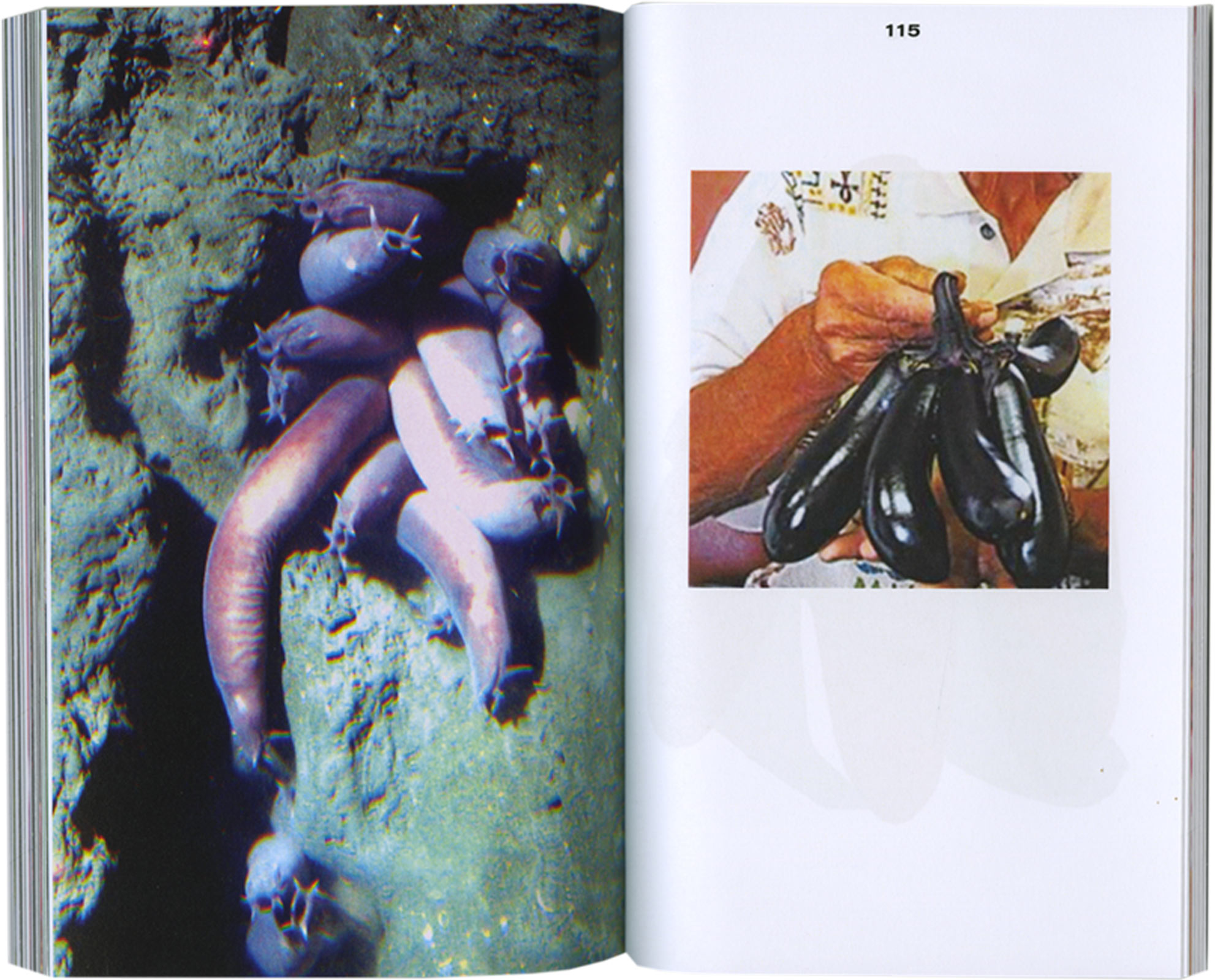
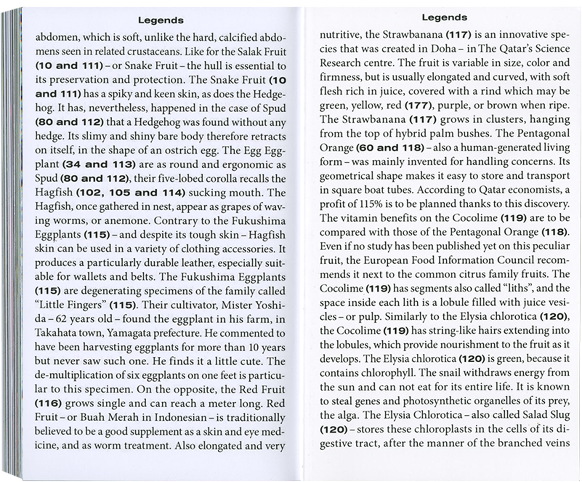
Legends. Book. 154 pages, 12.5cm x 19cm. Personal Research. 2014.
Visual encyclopedia of real and unreal forms or hybrids.
Against a classified and organised approach of knowledge, this book seeks the idea of a lineal evolution. All the image material is probed and selected from the internet. The text is written by borrowing from various sources; from advertising to Wikipedia. This work was presented during the Graduation show accompanied by a screen installation with an audio book.